by Jeffrey Saut, Chief Investment Strategist, Raymond James
“A long time ago in a galaxy far far away” I was running three separate departments at then Richmond-based Wheat, First Securities. Subsequently, Tom Dorsey and Watson Wright decided to leave Wheat, First and form the now legendary firm of Dorsey Wright. When they left, that department fell under my management.
Prior to their departure Tom and Watson were in charge of the options strategy department and the options trading desk. Pursuant to that job was that after the stock market’s close they “posted up” all the optionable stocks (puts and calls) traded on the various exchanges using the Point & Figure (P&F) charting system. For those unfamiliar with P&F charts we offer this explanation from Investopedia:
Conventional technical-analysis charts tend to be the open-close/high-low chart. In the creation of P&F, the emphasis is only on the closing price of an issue. The developers of P&F charting were interested in trend development and thus were concerned not with the noise created daily by minor moves up or down, but with the larger picture and how that plays out in the areas of supply and demand.
The key to P&F charts is the establishment of the unit of price, which is the unit measurement of a price movement that is plotted on the graph. On P&F charts, there is no time axis, only a price axis. Rising stock prices are shown with X's and falling prices are shown with O's. These points appear on the chart only if the price moved at least one unit of price in either direction. So say the closing prices of a stock moved up one price unit three times. This would appear as a column of three X's. If the price movement reverses direction, the chart shows a new column of O's, wherein an O is plotted for each unit of price movement. X's and O's never appear in the same column.
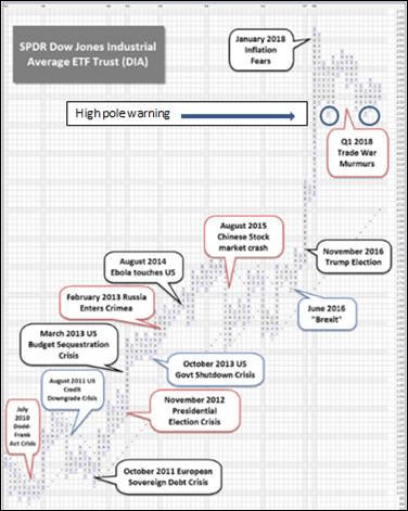
Andrew and I revisit this discussion of P&F charting this morning because we received a very interesting P&F chart from a particularly savvy financial advisor on Friday as crafted by, you guessed it, the astute folks at Dorsey Wright (Chart 1). Now, recall our discussion of the Dow Theory “sell signal,” which occurred on April 9, 2018. That was when the D-J Transportation Average fell below its February 9, 2018 closing low thus confirming a similar break by the D-J Industrial Average. Recall the Industrials violated their respective February low on March 23.
Also recall the longer it takes for one index to confirm the other index the less valid the signal, a point many alleged Dow Theorists fail to recognize. In the current case it took over two weeks for the Transports to confirm the Dow’s breakdown, which is one of the reasons we chose to ignore the “sell signal.” Another reason we turned a blind eye to said signal is because it came on aberrational news, which was the same thing that happened with Flash Crash 1 (May 2010) and Flash Crash 2 (August 2015), both of which generated false DT “sell signals.” As often stated in these missives, “Dow Theory is not always right, and it is subject to interpretation, but it is right a lot more than it is wrong!”
Returning to the P&F chart we received last Friday, study the attendant chart and notice that in this chart the D-J Industrials, as represented by the Dow “Diamond” ETF (DIA/242.95), did not violate the February low. In fact, it looks to us as if the Industrials actually made a double-bottom chart formation (see circles on the chart). The chart also shows a “high pole warning,” which is suggestive of a trading top. Following the “high pole warning” the chart shows the sideways consolidation the Industrials have been in ever since those February lows. As often stated, we continue to treat the February 9, 2018 low, of ~2533, as THE low until proven wrong.
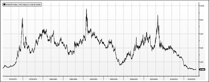
Coincident with the peak of the “high pole warning” is the annotation “January 2018 inflation fears.” We have commented repeatedly on our belief inflation was going to increase by some degree, but nothing like in the 1970s/1980s. We have even shown a ratio chart suggesting that commodities relative to equities are the cheapest they have been since the 1960s (Chart 2); and, have recommended tilting portfolios accordingly.
Moreover, in listening to corporate earnings’ conference calls, we are hearing more and more about how the commodities that companies need to produce goods (input costs) are increasing in price. As of now this has had a de minimis impact on corporate margins, but it is a trend worth watching. Also worth monitoring is wage growth since it plays such a large part in driving inflation.
To that point, last Friday the employment cost index reflected solid wage growth of +0.8% q/q and on a year-over-year (y/y) basis, wage growth was higher by 2.9% for the strongest growth rate in years. That caused one Wall Street wag to exclaim, “Is the inflation genie climbing out of the bottle?!”
Moving on to earnings, according to Thomson Reuters:
First quarter earnings are expected to increase 24.6% from Q1 2017. Excluding the energy sector, the earnings growth estimate declines to +22.7%. Of the 267 companies in the S&P 500 that have reported earnings to date for Q1 2018, 79.4% have reported earnings above analyst expectations. This is above the long-term average of 64% and above the average over the past four quarters of 75%. First quarter revenue is expected to increase 8.1% from Q4 2016. Excluding the energy sector, the revenue growth estimate declines to 7.7%.
Credit Suisse further elaborates on earnings by writing:
It is not just the size of earnings beats that is impressive this quarter, but also the sheer volume of companies exceeding expectations. 80% of S&P 500 companies have topped their EPS estimates, the highest rate we have seen in 20 years.
And, it is not just earnings that are surging, first quarter revenues are expected to increase by some 8.1% from 4Q16. Clearly our assumption back in late 2015 that the equity markets were transitioning from an interest rate to an earnings driven secular bull market has played in spades.
Other events that occurred between the “bookends” of the week included: 1) better that expected GDP growth (+2.3%); 2) U.S. exports tag a record high; 3) the Conference Board’s consumer confidence index topped the estimate of 126 at 128.7; 4) March home sales recorded an upside surprise (~694K vs. ~630K estimate); 5) existing homes prices rose an eye-popping ~7% in February; 6) existing home sales beat estimates; 7) the market manufacturing/services index rose; and, the good news list goes on.
The call for this week: We have not written for the past few weeks due to various reasons. We appreciate all the concerned emails and phone calls we received regarding our dearth of publishing. In addition to those concerns, we have gotten voluminous requests to provide updates on our three directional models (long-term, intermediate, and short-term), as well as our internal energy model. As often noted, our long-term model flipped positive in October 2008 and has never turned negative since.
We don’t have our notes here at the house so from memory the intermediate and short-term models turned negative at the beginning of March last year leading to a 70 point loss in the S&P 500 (SPX/2669.91) after which they again turned constructive again. The intermediate model did not flash any negative signals for the rest of the year. The short-term model, however, registered a negative flip at the beginning of August 2017, but hereto flipped positive in late August after a small decline by the SPX.
Coming into this year, all the models were positive at the beginning of January, but started telegraphing that February was going to be the first potential window of downside vulnerability for the equity markets in a very long time; and the rest, as they say, is history. Currently all the models are bullishly configured and the internal energy model, while not possessing a full charge of energy, is pretty darn close to a full charge.
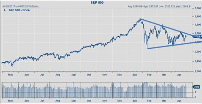
Looking at the chart of the SPX shows a wedge chart formation, with the SPX bonking up against the downtrend line three times (Chart 3). Typically on the fourth attempt the SPX usually breaks above said downtrend line. Verily, there is nothing in the charts suggesting this is anything more than a normal retracement consolidation chart pattern. Overnight reports have it that Israel launched a massive missile attack on Iranian bases in Syria, earnings reports end this week, and the Fed meets, but none of this seems to be affecting the preopening futures that are better by 10 points as we write (5:00 a.m.).
Chart 1
Source: Dorsey Wright
Chart 2
Source: Bloomberg
Chart 3
Source: FactSet
*****
Additional information is available on request. This document may not be reprinted without permission.
Raymond James & Associates may make a market in stocks mentioned in this report and may have managed/co-managed a public/follow-on offering of these shares or otherwise provided investment banking services to companies mentioned in this report in the past three years.
RJ&A or its officers, employees, or affiliates may 1) currently own shares, options, rights or warrants and/or 2) execute transactions in the securities mentioned in this report that may or may not be consistent with this report’s conclusions.
The opinions offered by Mr. Saut should be considered a part of your overall decision-making process. For more information about this report – to discuss how this outlook may affect your personal situation and/or to learn how this insight may be incorporated into your investment strategy – please contact your Raymond James Financial Advisor.
All expressions of opinion reflect the judgment of the Equity Research Department of Raymond James & Associates at this time and are subject to change. Information has been obtained from sources considered reliable, but we do not guarantee that the material presented is accurate or that it provides a complete description of the securities, markets or developments mentioned. Other Raymond James departments may have information that is not available to the Equity Research Department about companies mentioned. We may, from time to time, have a position in the securities mentioned and may execute transactions that may not be consistent with this presentation’s conclusions. We may perform investment banking or other services for, or solicit investment banking business from, any company mentioned. Investments mentioned are subject to availability and market conditions. All yields represent past performance and may not be indicative of future results. Raymond James & Associates, Raymond James Financial Services and Raymond James Ltd. are wholly-owned subsidiaries of Raymond James Financial.
International securities involve additional risks such as currency fluctuations, differing financial accounting standards, and possible political and economic instability. These risks are greater in emerging markets.
Investors should consider the investment objectives, risks, and charges and expenses of mutual funds carefully before investing. The prospectus contains this and other information about mutual funds. The prospectus is available from your financial advisor and should be read carefully before investing.
Copyright © Raymond James


