by Denise Chisholm, Director of Quantitative Market Strategy, Fidelity Investments
Here's what market history can tell us.
Key takeaways
- The US stock market has become concentrated, with a handful of stocks driving a larger percentage of the market's gain than at any time since the 1970s.
- Although the last 2 periods of high market concentration ended in a recession and a burst valuation bubble, high concentration alone might not be a worrisome issue for investors.
- Valuations matter, and the forward price-earnings ratios of stocks in the information technology sector are about half of what they were before the technology stock bubble burst in the early 2000s.
- Higher market concentration may also be an opportunity for active stock selection due to a higher variance of earnings surprises.
The US stock market has become even more concentrated than it had been in the early 2000s technology stock bubble, as a small number of stocks have driven most of the gains for the broadly based S&P 500® index. Is this a worrying sign for the markets going forward?
Not necessarily. While the market has become historically “top-heavy” over the past 7 years—and increasingly so—stock valuations have not reached the excessive levels of the past. Moreover, rising performance dispersion among the largest components in the S&P 500 may be an opportunity, as it helps create room for active managers to add value through security selection.
Looking at concentration historically
What do we mean by market concentration, exactly? This concept can be defined in several different ways. For this article, we mean that a small group of stocks has been driving most of the market gains since 2017. The chart below shows that over the past 7 years, the largest 5 stocks at each point in time among the 3,000 largest by market capitalization have represented an increasing proportion of the total market capitalization. This year, the top 5 reached the largest percentage of the market cap since the early 1970s.
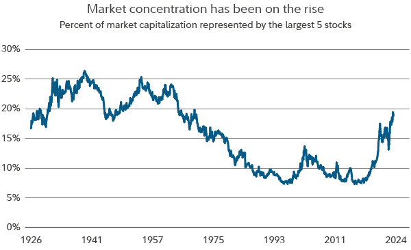
Market capitalization and percent of market capitalization is based on a Fidelity list of the top 3,000 US stocks, calculated monthly. The blue line depicts the percentage of market capitalization represented by the top 5 stocks among the 3,000 at each point in time. Source: Haver Analytics and Fidelity Investments, as of April 30, 2024.
In recent months, the top 5 stocks have represented nearly 20% of the total market capitalization, far more than the median of 15.9% going back to 1926.
Note, however, that the stock market has previously gone long stretches with a far-higher concentration. For example, the top 5 stocks represented 20% of the market or more for the roughly 4-decade period from 1926 through the mid-1960s. Within this time frame, the market suffered a major drawdown early on at the start of the Great Depression, then another major drawdown in 1937. Yet it also posted a gain for most of the years from the mid-20s through the mid-60s. More than 20 of those years were double-digit advances.
How have past periods of high concentration been resolved?
The technology bubble of the early 2000s and the Nifty Fifty era that started in the 1960s marked the last 2 major periods of high market concentration. Each was resolved by a change in the business cycle, a recession, and a change in stock market leadership driven by the bursting of a valuation bubble.
Beginning in the 1960s, a group of about 50 buy-and-hold stocks known as the “Nifty Fifty” powered a long market rally that lasted until about 1968. A combination of higher-than-average valuations, unrealistic growth expectations, and adverse economic events conspired to end the rally. Market concentration continued to decline through the subsequent decades.
Market concentration began to rise again in the mid-1990s, up until the dot-com bubble, although not to the level of the 1960s and 1970s. The market peaked in March of 2000 and saw several high-profile stocks disappear from the index amid spending excesses and high valuations. Market concentration subsequently declined until roughly 2016.
Some investors are beginning to ask whether the gains in recent years for the “Magnificent 7” stocks—Alphabet, Apple, Amazon, Meta Platforms, Microsoft, Nvidia, and Tesla—represent a new era of excess.
While many of these mostly tech-and-growth-centric stocks trade at historically high valuations, there isn’t broadly based and excessive valuation, either at the overall market level or within the technology sector.
What about valuations?
As the chart below shows, both the median and cap-weighted forward price-earnings ratios of information technology stocks within the 3,000 largest stocks by market cap stood at less than 31 times earnings as of late June. This is significantly higher than the cap-weighted median forward P/E of about 16 times going back to early 1977. That said, it’s less than half the peaks during the tech stock bubble of the late 1990s and early 2000s.
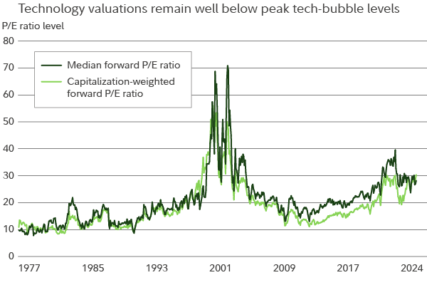
P/E is price-earnings ratio and is calculated monthly based on end-of-period values, using analyst estimate for earnings for the following 12 months. Sector valuations are based on the information technology stocks within the Fidelity list of top 3,000 US stocks by market capitalization at each point in time. Source: Haver Analytics and Fidelity Investments, as of June 30, 2024.
It may be fair to say that today’s stock market is expensive, although growth expectations have been supported by fundamentals. As of mid-2024, there also are reasons to think the stock market could continue to advance, including very strong earnings growth, a recent upturn in leading economic indicators, and bullish trends for cyclical stocks relative to defensive sectors.
Studying the typical bull market
In most of the periods since 1926, large-cap stocks have driven the secular market trends, as small caps have lagged large caps in major secular bull markets. The chart below shows the S&P 500 index and the total return of US small cap stocks relative to large caps among the largest 3,000 tickers by market cap.
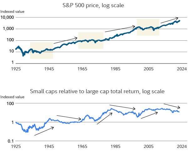
The data is charted on a log (logarithmic) scale. Top: S&P 500 bull-market uptrends shown with upward/sloping arrows and bear markets (downward or sideways trends) with the beige rectangles. Bottom: The axis indicates the ratio of the total market return of small-cap stocks relative to large caps. The 1 on the scale at left indicates the ratio is equal (1 to 1). As of May 2024, the ratio was about 3.5 times the market returns vs. large caps. Arrows mark the general trends for small-cap versus large-cap returns. Source: Haver Analytics and Fidelity Investments, as of May 31, 2024.
Small caps have tended to outperform large caps during bear markets, which has caused the chart above to slope upward for much of the time frame studied. Notably, the most significant eras of gains for the market overall occurred in periods in which the total return of small-cap stocks either held steady or waned relative to large caps. This is true of the postwar period through about 1965; again from 1983 through 1999; and, finally, from 2009 through 2020.
What is this saying about the current stock market? The ratio of small caps relative to large caps continues to decline, and this trend has corresponded with bull markets in the past. It’s another reason to think that market concentration on its own may not be a problem. Large-cap leadership (large-cap stocks outperforming small caps) is not a strange or anomalous occurrence. To the contrary, it is typical of bull markets.
Are there any advantages to a concentrated market?
Lastly, the currently concentrated market may provide an important advantage for active investors. The chart below looks at the quarterly earnings surprises for the top 200 stocks in the Russell index. Higher readings on the chart show a larger gap between stocks that surprised the most versus those that surprised the least.
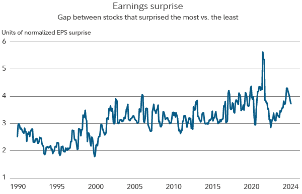
The blue line shows the spread of standardized unexpected earnings (SUE) for the top 200 stocks in the Russell Top 200 Index, calculated quarterly. The Russell Top 200 is a large-cap index that contains the 200 largest companies in the broader Russell 1000 index. The SUE differential is the difference between the standard deviation adjusted earnings surprises of the 90th and 10th percentile (weighted 25%), and the 75th and 25th percentile (weighted 75%). Sources: Haver Analytics and Fidelity Investments, as of June 30, 2024.
What this chart suggests is that the amount of surprise variance has risen since early 2022 and remains above its median going back to the early 1990s.
“I think the current environment sets us up well for active stock selection,” says Nidhi Gupta, manager of the Fidelity Fund.
Following are some of the ways Gupta is seeking to take advantage of the stock selection opportunities:
- Focusing on companies with healthy free cash flow yields—not just earnings surprises or earnings growth relative to peers. Gupta believes that free cash flow can be less subject to manipulation. Over the long term, stocks arguably follow free cash flow. Specifically, she calculates the free-cash-flow yield of each industry group and stock category and combines that with sector fundamentals and company-level inputs.
- Looking for opportunities that might not be obvious. Gupta has calculated more potential stock upside among certain faster-growing companies that may not be on every investor’s radar screen. In particular, she looks for companies that are reasonably priced on their longer-term free cash flow potential and are seeing improving business conditions—some of which are tied to secular trends.
- Digging deeper. With the help of Fidelity’s global research team, Gupta strives to uncover companies with “best of breed” qualities, including companies with strong competitive positions, high returns on capital, and management teams that are good stewards of shareholder capital. In recent months, this has been especially true in the technology sector, where she’s focused on finding companies with secular growth drivers that she believes have a chance to win no matter the economic backdrop.
- Studying more-expensive stocks for signs that their earnings might not be sustainable. This sometimes means either underweighting or not owning specific stocks that have contributed significantly to market gains. This can lead to relative gains when market participants begin to lose faith in a highly valued stock.
- Seeking companies with major growth drivers that are outside the technology industry. Gupta sees potential for the strength and enthusiasm garnered by a handful of mega-cap stocks to potentially expand into other sectors and industry groups over time. This recently has been the case, for example, among a select group of utilities stocks that have become viewed as infrastructure plays that are crucial to the buildout of artificial intelligence projects, each of which requires significant energy use.
- Gravitating toward companies with unique positioning and sustainable competitive advantages. She particularly watches for companies that are “capital light,” because they can spend their free cash flow on shareholder remuneration—including increased dividends and share buybacks—or invest more in research and development, as opposed to in machinery, plants, and equipment.
- Watching for opportunities to make initial investments and add to positions of high conviction at opportune times. Entry and exit points can matter, even among stocks with long-term upside potential.
- Keeping tabs on the macro picture, including the rate of inflation, for any hints that the US Federal Reserve might be done raising interest rates. She believes that this expectation may be only somewhat factored into stock prices as of mid-2024.


