

by Liz Ann Sonders, Chief Investment Strategist, and Kevin Gordon, Charles Schwab & Company Ltd.
Analysis shows an extraordinary range of outcomes since the S&P 500's inception in 1928.
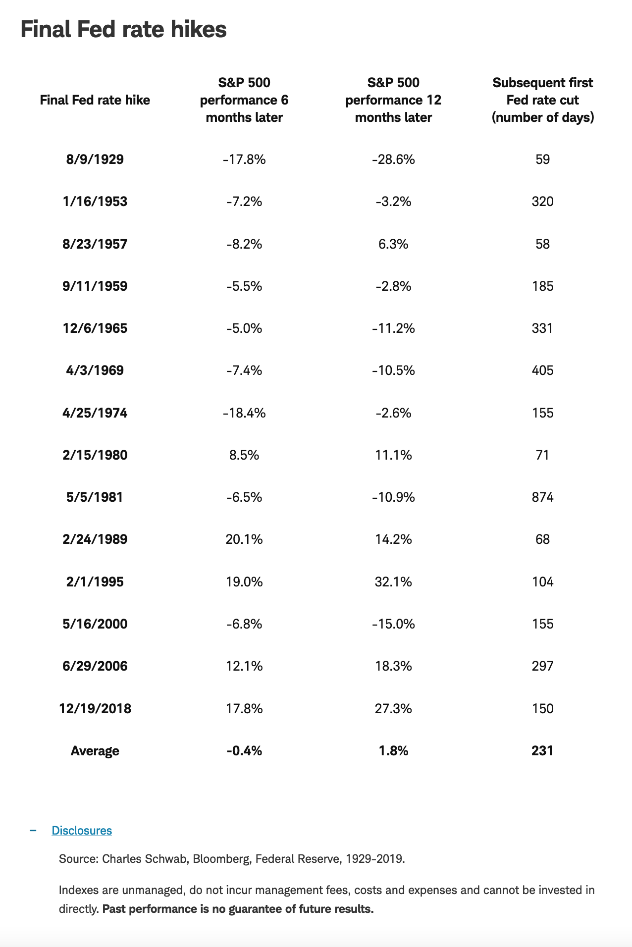
Staying with those odds for now, perhaps it's time to dust off the "what happens when the Fed is done hiking" playbook. The problem is the playbook has had many different (and diverging) chapters over the history of rate rise cycles. Be mindful of the fact that the sample size is relatively small at 14 main rate-rise cycles since the S&P 500's inception in 1928. That suggests caution around thinking there is a consistent pattern to apply to investment decision-making.
It is indeed possible to construct an average trajectory of the S&P 500 from six months before the final rate rise of each main cycle out to the following year. Focusing only on the average would suggest a pattern of weakness leading into the final rise, some strength in the immediate aftermath, and then a significant sell-off out to about 100 trading days after the final rise. Shame on anyone though who begins and ends the analysis with these generalities.
Why? Consider the extraordinarily wide range of outcomes in the 14 cycles—generally in the range of a rise of 30 percent to a fall of the same scale over the span of the 12 months following the final rate rise.
Average market path around final rate hike

Source: Charles Schwab, Bloomberg, Federal Reserve, 1929-2019.
Indexes are unmanaged, do not incur management fees, costs and expenses and cannot be invested in directly. Past performance does not guarantee future results.
The problem is that there is no "typical" when it comes to this analysis. In fact, the pattern associated with the average trajectory of stocks actually never occurred during any individual cycle!
This rate rise cycle has already been particularly unique relative to the past three cycles. Last year, stocks got crushed during the first six months of the rise cycle; in contrast to the previous three main rise cycles (2015-2018, 2004-2006, and 1999-2000), when stocks rallied during the rising phases.
Wide range of outcomes around average

Source: Charles Schwab, Bloomberg, Federal Reserve, 1929-2019.
Green shading represents best historical performance before and after last Fed rate hike. Red shading represents worst historical performance before and after last Fed rate hike. Indexes are unmanaged, do not incur management fees, costs and expenses and cannot be invested in directly. Past performance does not guarantee future results.
In fact, the stock market peaked in less than a month following the first rate cut in September 2007. This was also in the midst of the secular bear market from 2000 to 2009.
Then there were the deleterious paths stocks took following the Fed's final rate rise in 1929, and to a lesser degree following the final rise in 2000. Stocks were down 28 percent after 1929's last rate rise and 15 percent after 2000's pause.
The cycles don't represent proxies for the current environment—with 1929 marking the start of the Great Depression, and 2000 marking the onset of the bursting of the tech stock bubble. Both also represented commencements of the secular bear markets between 1929 to 1942, and 2000 to 2009, respectively.
The hoped-for end to the Fed's most aggressive monetary tightening campaign in four decades may be in sight. But commensurate assumptions about it representing a clearing the skies of additional risk may be too complacent. In this anything-but-typical cycle, be wary of "typical" commentary when it comes to market behavior.
Copyright © Schwab.com