by Martin Pring, Pring Turner Capital Group
A year ago, as the economy was emerging from its third slowdown following the financial crisis, commodity prices looked set to move higher. However, due to the pandemic lockdown, the global economy abruptly fell into recession and commodity prices quickly collapsed. Today, business activity is back in recovery mode and commodities are surging and once again, poised to take advantage of improving conditions. We see five independent areas providing evidence of a commodity bull market. They are, commodities themselves, the economy, and the bond, stock and currency markets. Let’s consider them in turn to see if this time commodities can fulfill their promise.
Commodity Indicators
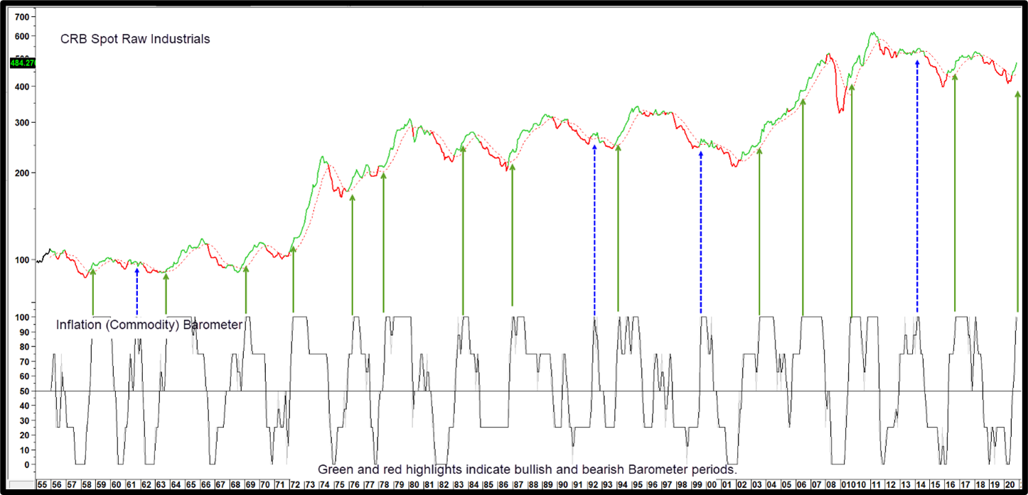
Chart 1 features the Pring Turner Commodity Barometer, a consensus indicator comprising commodity and inter-asset relationships. It generates bullish signals (a green highlight in the chart) with a 50% reading or more. Between 1956 and 2019 it returned an average monthly annualized gain of 8% when positive, compared to the buy hold approach of under 3%. Its current level just reached 100%, which is very bullish news for industrial commodity prices. In that respect, the arrows tell us when the Barometer first reaches 100% in a new cycle, it’s usually a signal that a strong advance is likely to follow. The dashed blue arrows remind us that this is not a fool proof approach. However, only one signal, that triggered in 1992, can be said to have been unprofitable. The others were more or less break even. Obviously, this track record does not ensure a robust commodity rally, but it does point up that such an outcome is certainly probable.
Chart 1 – CRB Spot Raw Industrials and the Commodity Barometer
The Commodity Barometer defines favorable or unfavorable environments for commodities and is currently at the maximum 100% reading!
Source: Martin Pring’s Intermarket Review (click chart to enlarge)
Industrial Commodities and the Economy
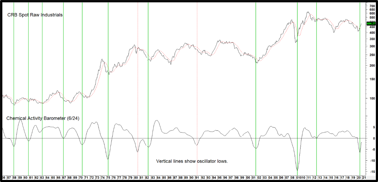
Swings in the economy do not reflect exact changes in the demand for commodities but they do serve as a proxy. The current inflationary phase of the business cycle is consistent with the positive Barometer reading. In that respect, Chart 2 shows us that the price oscillator for the Chemical Activity Barometer, a leading economic indicator published by the American Chemistry Council, has turned sharply higher. We particularly like this one, because its history can be traced back to the 1920’s. Changes in the demand/supply relationship for chemicals, which are high up in the supply chain, add an ingredient not included in other popular leading economic indicators. The eleven vertical green lines tell us that, when momentum has bottomed from a sub-zero position in the past, a significant commodity rally or extended trading range has usually followed. The two red dashed ones over the last 65 years point up the false positives. This indicator has been rising sharply since the late spring. The CRB Spot Raw Materials Index has responded with a decisive penetration of its 12-month moving average (MA) and 2018-2020 down trendline.
Chart 2 CRB Spot Raw Industrials versus Chemical Activity Barometer Momentum
This leading economic indicator is signaling a new economic expansion has begun and commodity prices are likely to continue rising.
Source: Martin Pring’s Intermarket Review (click chart to enlarge)
The Bond Market is Forecasting Higher Commodity Prices
Bond yields usually begin their cyclical rise after commodities hit their bear market low. Unfortunately, this lagging relationship is not of much use in forecasting commodity prices. On the other hand, credit spreads, which reflect changes in the level of confidence, can be really helpful in that regard. That’s because changes in sentiment greatly influence the level of economic activity.
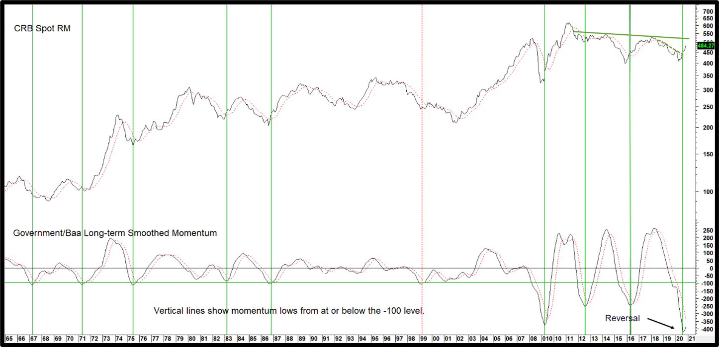
Spreads can be measured in many ways. One of our favorites is the ratio between the 20-year Government and Moody’s Baa Corporate yield; more precisely, its long-term smoothed momentum. When rising, it indicates confidence is improving. That’s because bond investors are showing a preference for higher yields over greater safety, as a stronger economy is expected to result in fewer defaults. Not surprisingly, lows in this momentum series are often associated with bear market bottoms in commodity prices. Successful signals have been flagged by the green vertical lines. Like everything else, this relationship does not produce perfect results. However, it has worked pretty consistently since the 1960’s. November saw smoothed momentum hook to the upside, from a position at or below the horizontal green line, for the tenth time this century. This tells us that investors are expecting a firmer economy going forward, and that should translate to higher commodity prices.
Chart 3 CRB Spot Raw Industrials and Credit Spread Momentum
High Yield bonds are beginning to outperform Government bonds, an indication of confidence in the economy and a positive sign for commodity prices.
Source: Martin Pring’s Intermarket Review (click chart to enlarge)
The Stock Market Weighs In
The S&P Composite discounts the economy but not in a way that can be helpful in forecasting commodity prices. For that, we have to break the overall market down into sectors, as their performance is dependent on the prevailing phase of the business cycle. Homebuilding stocks for instance, discount the housing sector, an early leader due to its interest rate sensitivity. Mining stocks on the other hand, put in their best relative performance in the more mature phases of the business cycle, when capacity is tight and industrial commodities running. The good news is that sector rotation can be utilized in the commodity forecasting process. This is achieved by comparing a laggard to a leading sector, upside reversals in this relationship signaling that commodities are likely to rally and vice versa.
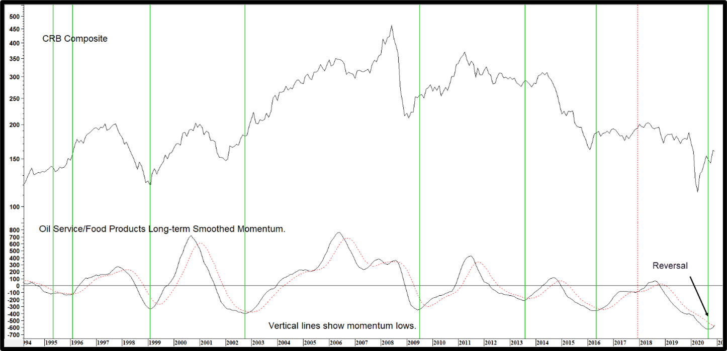
That’s where Chart 4 comes in, as it compares the energy sensitive S&P Oil Service Index with that for the defensive Food Manufacturers. Once again, momentum is substituted for the raw data. Note that the commodity reference point in this chart is the more broadly based CRB Composite. The vertical lines flag momentum lows, an event that is usually followed by a commodity rally. Note that this indicator has tentatively reversed to the upside, thereby supporting the bullish position of the others.
Chart 4 CRB Composite and Oil Service/Food Products Momentum
Commodity prices can rally strongly when energy stocks start to outperform food product companies.
Source: Martin Pring’s Intermarket Review (click chart to enlarge)
The Dollar and Commodity Prices
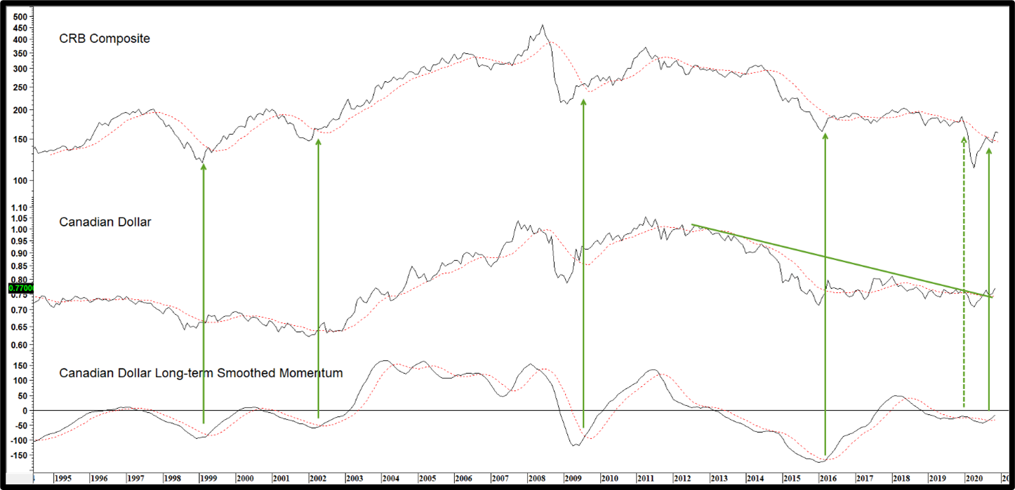
It’s well-known that the dollar and commodities move inversely most of the time. Currently, the Dollar index is in a bear market, as it is below its 12-month moving average (MA). That represents a bullish background factor for commodity prices. However, there is an even stronger link between the performance of the Canadian dollar and commodity prices than that with the Dollar Index itself. Chart 5 shows that strong connection, as broad swings in the CRB Composite are matched fairly closely with those for the Canadian buck. Moreover, the green arrows demonstrate that sub-zero momentum MA crossovers for the currency have represented excellent opportunities for commodity acquisition. Since that currency momentum has started to reverse to the upside, recent breakouts by both the Index and the Canadian dollar above their 12-month MA’s are likely to translate into higher commodity prices.
Chart 5 The CRB Composite versus the Canadian Dollar
Canada’s resource-based economy and currency provides a quite reliable leading indicator for commodity prices.
Source: Martin Pring’s Intermarket Review (click chart to enlarge)
Conclusion
No doubt, in many ways 2020 has been a challenging and surprising year. It started with an improving economy and hope for a healthy extension to the longest economic expansion in history. But in March, the abrupt pandemic-induced partial economic shutdown and a deep, but short recession threw the world economy way off course. The good news is that a new economic expansion has begun and there is plenty of evidence of a commodity bull market emerging on a wide front. Provided the commodity bull market does not get out of hand, as it most recently did in 2008, this bodes well for stocks. Inflation-sensitive sectors and resource-based markets are especially favored. The new primary bull market for commodities probably has many more months ahead of it. Nevertheless, the fake rally at the start of the year tells us that it will be important to follow the evidence and be on the lookout for any changes in trend affecting this optimistic outlook. Best wishes to all for a great 2021!
About Martin Pring
 Martin J. Pring has written more than 20 books on investing such as asset allocation, market psychology and investing around the business cycle. His widely popular book, “Technical Analysis Explained”, has been translated into 8 languages and for several decades was required reading for the Chartered Market Technician’s (CMT) designation. Martin, in collaboration with Dow Jones Indexes, co-developed the Dow Jones Pring U.S. Business Cycle Index in 2012, a unique index based on the financial advisory firm’s “Six-Stage” business cycle investment strategy. Martin is an investment strategist & principal of Pring Turner Investment Management, Walnut Creek, CA.


