How to Improve Your Content Game with Infographics
by Commonwealth Financial Network
 You’ve seen them—those beautifully laid out, tidy, eye-catching e-mails, blog posts, and newsletters from companies well versed in marketing to their clients. We all should aim to have content equally as refined, but how do you achieve this if you aren’t a graphic designer yourself, and you don’t have one on staff? The solution is easy: use an infographic app.
If you’re looking to improve your content game, an infographic app can help you add visual elements to your storytelling, making it easier to grab attention, highlight key takeaways, and keep your clients and prospects engaged. But do these apps really do a good job?
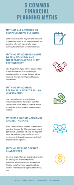
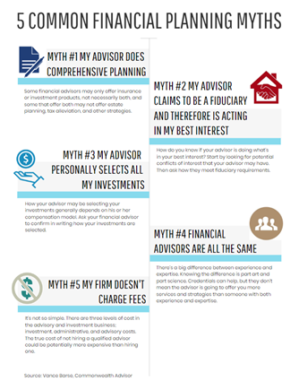
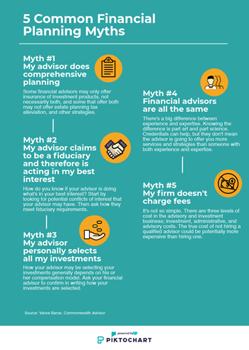
I partnered with Marketing team member Stephanie Kuo to put three apps to the test. As content, we borrowed a blog post, “5 Common Financial Planning Myths,” written by Vance Barse, AIF®, a financial advisor affiliated with Commonwealth. To ensure that our test was more in line with the experience of a financial advisor or staff member using these apps, we didn’t ask our own creative associates for feedback until the very end.
While infographics can add value and help you improve your content game, it’s important to keep in mind some key points when creating them:
Keep it simple. Start with content that’s both informative and engaging. Numbered lists or statistics often work well, as the purpose of infographics is to present data that is easily understandable at a glance. Consider your audience and desired goal—do you want to educate clients on how to protect themselves from a specific cyber threat or risk? Inform younger investors about the benefits of a great money-saving tool? Talk about future expectations for the socially responsible investing space?
Overly complex infographics can defeat the purpose and confuse the message. Focus on the clarity of the message and remove anything that gets in the way (i.e., extra words, complex images). The message should come first, then the support graphics.
Remember your brand. People are drawn to graphics before words, so you want to select images that support and enhance your message. Many applications allow you to import your own graphics and icons, so you aren’t limited to what the application provides.
When possible, use colors that reflect and support your brand. Don’t be tempted to use every color in the toolbox. The goal is to engage while subtly aiding in increased brand awareness.
We tested three infographic apps: Canva, Venngage, and Piktochart. All were easy to use, but only one came out on top.
Canva—our favorite! Canva is free, though, like the other two apps, you can pay to upgrade to a more robust package if the free version doesn’t have what you need. We were happily surprised at the amount of free options. It’s easy to upload your own custom graphics in addition to the ones Canva offers. The app also provides linearly designed templates, a format that makes it easier for the reader to follow along.
Users can build all sorts of graphs—from Venn diagrams to mind maps—and have the option to save them to the system to use for future projects. Photo tools allow users to align and crop images, add captions, and enhance, blur, or fade the pictures.
There is a host of video tutorials to help you get started or if you’re having trouble with a project. You can also enroll in online design courses, which include lessons on getting familiar with the app and building a brand.
What we found challenging about Canva is that all templates are vertical, which may not fit the content you’re using if it gets to be too long for social media. Another problem we discovered is that if you accidently click on another template while designing your page, it changes the template and saves automatically, and you can’t simply revert to the original layout.

Despite these minor drawbacks, Canva is our preferred application for two reasons: it’s easy to use, and the final graphic is the easiest to scan and consume.
There’s an option to upgrade to a plan called Canva for Work, which includes the ability to resize designs, create animated graphics, and export designs with transparent backgrounds. The price to upgrade is $12.95 per month or $119.40 for an annual subscription.
Venngage. We also worked with Venngage, which offers a larger variety of templates than Canva. The template shapes and styles are more poster-like and provide more white space, and they were easy to customize. There are several graphic categories to choose from, including informational, statistical, tutorial, and geographic.
Although Venngage does offer a linear layout option, most templates have a unique design with different placements for the text. This gives users more freedom in building an infographic. You can also adjust the placement of the text boxes if the nonlinear layout proves to be hard for the reader to follow.
Customer service is only a phone call away—whether you have a technical question or need a one-on-one consultation with a professional. It’s easy to share your work privately, embed links to the infographic on your blog or website, or download your products and images as PDFs. Here, too, you have the option to build charts and graphs.
One major downside, however, is that you must upgrade to download the finished product.
The premium version costs $17–$49 per month, depending on the package and payment terms. It also comes with a larger graphic selection.

Piktochart. This app offers a blank template in the free version, which is helpful if you can’t find a template that suits your needs. Some of the templates offered are longer and can be divided into sections. With this layout, you can offer a quick introduction of your firm, add a bio, and then enter your data or list. Overall, the usability is just as easy and intuitive as Canva and Venngage. There are a variety of icons offered as well.

There are video tutorials and a help center that includes a long list of FAQs and a Contact Us page, but no phone number is provided on the website. If you need help with something, you must submit a request and wait for them to respond.
The main drawback here is that Piktochart has a very limited selection of free templates—only 12 to choose from. If you upgrade, however, there are more than 600 templates available, and you can upload your own images, too.
Costs range from $12.50 to $82.50 per month.
After our initial testing, we passed our work along to in-house graphic designers and writers for their input. Did these apps do an admirable job of replicating what a graphic designer might create? In a word, yes. By offering the ability to pair graphics and text, and by offering a library of images to choose from, it’s clear that the infographic apps help users better communicate their message in a clear and easy-to-read format.
That said, there are elements users should consider to make their infographics more cohesive and user friendly. Our colleagues suggested we use icons of the same style for each post—for example, for the Canva infographic, our images were in more of an outline style, whereas our Piktochart images were solid and full color. This improved the appearance of the layout and made it more professional. In addition, headlines need to be on point, even borderline outrageous, to grab readers’ attention. So, users should spend most of their time brainstorming creative copy.
Overall, both graphic designers and writers appreciated that these programs make executing graphical depictions of information accessible to nondesigners in a way that doesn’t betray lack of experience.
When executed properly, infographics can improve your content game by getting your information across in a more visually appealing and digestible way, which may very well keep your clients and prospects engaged with you. With apps like the ones discussed here, you don’t need to worry about the expense of hiring a graphic designer or becoming one yourself. Test a few out, experiment, get feedback, take note of what works and what doesn’t. A whole new world of marketing awaits you; all you have to do is take the first step.
Have you tried any of these apps? What was your experience with them? Did your clients respond differently to your infographics than to other communications they receive from you? Please share below!
Commonwealth Financial Network is the nation’s largest privately held independent broker/dealer-RIA. This post originally appeared on Commonwealth Independent Advisor, the firm’s corporate blog.
Copyright © Commonwealth Financial Network


