


May has arrived in the middle of a big week for economic and corporate news. The Fed held interest rates steady as expected and looks like its still on course for 3-4 rate hikes this year. The US 10-year treasury yield continues to flirt with 3.00%. ADP payrolls came in as expected with nonfarm payrolls due on Friday.
Another flood of corporate reports is out this week as we move through the peak of earnings season influencing trading in individual shares. Overall results are still mixed along with the market’s reaction to results. On Wednesday for example, Apple rallied 5% on positive results and guidance plus a dividend increase but Snap shares plunged 22% on weak results and a dismal outlook.
In this week's issue of the Equity Leaders Weekly we investigate why gasoline prices in Canada feel so high relative to oil prices and take our monthly look at what the Sector Scopes report is telling us about money flow between stock market groups.
Crude Oil (CL.F) and Gasoline (RB.F) Prices, plus Energy stocks
With the price at the pump for gasoline spiking back above $1.35/Litre across the country many Canadians are starting to ask what gives, why is gasoline back where it was 10 years ago when crude oil is still way below $100 per barrel and who is benefitting from this?
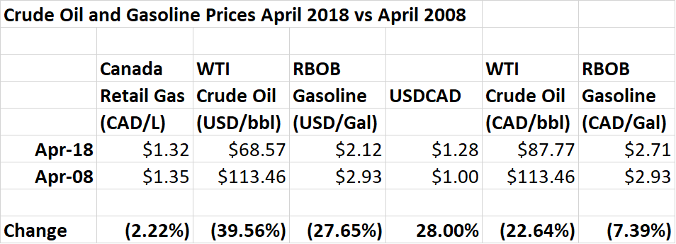
The table shows that the growing sense that gasoline prices have increased dramatically relative to crude oil prices are correct. The Canadian retail gas price is nearly back to where it was 10 years ago, now down only 3 cents per litre or only 2.2%, while the crude oil price is still down nearly 40%.
Exchange rates are to blame for much of this difference. Crude oil is priced in US Dollars, while the Canadian retail gas price is in Canadian Dollars. Over the last ten years, the US Dollar has increased 28% relative to the Canadian Dollar, increasing gasoline prices in Canadian Dollars.
Commodity and currency price moves don’t completely explain the higher gasoline price. The first column shows the Canadian retail gas price down 2.2% from 10 years ago, while the last column shows the US RBOB gasoline price converted to Canadian Dollars is down 7.4% from April 2008. This difference is likely due to increases in Canadian taxes, particularly related to carbon pricing.
On both sides of the border, there has been an increase in gasoline prices relative to crude oil prices over the last decade. In the US, WTI is down 39.5% while gasoline is down only 27.6%, while the Canadian Dollar equivalents of WTI and RBOB are down 22.6% and 7.4% respectively. What this means is that margins for refiners who buy crude oil and sell refined products like gasoline (aka the Crack Spread), have increased dramatically. It comes then as no surprise that the resurgence of Energy stocks over the last couple of months has been led by companies with midstream assets, the Integrated Oils and Refiners. It’s also not a surprise that refiners have become takeover targets. Earlier this week, Marathon Petroleum (MPC) agreed to purchase Andeavor (ANDV) in a $23.3B deal to create the largest independent US refiner.
Bottom Line: Relative to the price of crude oil, gasoline prices are a LOT higher than they were a decade ago. Most of this increase is due to the Canadian Dollar falling and carbon taxes increasing. Big Oil appears to be getting its piece of the action too, but not as much as you might think.
Monthly Sector Scopes Update
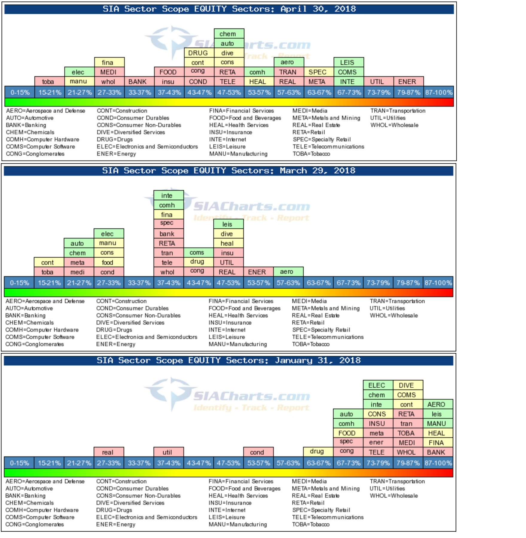
The SIA Sector Scopes charts available in the Markets section of the SIA Charts site provide significant insights into capital flows within stock markets both in terms of overall market sentiment and which groups are outperforming or underperforming others. These charts compare the Bullish Percent (percentage of stocks in a group on bullish technical signals) for 31 North American industry groups.
Looking first at overall markets. Recall that by the end of January (bottom chart), at the end of a year-long bull market and just before the big market corrections started, most groups were clustered at the right-hand side of the page (high bullish percent) suggesting that the market was becoming overbought.
Following several selloffs over a two-month period, the middle chart shows that the majority of groups had moved over to the left-hand side, indicating that overbought conditions had eased and that the market, or at least some groups, may even have become slightly oversold.
Having swung toward the two extremes over the winter, stock markets appear to have finally normalized as they bounced back in April. The top chart shows the distribution of groups across the Bullish Percent spectrum is quite broad with the largest numbers clustered near the middle and a very small number of groups at bullish or bearish extremes.
A look at the performance of individual groups shows that leadership has changed significantly over the last month. At the end of March, Aerospace and Defense had been the strongest group but as it held steady through April, other groups passed it. In particular, Energy stocks have turned upward in recent weeks, along with Communications, Internet and Leisure.
There also has been a reshuffling among interest-sensitive groups. Utilities have also been bouncing back, but this could be a trading reversal from being depressed in January. Banks and Financial Services, on the other hand, which were very strong and seemed to be defying gravity back in January, have been sinking toward the bottom (left side) as rising interest rates catch up to the group.
SIACharts.com specifically represents that it does not give investment advice or advocate the purchase or sale of any security or investment. None of the information contained in this website or document constitutes an offer to sell or the solicitation of an offer to buy any security or other investment or an offer to provide investment services of any kind. Neither SIACharts.com (FundCharts Inc.) nor its third party content providers shall be liable for any errors, inaccuracies or delays in content, or for any actions taken in reliance thereon.
For a more in-depth analysis on the relative strength of the equity markets, bonds, commodities, currencies, etc. or for more information on SIACharts.com, you can contact our sales and customer support at 1-877-668-1332 or at siateam@siacharts.com.
Copyright © SIACharts.com