by Bryce Coward, CFA, Knowledge Leaders Capital
As our readers ponder the implications of trade wars and the possibility for moderately higher inflation – a circular loop if we ever did see one – we thought we’d evaluate the market’s behavior to see what kind of clues it’s giving us about its health. Before we begin, however, let’s remember that the market testing its February low is a completely normal, if not predictable, outcome of a correction, as we highlighted here and here. And the timing of this test, the length of time that has passes between the original low and the test, fits with the historical precedent nearly perfectly. Therefore, we need to be careful to not read too much into this recent bout of weakness unless or until indicators of market health tell us we are dealing with something more sinister.
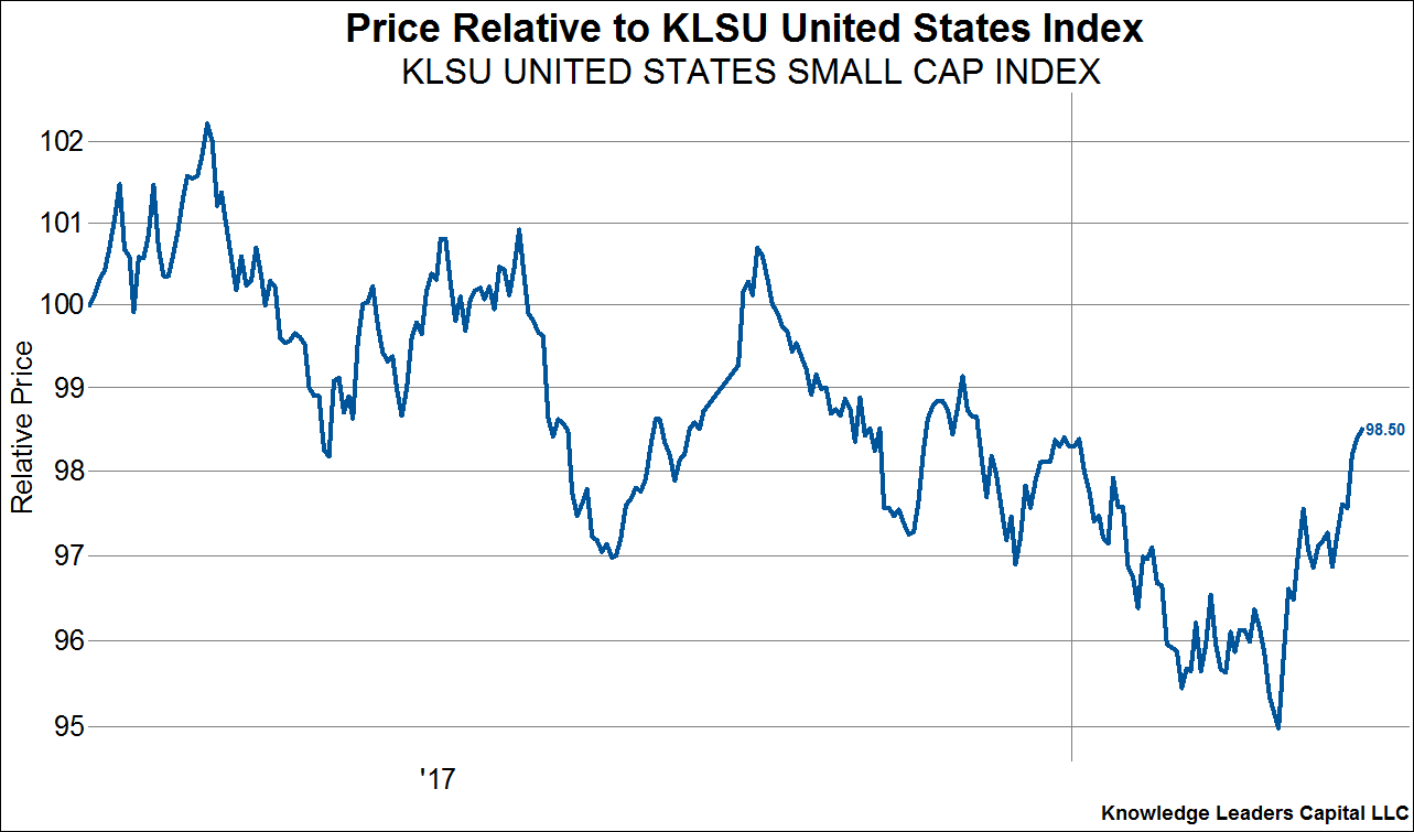
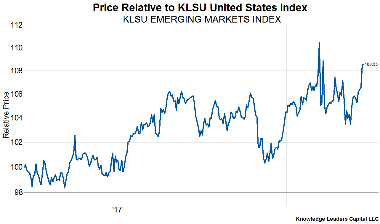
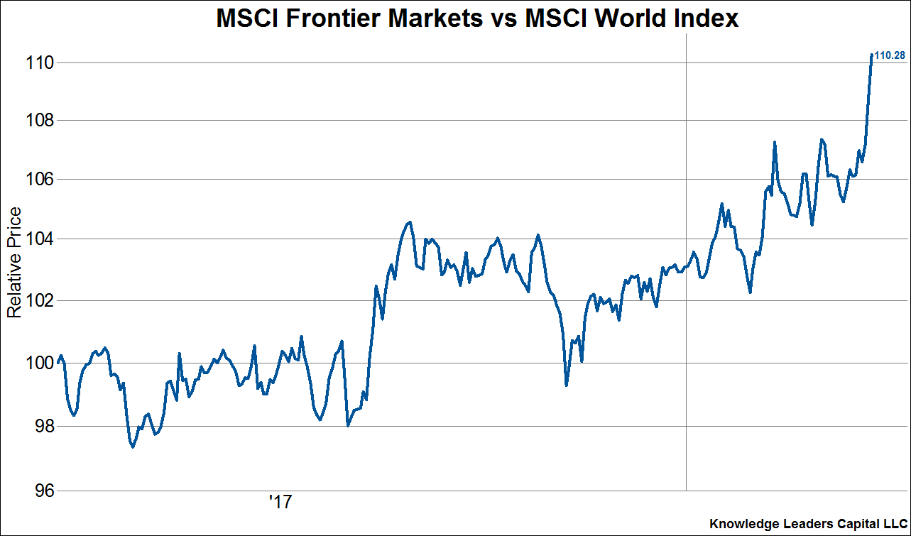
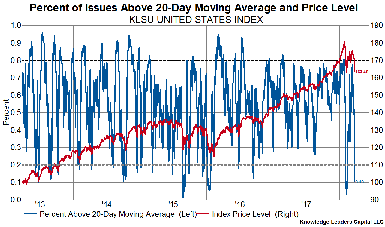
First off, the good. Not everything in equity land is painting a doomsday picture. Indeed, liquidity sensitive small cap stocks, emerging market stocks, and frontier market stocks are all outperforming United States equities and developed world equities more generally. This is a strong indication that 1) either panic selling has not set in yet, or 2) the overall health of the market is not that bad. Furthermore, stocks are deeply oversold on a short-term basis as measured by the percent of issues above their own 20-day moving average, as shown in the 4th chart below. When stocks get this oversold, they tend to rally at least a bit.
Now the bad. Even though stocks are short-term oversold, they are nowhere near being long-term oversold. At each of the good lows since 2008 (except for the 2012 low), the percent of stocks above their own 200-day moving average dropped toward 20% or lower. We are currently at 49%.
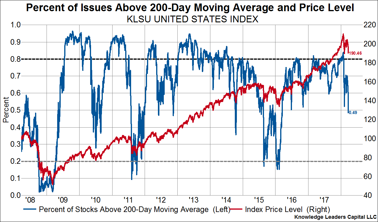
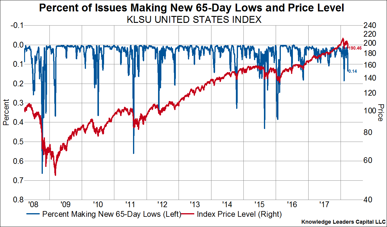
The percent of stocks making new 65-day lows is also muted, at only 14%. Good lows see new 65-day lows above 30%.
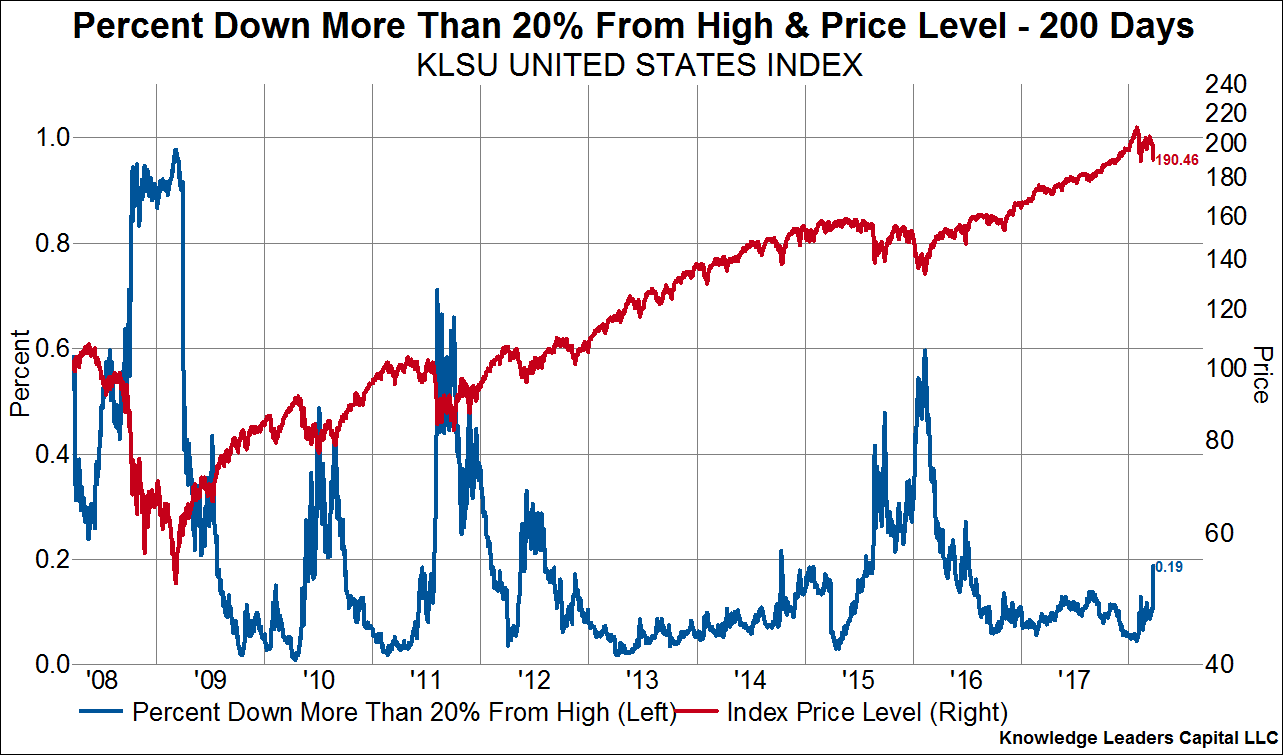
The percent of stocks in a bear market – down more than 20% from their own 200-day high – is only 19%. If stocks are done falling, this would mark, by a long shot, the smallest percent of stocks entering a bear market of any selloff in the last decade.
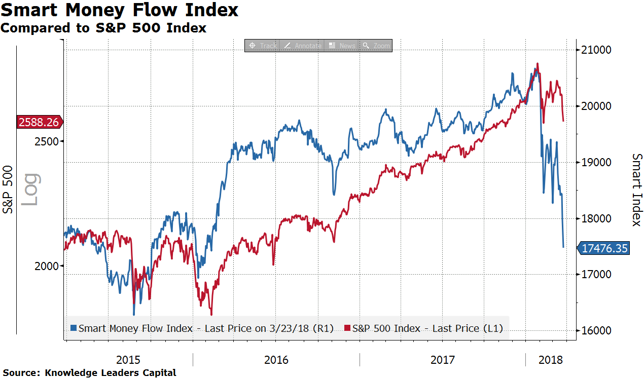
Now for the ugly. The Smart Money Index is intended to track the behavior of professional money managers (the smart money), by comparing market performance during the first hour of trading ,when inexperienced/emotional buying/selling takes place, to market performance during the last hour of trading, when experienced managers make their moves. Stocks have been selling off late in the day recently, which is an indication that professional managers are taking chips off the table. The Smart Money Index is tanking and well below the levels of the February low.
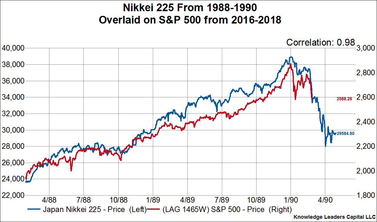
Finally, for the even uglier. The last chart shows the performance of the Nikkei 225 Index from the spring of 1988 through the spring of 1990 (blue line), and then we overlay the most recent two years of performance for the S&P 500 (red line). As we can see, the analog is nearly perfect, with a 98% correlation. If it were to continue, US stocks would stand to loose another 15% from here. Thank you to our friend, Jesse Felder, for the tip on this relationship.
Copyright © Knowledge Leaders Capital


