by Eddy Elfenbein, Crossing Wall Street
Here’s a point I want to stress that’s a bit difficult to explain. In the last year, the financial markets have become increasingly focused on the direction of short-term interest rates.
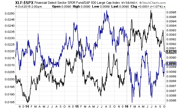
The chart below shows the relative strength of financial stocks (blue) and the relative strength of utilities (black). Notice that the two lines start to move in opposite directions about a year ago. Prior to that, the lines don’t appear to be terribly correlated.
After about the first of this year, the lines really become mirror images. What this means is that the axis of debate in the market has shifted towards short-term rates. If rates go up, that’s good for financials (in a relative sense). If not, that’s good for utilities and other high-yielding stocks.
It’s interesting that as recently as late 2014, the two lines appear to move the same way. Not so for 2016. On the chart above, notice the correlation difference between 2014 and 2016. It’s a changing market.
Copyright © Crossing Wall Street


