Recession Risk Rises
by Lance Roberts, Real Investment Advice
In last weekend’s newsletter, I discussed the rising risk of recession as presented by JP Morgan’s risk model:
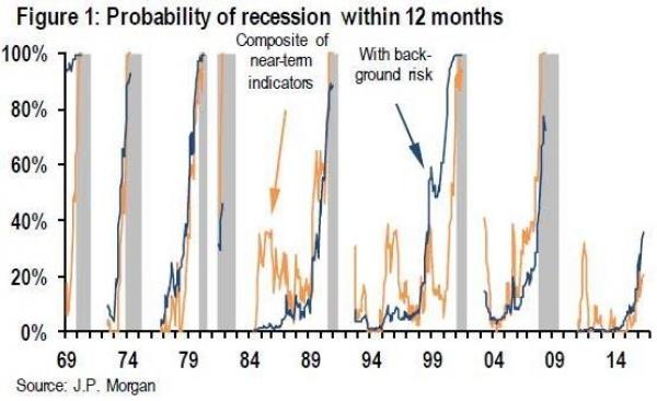
“Following the release of the employment data, and other rather dismal economic data, JP Morgan issued a note (courtesy of ZeroHedge) suggesting the probability of a recession beginning within 12 months has moved from 30% on May 5th, to 36% today.
‘Our preferred macroeconomic indicator of the probability that a recession begins within 12 months has moved up from 30% on May 5 to 34% last week to 36% today (Table 1, bottom row and Figure 1, blue line). This marks the second consecutive week that the tracker has reached a new high for the expansion.'”
But it is not just the employment data that is suggesting the risk of recession in the U.S. has risen markedly in recent months.
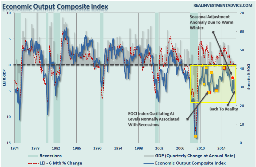
While many of the more mainstream economists were cheering the March and April bumps in the manufacturing data as a sign the manufacturing recession had come to an end, I warned you the extremely warm winter weather had skewed the seasonal adjustments and payback would come.
As shown in the chart below, that payback has now occurred. By comparing the Economic Output Cycle Index (EOCI) to both GDP and the Leading Economic Indicator Index, we see a clearer picture of what is currently happening in the economy. (The EOCI is comprised of the CFNAI, Chicago PMI, LEI, NFIB, ISM, and Fed regional surveys.)
With real economic activity still operating at levels normally associated with recessions, Central Bank interventions have been successful at dragging forward future consumption. Unfortunately, when you “drag forward” future consumption today, you leave a “void” in the future that must be filled. Eventually, you reach the point where that future “void” can not be filled.
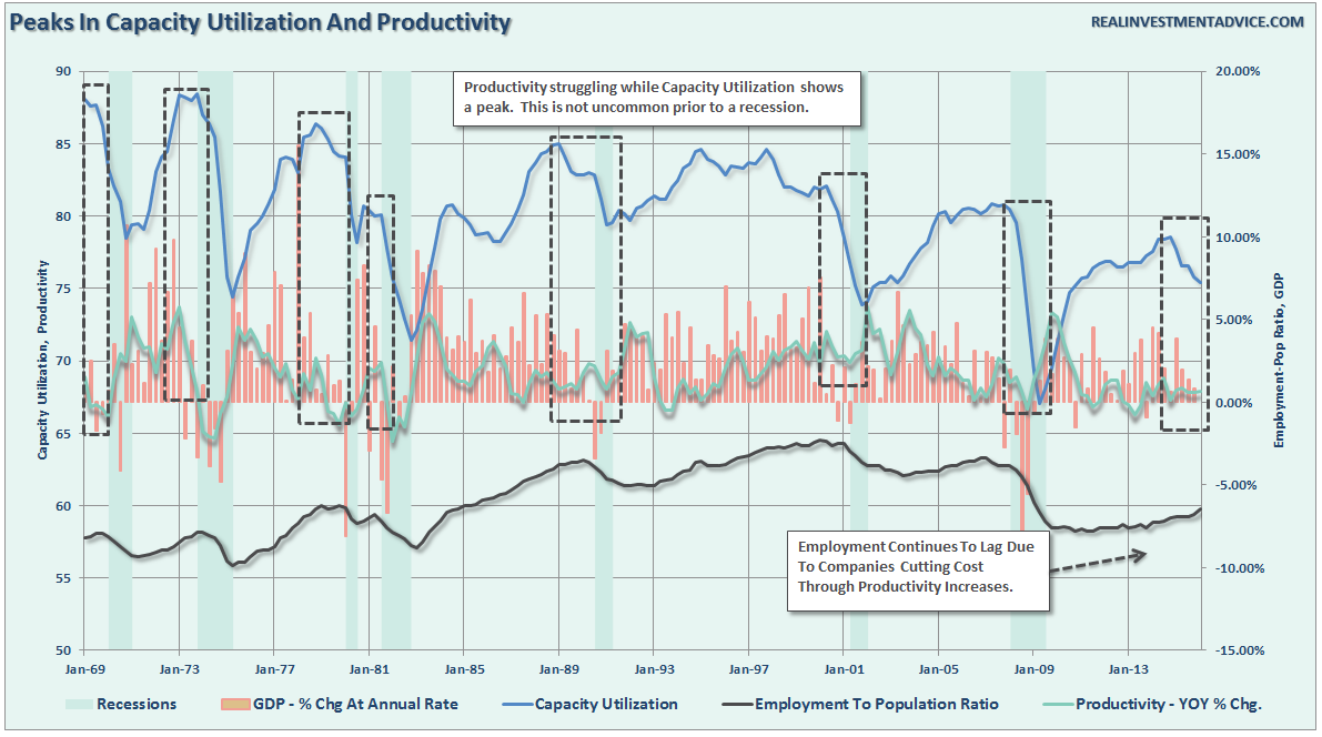
It is at that point that recessions will eventually take hold. One of the clearest warning signs of that inevitability can be found in the productivity and capacity utilization reports. As shown below, the downturn in capacity utilization rates and weak productivity growth have historically only been witnessed during recessionary periods.
“But we clearly aren’t in a recession.”
True, but that is only because we have not yet gotten the annual revisions to the economic data. Given the weakness in profits and revenues, a reflection of real economic activity, those revisions will likely be negative.
GDP Nowcasts: NY vs. Atlanta
My friend and proud new father, Salil Mehta recently penned an interesting piece of analysis comparing the competing GDP NowCast measures of the New York and Atlanta Federal Reserve branches. To wit:
“As it turns out, the public benefits from seeing probability and uncertainty in action, as these two competing measures provide (sometimes uncontrollably) differing signals throughout a quarterly cycle. The New York statistical product is more nascent (only 8 irregular readings so far), but already we have some initial empirical insights into these products precision when the markets use them jointly.
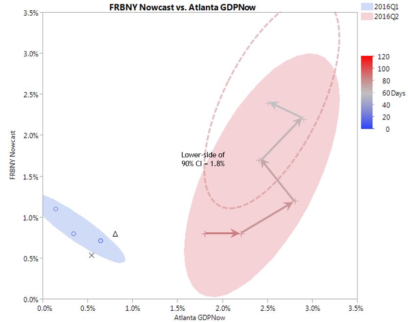
With just one of the bank’s current Q2 GDP nowcasts, we would have expected the 90% confidence interval of the relatively buoyant 2.45% nowcast to extend on the low-side to 1.0%. However when we combine the insights from both banks’ nowcasts (here 57 days prior to report release), this 90% confidence interval only extends on the low-side to 1.8%. This low-side on the confidence would have been even lower at 1.5%, if both nowcasts were perfectly identical, correlated random variables! Which they are not. At some point still, the accuracy of the unconventional analytical approach of these nowcasts will produce an error larger than would be expected generally between the advance estimate, and the “final” annual revision. And the Federal Reserve themselves do not consider the nowcasts to be by themselves a superior model most of the time.”
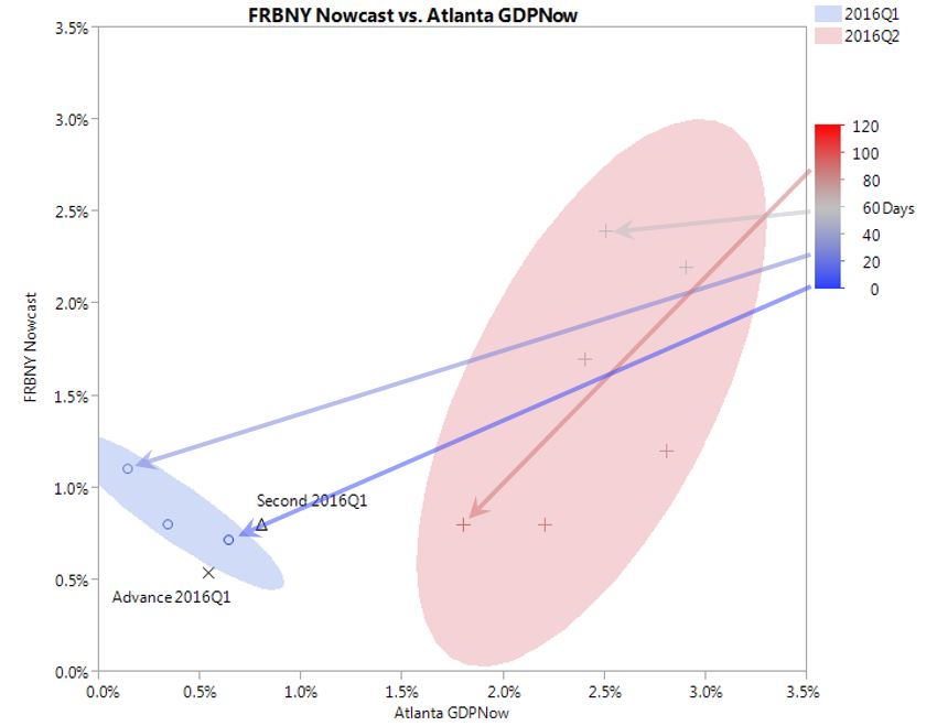
To start, see this graphic below which includes all of the paired nowcasts between the two banks, since April 8 (21 days prior). While Atlanta provides nowcasts daily, in the blue shaded region we see all 3 nowcasts paired between the two banks for Q1. We notice that the Atlanta nowcast increased through April 29 (0 days prior), while the New York nowcast dropped. Both converged to ~0.7%. This was higher than the 0.5% first (advance) reading shown as an “x“, and lower than the 0.8% preliminary (second) reading shown as a triangle. The typical initial error on the day or the advance GDP release is (given on the link above) a lot worse, at ~0.9%.”
“New York started providing nowcasts for Q2, on April 8 (113 days prior). Atlanta however didn’t join until April 29 (92 days prior). We see this data in the red shaded region, along with the 5 (8-3) later nowcasts from both banks. For April 29, there was a 1.0% difference between the 0.8% New York nowcast and the 1.8% Atlanta nowcast. By the most recent nowcast of June 3 (falling only slightly due to the May labor report disaster of 38k with 59k downward revisions to prior months), we see that both nowcasts are near 2.45%. Over Q2 this time, the New York nowcast has continuously increased. It is worth noting that on this day New York provided a Q3 “nowcast” as well. Doesn’t forecasting Q3, in Q2, violate the definition of a “now”cast? Given that the time to Q2 release is still fairly high at 57 days, the joint-confidence interval tends to still be large (though a little smaller than at 92 days). Given only two quarters of joint nowcasts, it is difficult to gauge the shape of the confidence, yet it should (centered as shown below) around the most recent nowcasts.”
“We can imagine that as we progress, towards the Q2 release date, that the low-side of the 90% confidence would fall more along the New York nowcast versus the Atlanta nowcast. We can see something near 1.8% as this low-side of the growth nowcast, and a risk to market participants who might be expecting a >2% GDP growth. Which would be an achievement we have not had in a year. And nonetheless, the typical revision from these advanced estimates to the final revision (the annual revisions) is more than 1%, implying just focusing on matching to the advance reading is partly a meaningless given that all the Big Data in the world, between two banks, still can’t provide a more accurate read on what is really happening. And in fact even as they tinker and “evolve” the models it is certainly going to lead to a wild miss at some point.“
Long Time Since Last 1% Down Day
Since the bottom of the market in February, the markets have been lofted higher as the “yield chase” continues. However, there are a couple of issues that suggest the risk of a near term correction have risen markedly.
First, while asset prices have risen there has been a negative divergence in both relative strength and volume. Such negative divergences tend not to last long.
Secondly, as noted by Jason Goepfert via Sentiment Trader:
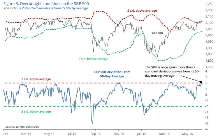
“It’s been a long time since we’ve seen a big down day. Like we discussed on Tuesday, the S&P hasn’t had many large up days during the past several months, but it hasn’t seen a single large down day for two months.
The past few days have been enough to push stocks far above trend. The S&P is now 2-standard deviations above its medium-term 50-day moving average, a signal commonly used as an overbought indication.”
“Like the lack of 1% down days, a push like this so far away from the trend has the potential to be a signal of buying exhaustion, increasing the potential to see a correction that pushes the market back toward its average.”
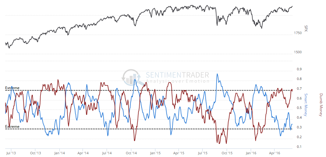
When combined with “dumb money” back at extremes, shown below, the potential for a correction is high particularly given the magnitude of the advance from the February lows. The market currently has many of the markings of a “melt-up phase” in stocks following a rough start to the year as prices have seemingly become detached from “reality.”
I agree with Jason’s conclusion:
“There have been an abnormally large number of disagreements among the indicators and studies we look at. That has reduced any kind of edge in our niche, usually a good sign to reduce exposure and wait for a better setup. It’s hard to ignore some of the bullish factors outlined in reports over the past several months but when many of our indicators have been at an optimistic extreme and there is a wide spread between Smart and Dumb Confidence, it’s risky to add exposure. Bottom line, I’m sitting on my hands and risking a runaway breakout.”
Just some things to think about.
Lance Roberts
Lance Roberts is a Chief Portfolio Strategist/Economist for Clarity Financial. He is also the host of “The Lance Roberts Show” and Chief Editor of the “Real Investment Advice” website and author of “Real Investment Daily” blog and “Real Investment Report“. Follow Lance on Facebook, Twitter, and Linked-In


