


The Callan Periodic Table of Investment Returns
by The Alts Team, Attain Capital
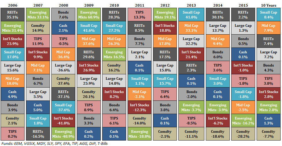
The so called Periodic Table of Investment Returns, or Callan Chart, or Asset Allocation Quilt has been making the rounds lately as the final 2015 numbers become easily accessible. We noticed it most recently on Ben Carlson’s wonderful blog, and the general idea is to stack how asset classes have performed in relation to one another over the past 10 or 15 years, as you can see below.
 (Disclaimer: Past performance is not necessarily indicative of future results)
The idea is to teach you visually about diversification – with the eye hopefully able to see that no one asset class (color) is always at the top of bottom of the rankings. They move up and down in relation to one another, leading to the logic that you should essentially give up trying to pick which one will be best for your portfolio, and just invest a little in all of them. A strategy also known as diversification.
Now, that’s all fine and good – but there are a few issues with it from our standpoint. One, it somewhat confuses the term ‘asset class’, with 5 of the 10 “assets” listed actually just different parts of the equity asset class (small cap, mid cap, large cap, international, and emerging market equities). Second, this chart doesn’t really give a feeling for the magnitude or depth of the performance. For instance, the 4th ranked asset class in 2008 (Mid Cap) was down -36%, while the 4th ranked in 2009 (REITs) was up 29%, despite their appearing equal in the rankings. Finally, it’s missing some important asset classes, such as alternative investments – mainly hedge funds and managed futures.
So, we fixed it, adding managed futures and hedge funds, while attempting to display the magnitude of the performance in a better way. We also just updated the numbers we used the last time we took a look at this, which differ some from Ben Carlson’s source data, but not much.

Large Cap = S&P 500
Small Cap = Russell 2000
Intl Stocks = MSCI EAFE
Emerging Markets = MSCI Emerging Markets
REIT = FTSE NAREIT All Equity Index
HG Bond = Barclay’s U.S. Aggregate Bond Index
HY Bond =BoAML US High Yield Master II
Cash= 3 Month T Bill Rate
Managed Futures = SG CTA Index
AA = Asset Allocation Portfolio
(15% Large Cap, 15% Intl Stocks, 10% Small Cap, 10% Emerging Markets, 10% REIT, 40% HG Bond)
But if you’re more of a traditionalist – here’s the classic ‘periodic table’ look with managed futures and hedge funds added in:
 (Disclaimer: Past performance is not necessarily indicative of future results)
Enjoy!
Copyright © Attain Capital