Corporate profits are impressive, but valuations are merely average

Corporate profits are impressive, but valuations are merely average

by Scott Grannis

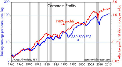
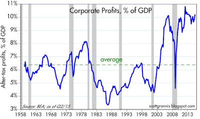
With last week's release of revised GDP statistics for Q3/15, we learned that after-tax corporate profits in the 3rd quarter were down 3.2% from the second quarter, but were up 1.4% from year-ago levels. The growth in profits has slowed significantly in recent years, but profits were still 9.9% of nominal GDP last quarter, just shy of their all-time high of 10.8%, which was set three and a half years ago. To put that in perspective, consider that after-tax corporate profits have averaged about 6.5% of nominal GDP since 1959, and as recently as 11 years ago, profits had never exceeded 8% of GDP.

At a time when corporate profits have been unusually strong relative to nominal GDP, it is worth noting that investors' valuation of those profits (i.e., how much they are willing to pay per dollar of profits) is only about average, according to a variety of measures detailed below. Current valuations thus appear to incorporate a substantial amount of skepticism about future profits. Put another way, there is no evidence here that equity valuations are in "bubble" territory. Instead, and as I've been noting for years now, it would appear that the market is priced to the expectation that corporate profits will sooner or later regress to their long-term mean—which would in turn imply years of no growth or declining profits. But as I've also noted, that may be an overly pessimistic view, given that corporate profits today are about average when compared to global GDP.
valuations are merely average
The chart above shows two versions of after-tax corporate profits: one, a comprehensive measure compiled by the National Income and Product Accounts (aka the GDP stats), and the other the earnings per share of the S&P 500 companies. Both are close to all-time highs, and both have increased by roughly the same order of magnitude over the past 5-6 decades. Both show relatively slow growth of late. There are some important differences between the two which I discuss in detail here, but by and large they are telling the same story.
 
The chart above compares the NIPA measure of after-tax corporate profits to nominal GDP. This has averaged about 6.5% since the 1950s, but for the past several years it has been significantly higher. Is this series mean-reverting? That is the question investors have been asking themselves for years. Many worry that it is.
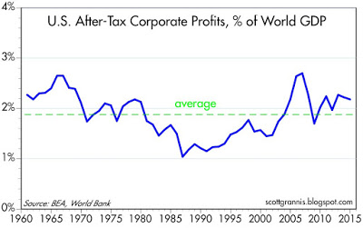
I've been arguing for years that corporate profits relative to GDP are not necessarily going to revert to their historical mean of 6.5% because of globalization. Major U.S. companies now earn a substantial portion of their profits overseas, and overseas markets have grown much faster than than the U.S. market (think China and India). When profits are measured relative to global GDP (see chart above) they are only slightly above their long-term average.
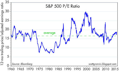
One traditional measure of valuation is the ratio of equity prices to earnings, shown in the chart above. Here we see that current PE ratios of 18.6 (according to Bloomberg) are only moderately above their long-term average of 16.7. Valuations today aren't even close to what they were in 2000, when we now know stocks were in "bubble" territory.
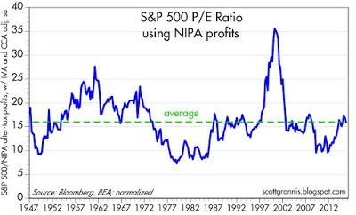
The chart above is my version of PE ratios: it uses the S&P 500 index as a proxy for the price of all companies, and it uses the NIPA measure of after-tax profits as the "E." I've normalized the series so that its long-term average is similar to the standard PE measure shown in the previous chart. Here again we see that valuations today are about average.
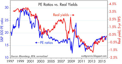
While on the subject of PE ratios, the chart above compares PE ratios to the real yield on 5-year TIPS, which in turn is arguably a good proxy for the market's sense of the real growth potential of the U.S. economy. With the exception of the 2004-2008 period, these two series display a remarkable correlation, which I think makes sense. (That period might be explained by noting that the Fed was too aggressive in tightening monetary policy—pushing real rates artificially high—and that contributed to the crisis of 2008.)
When real yields on TIPS were around 4% in the late 1990s,the U.S. economy was booming and investors expected the good times to continue to roll. That expectation was fully embedded in PE ratios, which were unusually high. Investors were so confident that economic growth and profits would be strong that they were willing to pay a huge price for those profits. Since then, growth expectations and real yields have declined and, not surprisingly, PE ratios are much lower. The market is not very enthusiastic about the prospects for growth and profits, and that's why equity valuations today are merely average. It's a cautious market, not an irrationally-exuberant market. But on the margin, real yields and PE ratios have been moving higher; the market is becoming less risk averse as confidence slowly returns.


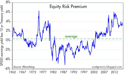
Caution is also reflected in the chart above, which shows the difference between the earnings yield on stocks (the inverse of PE ratios) and the yield on 10-yr Treasuries. In order to satisfy investors' aversion to risk, the market demands a yield on stocks that is about 4% higher than the yield on safe Treasuries. Today's equity risk premium is substantially higher than its long-term average.

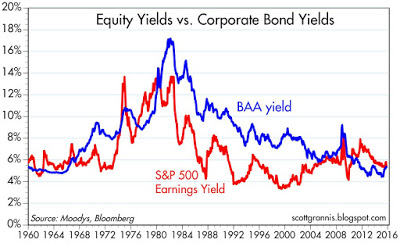
The chart above compares the earnings yield on stocks with the yield on BAA corporate bonds (a proxy for the typical large company that issues bonds). Finance theory would say that in "normal" times the yield on a company's bonds should be higher than the yield on its equity. That's because the potential return to owning corporate bonds is limited to their coupon, whereas the potential return to owning stock is theoretically unlimited, since earnings can grow significantly over time. Investors should be willing to pay a higher price for the stock (and consequently accept a lower yield) than for a bond of the same company. Today bond yields and earnings yields are about the same. For the same price as a bond, equity investors get much more upside potential; that in turn implies that equity investors don't see much upside potential—if any—to corporate earnings.
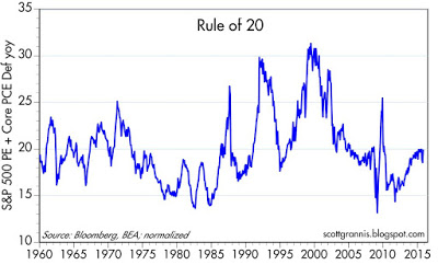
The chart above illustrates one simple rule of thumb which attempts to reveal whether stocks are over- or under-valued, or just about right. The Rule of 20 says that the stock market is fairly valued when the sum of the average price-earnings ratio and the rate of inflation is equal to 20. Above that level, stocks begin to get expensive; below it, they’re bargains. In the chart I've added together the EPS of the S&P 500 and the year over year rate of inflation according to the core PCE deflator, the Fed's preferred measure of inflation. The sum today is just about exactly 20 (18.6 + 1.3), which puts equity valuation squarely in "average" territory.
To summarize: if there is a common theme to the charts and discussion above, it's that stocks are not obviously over-priced or under-priced. Valuations are likely in the range of what a conservative investor might call "reasonable."
Copyright © Scott Grannis
Total
0
Shares
Previous Article

VISA INC (V) NYSE - Dec 02, 2015

Next Article

Asset Class Performance Review – November 2015

Related Posts
Subscribe to AdvisorAnalyst.com notifications
Watch. Listen. Read. Raise your average.