by Scott Grannis, Calafia Beach Pundit
Here are a dozen interesting charts that I've been following rather closely of late, in no particular order.
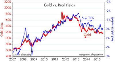
I've been featuring this chart on and off for the past several years. I find it fascinating that the prices of gold and 5-yr TIPS should be so well correlated for so long. (I'm using the inverse of the real yield on TIPS as a proxy for their price.) Both of these are what you might call "safe" assets: gold is a classic refuge from nasty things (e.g., inflation, currency debasement, geopolitical risks), and TIPS are not only default free but give you protection against inflation in addition to paying some interest (which gold doesn't). Both of their prices peaked around the time that the PIIGS crisis peaked—a time when the world was very afraid of another global financial market collapse. They have been falling for several years now, but both are still quite elevated from an historical perspective. I think this means that while the world's demand for safety has declined—and confidence is returning—investors are still concerned about things going wrong: e.g., China collapsing, the mid-East exploding, Russia advancing, a Grexit, and/or a breakup of the euro.
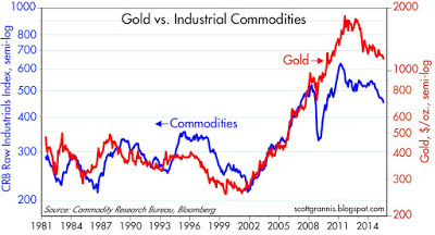
Not surprisingly, gold and commodity prices have been highly correlated for many years. Gold prices are a lot more volatile than commodity prices, however, as illustrated by the difference in scale of the y-axes: the gold axis is almost twice the range of the commodity axis. Both have been declining for the past several years, but both are still quite elevated relative to where they were in 2001. Commodities to some extent are an investment, like gold, that can protect against long-term inflation risks. So it makes sense that as inflation fears have eased, so have gold and commodity prices. But commodities also reflect the confluence of global growth dynamics and commodity supplies. Supplies surged in the wake of the huge surge in commodity prices in the early 2000s, and that, combined with a big global recession and weaker growth in Asian economies, has contributed to declining prices. But so far, nothing speaks to a collapse, serious weakness, or even deflation.
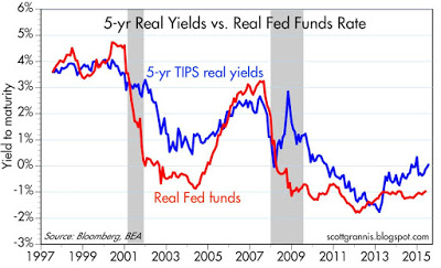
The real yield on 5-yr TIPS has a lot to do with where the market thinks actual real yields on short-term interest rates will be in the future. That's important, because it's the inflation-adjusted Fed funds rate that is the Fed's true policy tool, not the nominal funds rate. The real yield on 5-yr TIPS has been increasing for the past few years, a sure sign that the market is coming around to believe that the Fed will be raising rates (both in nominal and real terms) in coming years. The market will not be surprised or disappointed when the FOMC decides in coming months to raise the interest rate it pays on reserves. The only thing that could move the market at this point would be future hikes in interest rates that are more and faster than expected, or less and slower. Currently, the market is priced to a Fed funds rate of 1.25-1.50% in two years, according to Fed funds futures.
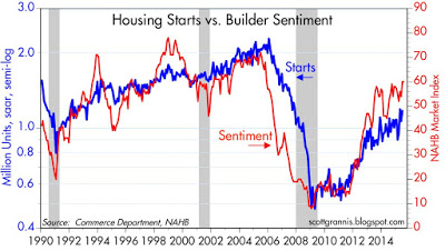
The housing market continues to show signs of strength. The index of homebuilders' sentiment suggests that housing starts are likely to increase over the next year or so. However, the index is still relatively low compared to where it was during the housing heydays. No sign of excessive optimism here. If anything, the chart above reflects housing starts that are going to be quite anemic relative to historic experience.
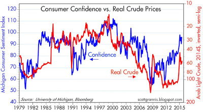
The above chart suggests that this year's big decline in oil prices (red line) has been a significant factor boosting consumer confidence. Confidence is still below its prior highs, however, and oil prices aren't exactly cheap at current levels.
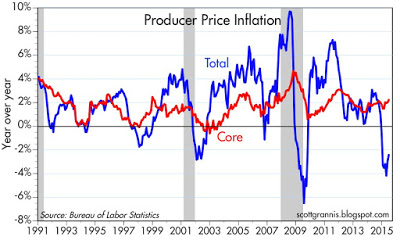
Oil prices have had a significant impact on inflation in the past decade or so, as the chart above shows. However, abstracting from food and energy prices (i.e., looking at "core" inflation), we see that inflation at the producer level is running at a solid 2%. No sign of deflation here. If anything, core inflation is somewhat higher now than it was in the 1990s.
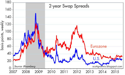
Swap spreads are a very important leading and coincident indicator of systemic risk. At current levels swap spreads are signaling that there is nothing wrong or threatening in the financial markets or in the economy. Liquidity is abundant, and risk aversion is more or less normal. Markets may get nervous from time to time, but as long as swap spreads are relatively low then nerves are unlikely to result in a weaker economy, and risk assets will continue to offer yields that are attractive relative to cash.
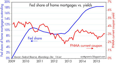
As the above charts show, the Fed holds about 18-20% of marketable Treasuries and outstanding mortgages. It's highly noteworthy that there does not appear to be any consistent correlation between the size of the Fed's holdings of these securities and the yield on those securities. This reinforces my belief that Quantitative Easing was never meant to be an attempt by the Fed to artificially depress bond yields. QE was all about swapping bank reserves for notes and bonds in an effort to satisfy the world's demand for safe, short-term securities; in other words, to accommodate the world's huge demand for money.
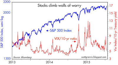
The ratio of the Vix index (the implied volatility of equity options) to the 10-yr Treasury yield is a good proxy, I believe, for the market's fears, uncertainty, and doubt. There's been a lot of that, off and on, in recent years, and each bout of FUD has seen an equal and opposite reaction in stock prices. Once fears recede, stock prices go back to their slowly rising trend. When the market is continually climbs "walls of worry" that is healthy, since it means the market is still fundamentally cautious and not overly exuberant.
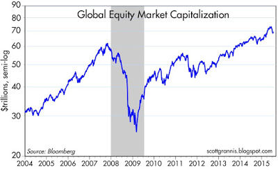
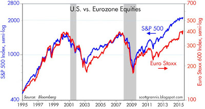
Global stock markets have been in rally mode for over six years, but prices today are not significantly higher than they were in 2000. In real terms, the S&P 500 is only about 2% higher today than it was at its 2000 peak.
The magnitude of the destruction of wealth that occurred from 2007 through early 2009 (in dollar terms, global equity values fell by almost 60% from their 2007 high to their 2009 low—a staggering loss of $37 trillion) is still very much in investors' minds these days. Once burned, twice shy, goes the saying, and that massive loss goes a long way to explaining why markets today are still somewhat cautious.
Copyright © Scott Grannis, Calafia Beach Pundit


