


For this week's SIA Equity Leaders Weekly, we are going to discuss two key features of Point & Figure Charts (PnF) that make them unique among all other charting systems. And since PnF Charts are the engine that drives our Relative Strength Analysis, it is important to understand why we use them. Simply put, PnF Charts look at the most important relationship in investing which is the supply and demand relationship of any holding. This is crucial to understand because supply and demand is the only factor that has a "direct correlation" to price action and PnF Charts are the best format to get an "uncontaminated" perspective of supply and demand.
Unique Asymmetric Filter on Price Action
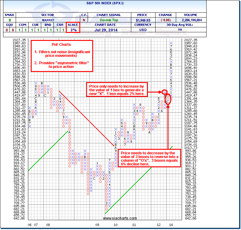
PnF Charts are completely unique versus all other charting systems because not only does it filter out insignificant price movements or “noise” from the market, but it also provides a unique “asymmetric filter” in terms of the direction of the price action. For example, 3-box reversal charts apply a 1-box filter in the direction of the current column or trend, but a 3-box filter against the direction of the current column or trend. If the current column is a column of Xs, the price only needs to increase by the value of one box to generate a new X, but must fall by the value of three boxes in order to generate a change of column to Os. So, 3-box P&F charts are giving more emphasis to the current trend defined by the latest column of X’s (uptrend) or O’s (downtrend), and ignoring any “minor” reactions against that trend which are less than 3 boxes. This is a completely unique feature to P&F Charts. All other price-filtering systems are symmetrical, taking no account of the prevailing trend when assessing the price filter. So how do you “let your winners ride and cut your losses short”? You use an “asymmetric price-filtering system” that assigns greater weighting to the prevailing trend and only plots reversals against the trend that are more significant.
Click on Image to Enlarge
Point & Figure Comparison Charts
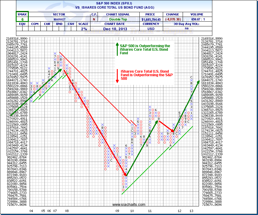
Point & Figure comparison charts are the foundation of Relative Strength analysis at SIACharts and are used to compare asset classes, sectors, and investments against each other to see who the relative winner is. A comparison chart is calculated by comparing one investment’s price data versus other investments. The investment in the numerator of the comparison is the primary investment for the chart and if the relative price comparison is in favor of the numerator, the chart will have an upward trend. If the chart has a downward trend, the comparison favors the investment in the denominator. An “X” in the comparison will represent when the numerator is winning the relative battle against the denominator and an “O” represents when the numerator is losing the relative battle. When looking at a comparison chart, the SMAX score can be found in the top left hand corner and if it shows a green score, in this example a 6, the numerator SPX.I is winning the current comparison. If it shows a red score, it would mean that the denominator AGG is winning the current comparison. A score of 5 means the current comparison is in a tie, and we would want to analyze the overall trend shown below with the green or red arrows for more information on who is winning the comparative battle. The benefit of doing this analysis is you can take a longer term perspective of the movement and you can see (in this example) the relative strength trends of U.S. Equities vs. U.S. Bonds over time which usually stay in a trend for multiple years. From 2003-2007, equities were favored, between 2008 and half of 2009 bonds were favored, and since the middle of 2009 to present equities became favored again with a brief exception in the fourth quarter of 2011. The power of the system is not limited to just doing this analysis between 2 investments, but is able to do this between hundreds and thousands of investments at the same time. The relative strength matrices and reports on SIACharts are processing millions upon millions of PnF comparison charts every night to determine the relative strength rankings and which investments provide the best opportunity moving forward with the lowest risk. With the advancement of technology SIACharts is utilizing the power of Relative Strength analysis in a way the industry never could before!
Click on Image to Enlarge
SIACharts.com specifically represents that it does not give investment advice or advocate the purchase or sale of any security or investment. None of the information contained in this website or document constitutes an offer to sell or the solicitation of an offer to buy any security or other investment or an offer to provide investment services of any kind. Neither SIACharts.com (FundCharts Inc.) nor its third party content providers shall be liable for any errors, inaccuracies or delays in content, or for any actions taken in reliance thereon.
For a more in-depth study of Point & Figure Charts, please refer to the PDF titled "SIA Point and Figure Education" within the "Education" tab on our site. Additionally, you can call or email us at 1-877-668-1332 or siateam@siacharts.com.
Copyright © SIACharts.com