


by Adam Butler, GestaltU
Fundamental Rule #1:
For most investors, financial risk is singularly defined as the probability of not reaching financial goals. As such, the sole objective of investing is to minimize this risk.
If you are an average investor with a typically basic understanding of investing, Rule #1 above will probably make perfect sense. However, if you are a financial professional, you will probably have to read the statement a few times before it becomes clear.
Here’s why: from the moment you enter into the field of finance, you are taught to think of risk in terms of volatility. But in the context of Rule 1, it is impossible to quantify risk in this way. That’s because financial goals are usually framed in terms of target wealth, and wealth outcomes are a function of both volatility and expected returns. As such, risk is the range of wealth outcomes that might be expected at the investment horizon. (Note that, from a financial standpoint wealth and portfolio income are inextricably linked – maximizing one will necessarily maximize the other – so we will focus on wealth. Note also that the sequence of returns matters too, but we won’t address that here.)
Investors will therefore prefer portfolios that provide for the highest expected return, in excess of their minimum required return, under adverse assumptions, and that match their tolerance for failure. Conservative investors may wish to invest in the portfolio that provides the highest expected return above their minimum required return of 3% for example, under the 5% least favourable conditions. More adventurous investors might tolerate a 25% chance that terminal wealth falls below their target. Only investors with lottery-like preferences will choose portfolios based on the best outcomes under the most favourable conditions.
Note that this is further complicated by the fact that investors’ time horizons are, in practice, just a small fraction of their true financial time horizons. For example, a 50 year old investor may have a life expectancy of another 35 years, and wish to leave a legacy amount with a much longer time horizon still. However, data on investor behaviour suggests that this investor is unlikely to stick with a strategy for much longer than 4 or 5 years. Figure 1. from Dalbar’s 2014 Quantitative Analysis of Investor Behaviour report, shows that investors in stock and bond mutual funds tend to stick with their strategy for about 3 years, while diversified investors (‘asset allocation’) have historically held on for almost 5 years.
Figure 1. Average Mutual Fund Retention Rates (1995 – 2014)
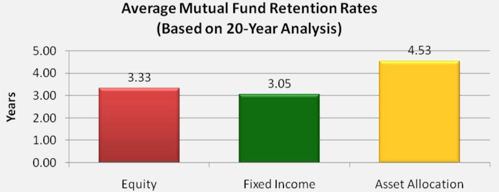 Source: Dalbar
From a modelling and planning perspective, there is little value in setting investor portfolio preferences for a 35 year time horizon if they are going to change their portfolio every 5 years or less. Rather, the objective should be to recommend a portfolio that the investor is likely to stick with through thick or thin, but also where the investor is likely to come to the least amount of harm if he or she abandons the strategy after experiencing an adverse period.
The fundamental question to answer is this:
- If an investor can tolerate p probability of not reaching target wealth and;
- If an investor’s emotional time horizon before abandoning a strategy under adverse conditions is y years and;
- The investor requires a minimum return of r to reach his wealth target then;
- Which portfolio minimizes the probability that the investor will NOT reach his financial goals
You will note that this question is just a more detailed way to frame Rule #1.
There are complex analytical models that can answer this question with great precision, but most have a subtle but important flaw: they assume portfolio returns are independent and identically distributed, and; they assume returns are normally distributed. It turns out that these assumptions are actually not very impactful, and it would have been relatively easy to solve the problem by applying a multi-period Roy’s Safety First model, or through traditional Monte Carlo analysis. But we thought we’d go the extra mile.
Boostrapping is a simulation method, much like Monte Carlo, which provides a way to generate sample paths for wealth. However, where Monte Carlo analysis generates random returns from the normal distribution, bootstrapping generates sample returns from the empirical distribution described by actual historical observations. For example, when creating a random return path for the S&P 500 through bootstrapping, actual observed historical monthly returns from the S&P 500 are drawn at random, usually with replacement. To create a 5 year sample path, you would draw 60 monthly returns; to create 1000 5-year sample paths you would choose 60 monthly returns 1000 times.
Each 5-year sample path represents an alternative history for the S&P 500. As a result, this process illuminates a fascinating and rarely contemplated reality for investors: they have observed just one of an (almost) infinite number of possible trajectories that the S&P 500 might have taken. While the path we observed evokes the only narrative that we can possibly understand, and seems positively inevitable in hindsight, any one of the alternative paths we created were equally likely ex ante. Only after time has passed, and the actual path has unfolded, can we look back and identify the one line that fits with our experience.
Now let’s look in the other direction – into the future. Remember, before history unfolded, we knew that their was a murky cloud of infinite possibilities for how the S&P 500 could have evolved. We now sit at the beginning of a new timeline that reaches out into the future before us. As such, we look out on the same murky cloud of possibility. Fortunately however, this cloud has structure, and we can quantify this structure in meaningful ways.
Figure 2. is what we call a ‘Quantile Cloud’ for the S&P 500. It is formed by generating 100,000 alternative 5-year paths, randomly drawn from actual monthly total returns including dividend reinvestment observed over the period 1880 – 2014, using bootstrap with replacement. Again, bootstrapping preserves the empirical distribution of realized returns rather than imposing a distribution on the data.
Figure 2. 5-Yr Bootstrap Quantile Cloud for S&P 500

Source: Global Financial Data
Let’s take a minute to get to know the Quantile Cloud. Each barely perceptible microscopic line on the chart (not the multi-colored thicker lines) represents 1 path of 100,000. Where the density of lines is high, near the middle of the cloud, the colour shifts into the pink spectrum. Where there are few observations, near the edges of the cloud, the colour shifts into the blue end of the spectrum. The very densest middle of the cloud, highlighted by the green line, represents the median, or average outcome. The individual thin blue lines which can be distinguished near the very top and very bottom of the cloud are statistically possible, but extremely unlikely. The black line running through the middle of the chart represents the ‘break-even’ line; that is, where the portfolio has returned 0% over the period.
The coloured lines on the chart represent the quantile wealth at each horizon. For example, the red line at the very bottom represents the 5th percentile wealth outcome for the S&P 500 each month. Notice that the red 5th percentile and the orange 10th percentile lines fall below the black line at all periods, which means over 5 years there is at least a 10% chance of seeing your wealth fall below starting wealth when investing in the S&P500. In fact, the pale green 20th percentile line falls below the black line for over 30 months, which means there is a 20% change of seeing your wealth fall below starting wealth over almost 3 years.
There is a summary of quantile geometric returns over the full 5 year period at the top left of the chart. Note that the 5th and 10th percentile growth rates are negative, consistent with what we observed above – negative wealth over all periods. All quantiles at the 20th percentile and above show positive returns. The median growth rate is 8.8%.
Now let’s apply this quantile chart in the context of our Rule #1. Let’s assume an investor has a history of switching strategies or advisors about every 5 years, which represents her true time horizon. Let’s also assume the investor requires 2.5% return to achieve her minimum target wealth, and can tolerate a 10% chance of failure. How appropriate is a 100% investment in the S&P500 in the context of these preference?
Note that the 10th percentile return from our S&P 500 Quantile Cloud is -1.1% over this investor’s time horizon of 5 years. But the investor requires a 90% chance of achieving 2.5% over 5 years to meet her minimum target wealth. Clearly, the S&P 500 portfolio is not a good match for this investor’s preferences.
If an all stock portfolio will not meet this investor’s objectives, let’s consider some other portfolio options. Figures 3-5 present 5-year Quantile Clouds for a U.S. 60/40 balanced portfolio, the Global Market Portfolio[1], and a Global Risk Parity[2] (Equal Risk Contribution ERC) portfolio respectively, all rebalanced quarterly. All data is total return including reinvested dividends and interest, but not accounting for fees, transactions, or taxes. [See notes [1] and [2] at the bottom of this article for a description of these portfolios.]
Figure 3. U.S. Balanced 60/40 S&P 500/US 10-year Treasury Quantile Cloud
 Source: Global Financial Data
Figure 4. Global Market Cap Weighted Portfolio Quantile Cloud
 Source: Global Financial Data
Figure 5. Global Risk Parity (Equal Risk Contribution) Quantile Cloud

Source: Global Financial Data
Let’s see if we can come closer to meeting our investor’s preferences with these alternative portfolios. Recall that we are searching for the portfolio which we expect to achieve at least 2.5% cumulative growth over a 5 year horizon, 90% of the time; that is, at the 10th percentile. First note that the median expected returns for US balanced, Global Market Cap, and Global Risk Parity (ERC) portfolios are 7.6%, 5.7%, and 5.3% respectively. All of these portfolios present median expected returns that are lower than the median return from the all-stock S&P 500 portfolio.
Yet, as we glance down the quantile returns a different story emerges. In fact, at the 10th percentile risk tolerance reflected by our model investor, the expected returns to stocks, balanced, global market cap and global risk parity portfolios are -1.1%, 1.4%, 1.9% and 2.5% respectively. The order of returns is reversed. In fact, despite the fact that the Global ERC portfolio reflects the lowest average return over 5 years, it presents the highest return at the investor’s risk tolerance of 10% chance of failure.
The goals of this exercise were threefold:
- First, reframe the primary investment objective in terms of the risk of not achieving a client’s financial target;
- Provide a visual model for the extreme random nature of returns, and;
- Illustrate how high average expected returns do not necessarily mean an investor is more likely to meet their financial goals over a finite horizon
By framing Rule #1 with Quantile Clouds, we can see how portfolio return and risk interact under a true random process to meet different investor preferences. Obviously there are ways to solve these problems with greater precision, but the intuitive visualization offered by Quantile Clouds may make it easier for clients to understand the risk/return tradeoff, and potential value of global diversification.
Notes
1. The Global Market Cap portfolio is an approximation based on USD Global Financial Data extensions for US equities, EAFE equities (manually assembled by Wouter Keller), emerging market equities, U.S. corporate bonds, 10-year U.S. Treasury bonds, U.S. high-yield bonds, international government bonds, REITs, and TIPs. Returns for the period 1880 to the mid 1920s are from S&P 500 and U.S. Treasuries only. TIPs enter the portfolio in 1973. Weights are contemporary market cap weights and do not reflect changes to portfolio constitution that occurred through time. For illustrative purposes only.
2. The Global ERC portfolio is rebalanced quarterly to Equal Risk Contribution weights for all of the assets described in Note 1. The variance-covariance matrix is formed from rolling 12-month returns.
Copyright © Adam Butler, GestaltU