by Paul Kornfeld, SIACharts.com
Click here to watch a video of this article
How to Navigate through Bear Markets and Ignore Corrections
By SIACharts
It has been said that investing is one of the most challenging and difficult professions in the world! It is difficult because you not only have to master the art and science of investing but you also have to be a master of your own emotions! At the end of the day, the ability to control your emotions is what separates the best from the rest. Having said that, it is also very important to use a system that gives you the best opportunity for success in the markets. In our opinion, the best systems are the ones that help you effectively navigate through the major bull and bear market cycles while at the same time prevent overreactions to common market corrections. This is the most challenging aspect of investing, how to navigate through Bear Markets and ignore corrections.
So let’s examine how our Relative Strength Process helps us to achieve these goals. We will analyze the nature of our Relative Strength Process as it pertains to Bear Markets vs Corrections to provide a deeper understanding of how our process works and why it is still effective in today’s environment.
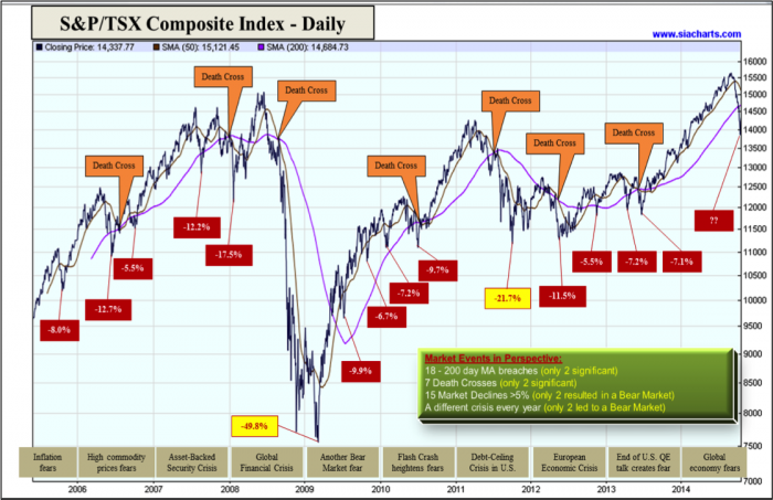
This is a daily chart of the TSX Composite Index going back to mid–2005. If you are thinking that this chart looks busy, you are right! Using the daily chart really shows the shorter term volatility of the TSX clearly and also illustrates how most investors approach the markets, on a short term basis. Many investors are very focused on short term performance and the latest crisis as discussed by the “talking heads”. So we’ve put together a chart that examines the TSX Index from a shorter term perspective. The red boxes show all the market declines greater than 5% over the past 9 years. There were 15 declines of greater than 5% on the TSX. However, of those 15 declines only 2 were significant which led to bear markets in 2008 and 2011. In hindsight we can see these corrections were nothing more than “noise” as the markets resumed its uptrend. However, during each correction it was not uncommon for many investors to get scared and lose their patience with their advisor, their investments, and their systems! They mistakenly believe that successful investing requires the ability to avoid all market downturns. In our view, successful investing is the ability to avoid bear markets while ignoring short term corrections. The purpose of market corrections is to reset sentiment so that the next leg in the uptrend can continue. They are vital to a healthy long term uptrend. The key is to be able to distinguish between corrections and bear markets.
Two popular ways the industry attempts to do this is to use specific technical indicators to give them a sign that a potential bear market is imminent. First, the 200 day moving average is one of the most watched technical indicators of the “talking heads”. It is said to be very bearish when the price falls below this average as it’s supposed to signal significant downside momentum. Over the past 9 years, there were approximately18 instances where the 200 day moving average was breached, only 2 of which were significant and led to a bear market in 2008 and 2011. Second, the “Death Cross” is a very popular technical signal used by many professionals. It occurs when the 50 day moving average crosses below the 200 day moving average. This is supposed to be a sign of significant weakness in the market and is considered very bearish. However, looking at the TSX over the past 9 years, there were 7 death crosses that occurred, yet only 2 led to a bear market, again in 2008 and 2011. These false signals lead to constant whipsaws in and out of the market that over time hurt the performance of your portfolio and result in unnecessary trading. On top of this every correction is accompanied by some “crisis” that grips the market and fans the flames of doubt and confusion causing investors to react emotionally and abandon their investment process. These “crisis news stories” are usually splashed across every financial newspaper and talked about ad nauseam on the financial news networks which serve to escalate everyone’s fears and anxiety. This is the time when investors need an objective perspective on the markets that eliminates the need for subjective analysis, predictions and forecasts and personal opinions! It is a valuable exercise to revisit history to help put short term market volatility in perspective. Here is a list of crisis events that worried the markets every year since 2005:
2005 – Inflation fears
2006 – High commodity prices fears
2007_** – Asset-Backed Security Crisis
2008 – Global Financial Crisis
2008 – Global Financial Crisis
2009 – Fear of the resumption of the 2008 Bear Market
2010 – Flash Crash Crisis
2011 – U.S. Debt-Ceiling Crisis
2012 – European Economic Crisis
2013 – End of U.S. Quantitative Easing talks incites fear in the markets
2014 – Global Economy fears
So with all of the negative news causing market volatility, how does an investor navigate through these market declines and distinguish a correction from a bear market? SIACharts has built a unique proprietary tool called “The Equity Action Call” to assist us with this analysis.
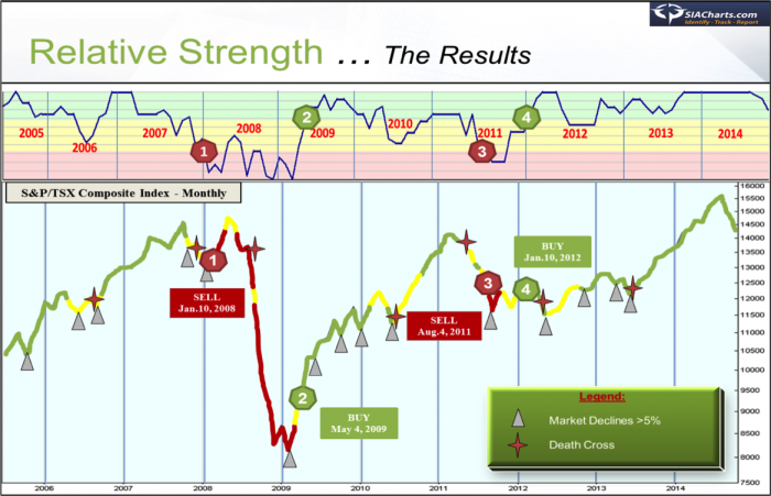
Here is how this Macro Level Analysis works. The top part of this chart shows our indicator that tells us the Relative Strength of the equity markets vs alternative investments. If the blue line is in the Green Zone, we want to be buying equities, if we are in the Yellow Zone we are still buying equities but more cautiously and if we are in the Red Zone we want to sell equities and move to bonds or cash. The bottom part of this chart is the TSX Composite Index and we are showing how our Relative Strength indicator performed during this time period. We have overlaid the colour coding of our Macro Indicator on the TSX Composite Index line to demonstrate the Buy & Sell signals throughout this period.
We were invested in the Equity markets until January 2008 where our Macro Indicator entered the Red Zone and we moved to Cash. The market then experienced a full-fledged bear market dropping 49.80% from peak to trough. We moved back into the Equity markets in May 2009 as our Macro Indicator entered the Green Zone and enabled us to capture the huge rebound over the next 2 years. We moved back into Cash in August 2011 as our Macro Indicator entered the Red Zone again. This was a sharp but brief bear market as the TSX declined 21.7% from peak to trough. We moved back into the Equity markets in January 2012 as our Macro Indicator entered the Green Zone again, after which the markets climbed to new all-time highs. Personal opinions count for nothing in investing, supply and demand will always determine the direction of the markets! The key is to align yourself with the market’s direction and not try to fight against it!
Again, the key to successful investing is to be able to navigate through the major bull and bear market cycles while at the same time ignoring the minor corrections. As you can see, this indicator not only successfully protected investors’ portfolios during the two bear markets of 2008 and 2011 but also managed to stay invested through every market correction over the past 9 years. It didn’t get shaken out of one correction during this time period thereby enabling our investors to stick with their game plan and remain in the markets as they reversed course and began a new uptrend. Market corrections always cause a lot of fear because they are sharp and quick and there’s never a shortage of scary news stories to accompany the decline. This is where the amateur investors get whipsawed out of the markets and buy and sell at the wrong times. This is also where money moves from the “weak hands” to the “strong hands” as the market “shakes out” the emotional, undisciplined players and the professionals swoop in to pick up the pieces. It takes an objective, unbiased, unemotional and highly disciplined investment process to know when to move out of the equity markets into Cash and when to ride out the short term volatility and stick to the game plan. If the markets are entering a decline that is more serious than a correction, we will see the supply/demand relationship of equities vs alternative asset classes shift significantly and our macro indicator will move into the Red Zone. If it’s a normal correction we are experiencing the macro indicator will remain in the Green or Yellow Zones and prevent us from getting shaken out of the equity markets unnecessarily.While no system is perfect, so far The Equity Action Call has achieved its stated objectives! So the next time the markets experience turmoil and short term volatility, remain calm and focus on The Equity Action Call to help you determine your decision to move to Cash or remain invested.
Copyright © Paul Kornfeld, SIACharts.com


