by Cam Hui, Humble Student of the Markets
I haven`t done this in a while, but it would be a good idea to take a financial tour around the equity world to see what Mr. Market is telling us about the current environment. From that, I can explain the market outlook and the risks to the forecast.
For this tour, I thought that I would use point and figure charts instead of the more common open-high-low-close or candlestick charts as point and figure charts take out a lot of the price noise and reveal the underlying trend a lot better.
Upside breakouts everywhere
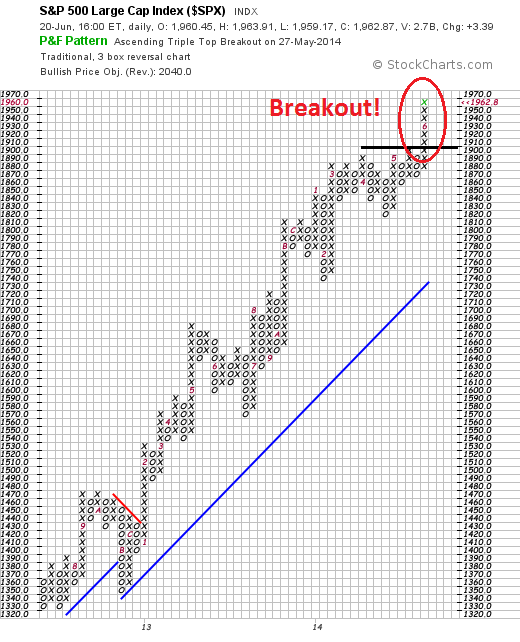
In general, there seems to be upside breakouts everywhere around the world. Let`s start with the United States. As the chart below shows, the SPX has staged an upside break and moved to all-time highs. While other indices, such as the NASDAQ and small cap Russell 2000 have not broken out to new highs, the upside breakout by the SPX remains impressive, though a little extended and may need some consolidation.
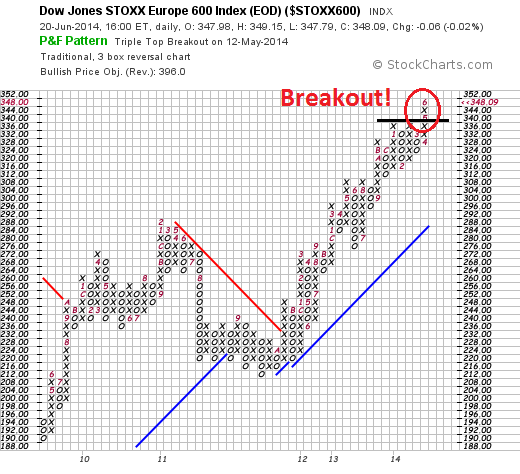
Across the Atlantic, the STOXX 600 displayed a similar pattern of an upside breakout indicating continued strength.
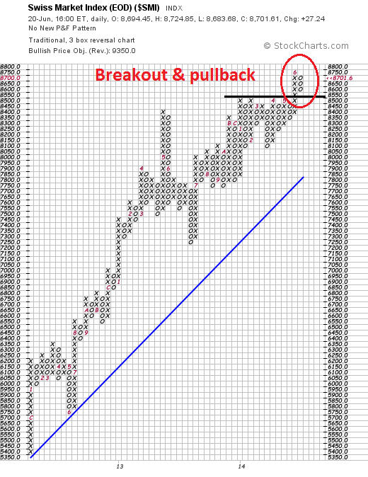
The STOXX 600 represents European equities, but that market is not necessarily monolithic. In particular, these markets are split into eurozone and non-eurozone economies. The latter group consists of countries that can chart a somewhat independent monetary policy, such as Switzerland and the UK, and others that have not adopted the euro but remain under the sway of the ECB, such as Denmark and many of the eastern European countries. Switzerland, the first independent (recall how fiercely the SNB defended the 1.20 exchange rate level), has shown a breakout-pullback pattern, with the Swiss index staging an upside breakout and pulling back to test support near the former breakout level:
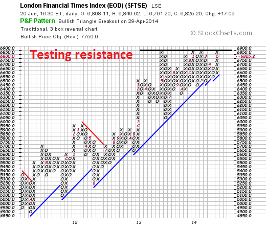
The UK market, as represented by the FTSE 100, is the weakest of the major European markets as it has not staged an upside breakout as it is just testing a long-term resistance level. Despite these minor blemishes, I would score European stocks as being in an uptrend.
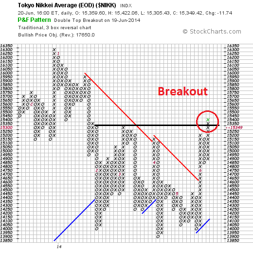
Moving to Asia, the Japanese market has also staged an upside breakout:
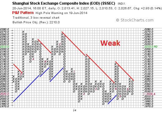
By contrast, the technical pattern of many Chinese related markets are mixed. The Shanghai Composite is one of the weakest bourses globally:
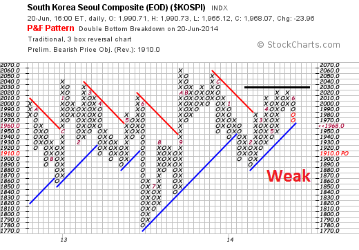
The South Korean KOSPI is showing a similar pattern:
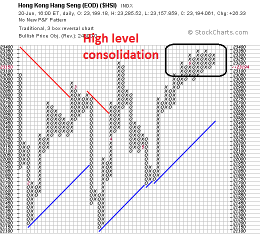
The Hong Kong Hang Seng Index has been the strongest of the Chinese related markets as it seems to be in a high level consolidation. I would note that while these markets are showing more weakness on a relative basis, none of them are showing bearish signs of technical breakdowns.
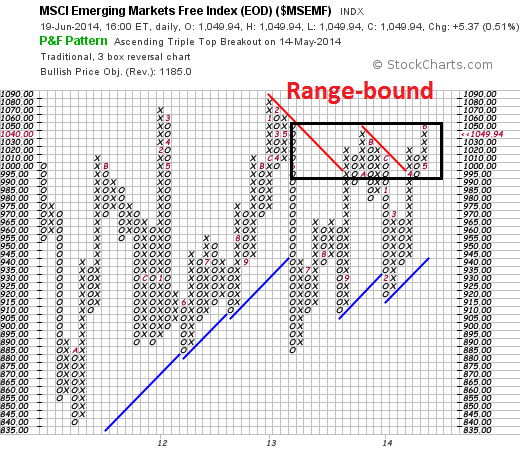
Indeed, the MSCI Emerging Market Index is showing a pattern of range-bound sideways consolidation. From a trend-following point of view, the jury is still out on these stocks.
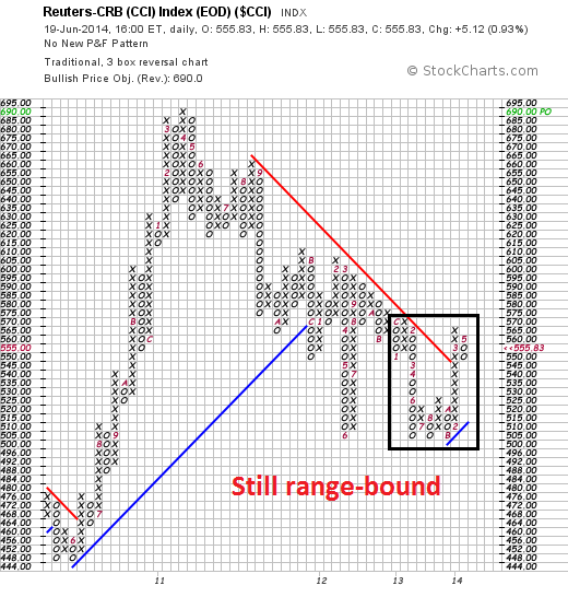
I am somewhat constructive on commodity prices. The CCI Index, which is the equal-weighted CRB Index that I find useful in the current environment to mitigate the geopolitical effects of Iraqi on energy prices, has rallied out of a downtrend and is now consolidating sideways. This is a good-news-bad-news story:
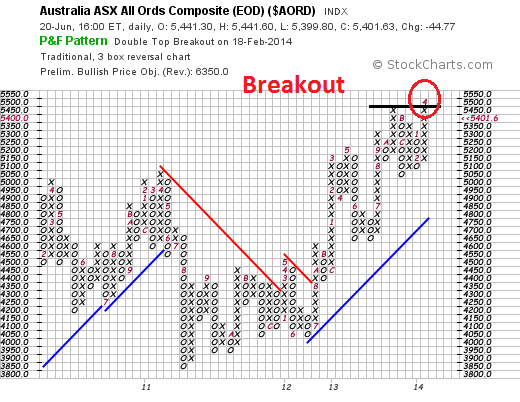
Interestingly enough, the stock markets of commodity-sensitive economies are seeing upside breakouts. Here is Australia:
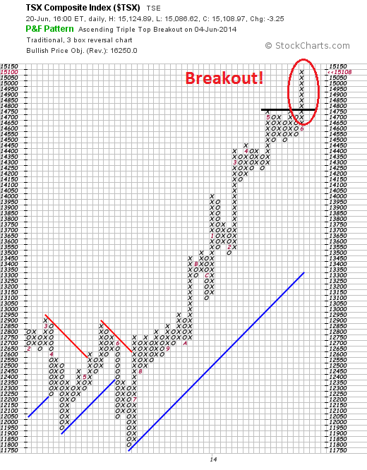
Canada has clearly staged an upside breakout, though the TSX appears a bit extended in the short-term:
Rising earnings = Bullish
When I put it all together, I see a global economy that is firing on most of its cylinders. This is the picture of a mid-cycle expansion. The US is leading the recovery, followed by Europe and with China bringing up the rear. There appears to be little sign of any developed market recession around the corner, so that kind of macro risk is well contained for the next 12 months.
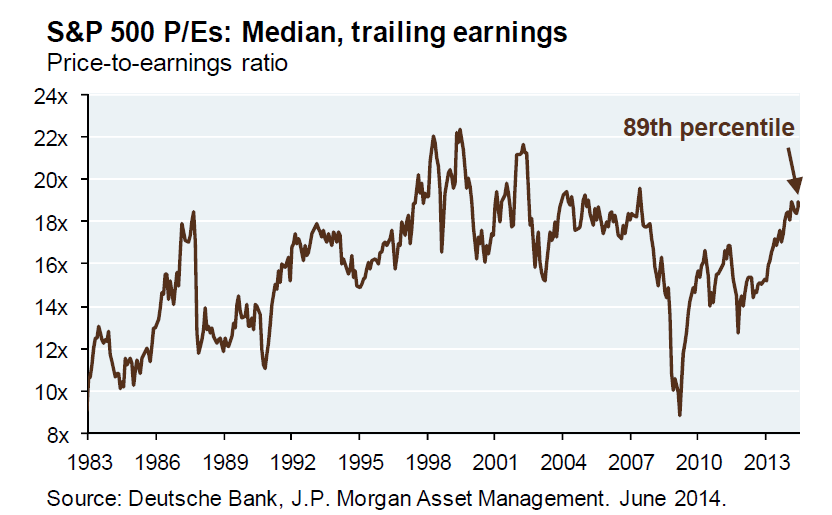
The main risk to US equity prices appears to be valuation. Michael Cembalest of JP Morgan Asset Management showed this chart of the median PE of the US market indicating that valuations are elevated.
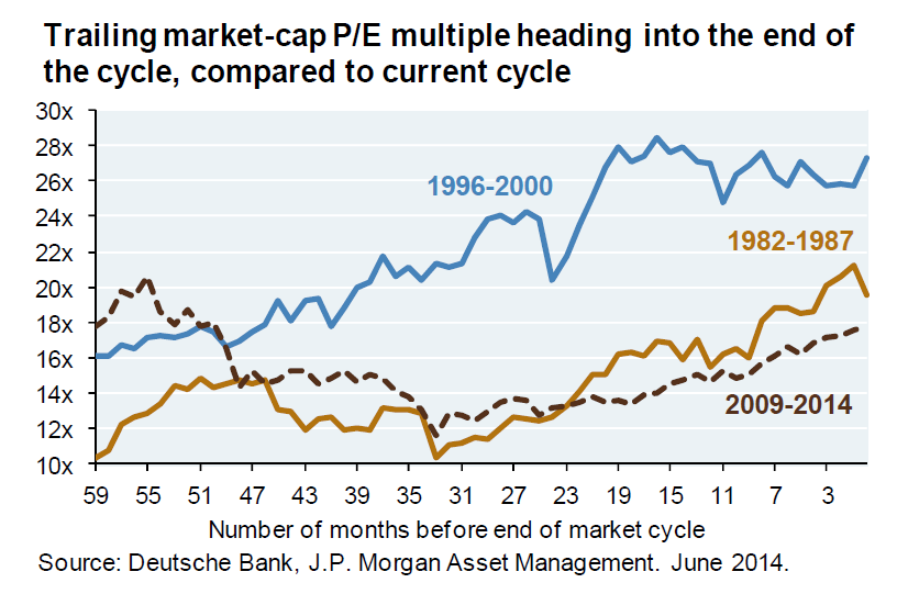
Cembalest went on to liken the current rally from the 2009 bottom to the 1982-1987 rally:
If I had to choose, this cycle is more reminiscent of the pattern in the mid-1980’s than the tech boom, particularly given how low interest rates fuel demand for stocks.
Indeed, the level of PE expansions are very similar:
Let me make this very clear: I am not implying that the stock market is likely to crash as it did in 1987. There seems to be no likely trigger in sight.
Little immediate risk of a crash
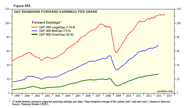
Given the stretched valuations, the main fundamental reason holding up this current bull are earnings - and we are seeing positive momentum there. As Ed Yardeni showed, Street consensus forward EPS estimates continue to rise, so downside risks are well-contained.
Brian Gilmartin confirmed this assessment when his analysis showed that forward EPS growth is rising. That should be supportive of further equity price gains and further PE expansion:
The year-over-year growth rate of the forward estimate is now 8.60%, once again at a new multi-year high, after dipping slightly last week. The forward growth rate hasn’t been this high since January 13, 2012 when it was 9.4%.
Analysis / commentary: If you’ve scrutinized SP 500 earnings as long as we have, the action in the SP 500 understandable this year, just looking at the revisions and forward estimates around SP 500 earnings. The fact is, despite the negativity, SP 500 earnings are growing at mid to high single digits, and starting to improve.
For all practical purposes, with the SP 500 at 16(x) forward earnings, and with it becoming increasingly likely that SP 500 earnings growth could hit 10% (easily) this year, p.e expansion to 20(x) that forward estimate wouldn’t be a stretch.
Watch the growth outlook!
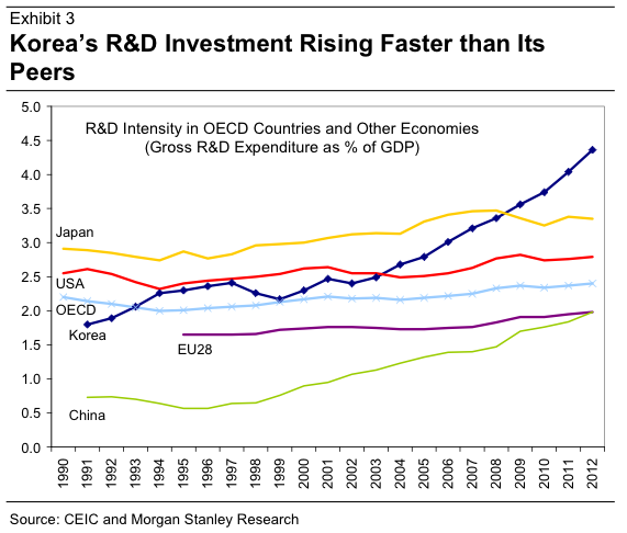
What if the growth outlook were to falter? That's what I am watching carefully. I have written about the lack of CapEx among companies (see What equity bulls need for the next phase and CapEx: Still waiting for Godot). While improving corporate cash flows and balance sheet strength should foreshadow more capital expenditures and investments from the corporate sector, they have not been forthcoming. What's more, analysis of research and development expenditures, which could be a substitute for CapEx, have not increased very much either globally (via Business Insider):
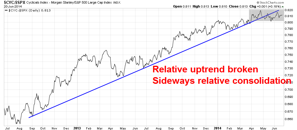
In the meantime, the relative performance of the Morgan Stanley Cyclical Index (CYC) has broken down through a relative uptrend and CYC is undergoing a relative sideways consolidation. While that may appear to be bad news for the bull camp, bears are frustrated because there is no sign of a relative breakdown indicating a downturn in the cyclical outlook.
The trend is your friend
In summary, my tour around the world is giving me a picture of global equity markets in an intermediate uptrend. As they say, the trend is your friend (until it`s not).
While some equity markets, such as US stocks, appear to be a little extended in the short-term, pullbacks are likely to be relatively minor. Until more definitive signs of global weakness occurs, the intermediate term uptrend needs to be respected.
Cam Hui is a portfolio manager at Qwest Investment Fund Management Ltd. (“Qwest”). The opinions and any recommendations expressed in the blog are those of the author and do not reflect the opinions and recommendations of Qwest. Qwest reviews Mr. Hui’s blog to ensure it is connected with Mr. Hui’s obligation to deal fairly, honestly and in good faith with the blog’s readers.”
None of the information or opinions expressed in this blog constitutes a solicitation for the purchase or sale of any security or other instrument. Nothing in this blog constitutes investment advice and any recommendations that may be contained herein have not been based upon a consideration of the investment objectives, financial situation or particular needs of any specific recipient. Any purchase or sale activity in any securities or other instrument should be based upon your own analysis and conclusions. Past performance is not indicative of future results. Either Qwest or I may hold or control long or short positions in the securities or instruments mentioned.
Copyright © Humble Student of the Markets


