


In this week's edition of the SIA Equity Leaders Weekly, we are going to take a look at the long-term yield direction and a comparison between U.S. Equities and Emerging Markets. To do this, we will relook at the CBOE 30-Year Interest Rate, a chart we have touched on many times in the past and look at two ETFs, the SPY vs. EEM, to get an idea of the relative strength between asset classes.
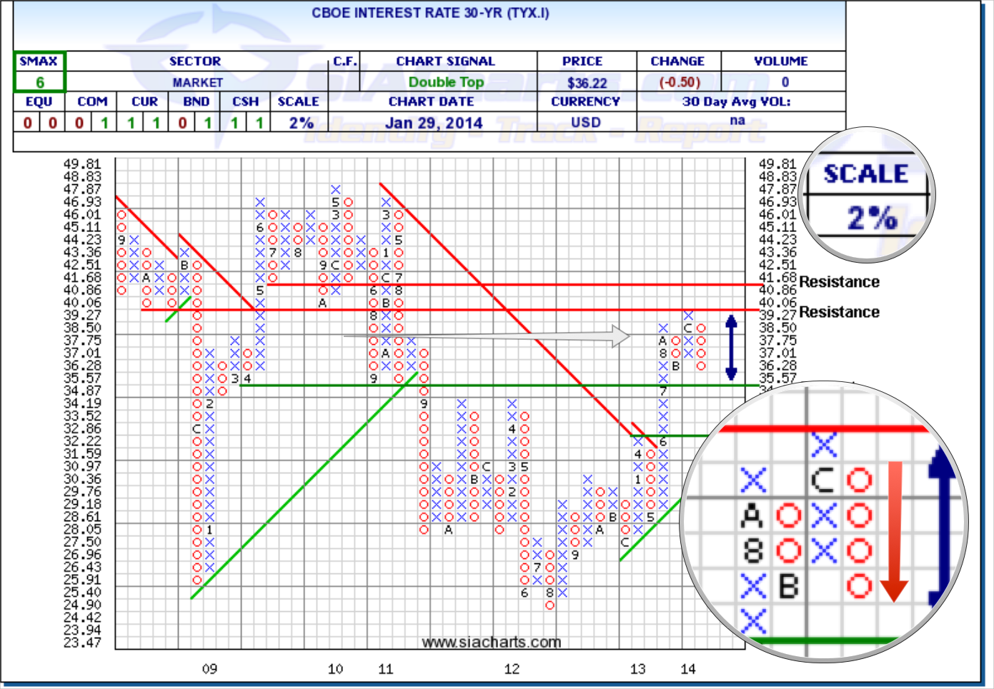
CBOE U.S. Interest Rate 30-Year (TYX.I)
We have looked at the U.S. Dollar vs. the CAD Dollar quite a bit lately but now we want to take a closer look at the importance of a key U.S. rate direction. Looking at the TYX.I chart, we can see it hit resistance at the ~4% level and reversed into a column of O's from there down now over 8% YTD. If this weakness continues, support around ~3.487% could come into play. Further support is found at 3.222% should weakness continue. To the upside, a break through the 4% barrier sees another level of resistance at 4.168%.
Since we last looked at the TYX.I in December, the SMAX score (near-term outlook versus other asset classes) has dropped from an 8 to a 6. Continued strength could apply additional pressure to investments on the long end of the yield curve. But should the recent weakness continue, the first support level could come into play giving us more indication of future direction or if a potential trading channel is forming.
Click on Image to Enlarge

SPDR S&P 500 ETF vs. iShares MSCI Emerging Markets ETF (SPY vs. EEM)
Looking at the comparison chart between U.S. Equity and Emerging Markets, we can quickly see that from a long-term outlook the relative strength relationship continues to Favor U.S. Equity at the start of 2014 and moving forward. Emerging Markets outperformed domestic markets in North America for a large span from 2003-2008, but over the past couple of years have been a relative underperformer compared to both Developed Markets and domestic markets.
Looking back at this comparison between the SPY and EEM, the trend hasn't changed since 2011 where U.S. Equity continues to outperform over Emerging Markets which is designated by the green upwards arrow on the chart. If you are looking for International exposure, please refer to the SIA International Equity Universe reports to help narrow down your choices to which country's exposure provide the best opportunity going forward or contact us if you need help explaining this further.
Click on Image to Enlarge

SIACharts.com specifically represents that it does not give investment advice or advocate the purchase or sale of any security or investment. None of the information contained in this website or document constitutes an offer to sell or the solicitation of an offer to buy any security or other investment or an offer to provide investment services of any kind. Neither SIACharts.com (FundCharts Inc.) nor its third party content providers shall be liable for any errors, inaccuracies or delays in content, or for any actions taken in reliance thereon.
Copyright © SIACharts.com