by Eddy Elfenbein, Crossing Wall Street
There’s been a lot written lately on the Cyclically Adjusted Price/Earnings Ratio (or CAPE). I highly recommend what Josh and Jesse have written.
CAPE is the Price/Earnings Ratio but based on the last 10 years of earnings instead of the last one year. I’ve never been much of a fan of CAPE. My reasoning is pretty basic — valuations are cyclical so there’s no need to adjust the earnings side of the P/E Ratio.
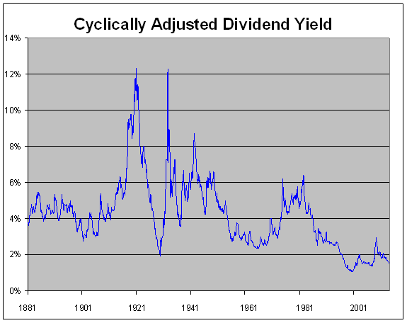
I went to look at the data on Prof. Shiller’s website, but I made one small adjustment. I changed the earnings input to dividends.** So instead of the trailing 10 years of earnings, this is what the trailing 10 years of dividends looks like, or as I’m calling it, CADY (Cyclically Adjusted Dividend Yield):
We see much the same as the CAPE graph, the current market is vastly overpriced. In fact, with CADY it’s even more so. But this underscores the point Josh makes—it’s not different this time, it’s different every time. According to CADY, the market has been priced above its long-term average every month over the last 28 years. The current stock market would have to drop 64% before CADY reached its long-term average.
Sounds crazy? I would argue that CADY has a major advantage over CAPE in that we don’t have to dig through all the accounting issues (Jesse does a great jobs on this). A dividend payment, after all, is a dividend payment.
Some of you might object to CADY by noting that dividend payout ratios have fallen so the yield should be less. But that’s my point exactly. The nature of stock ownership has changed over the decades, so the valuations metrics have also changed. By looking at CADY, I hope it highlights the problems of looking at CAPE. I love looking at old stock data, but be leery of drawing too many conclusions when looking at stock data before 1960.
** For the excel file, I changed the J’s in column K to I’s, and divided by the H cell factor instead of vice versa.
Posted on January 13th, 2014 at 12:40 pm


