


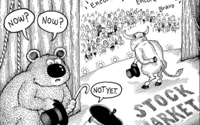
by Macro Man
Calling asset prices a bubble explicitly, or implicitly as a function of the Fed’s large balance sheet, is fairly popular these days. Market commentary projecting a “melt-up” driven by “excess liquidity” seems to be common. So whilst TMM do believe this to be a factor we would like to go one stage further and posit that DM equities are not expensive relative to other asset classes.
Now we realize this is a pretty hairy topic, mainly because there are a lot of ways to look at this asset class and hence a lot of ways to claim that they are rich or cheap. So instead of then trying to ‘prove’ that they are cheap (when we have just said the diversity of cheap/rich measures makes results inconclusive), we will go over the more popularly cited reasons for why they are expensive and follow with some counter points as to why they are not.
Yields are excessively low. Hence the high Equity Risk Premium is a mirage.
The Fed, along with a majority of market economists, pegs LT nominal GDP growth at 4%. 30y Treasury yields are not far from that level at all.
Short Term yields are unlikely to move a great deal relative to the size of the ERP. Even if the Fed hikes a year earlier than anticipated, (let’s say Sept 2014, and then at the 100bps / year pace that it has projected) fair value for 5y yields would be ~2.10%, vs ~1.5% now, a difference of ~60bps. This compares to an ERP of 225bps, using 30y yields, or ~350bps using 10y yields, both of which are historically very high.
Size of Fed Balance Sheet is huge. By implication, the money the Fed has printed is finding its way into stocks.
For this theory to hold, the private sector will have needed take the cash it has received from the Fed from selling bonds and used the cash to purchase stocks. Now, a balance sheet of all major entities in financial markets is hard to come by, but this story does NOT hold water based on retail flows. 377bn has been taken OUT of equities since 2007: (This conclusion was also recently reached by a McKinsey study)

Earnings as a percentage of GDP are too high. They will revert back to the long term mean, which means substantially lower profits.
That is only true if you look at TOTAL earnings. DOMESTIC earnings are NOT excessively high as a percentage of GDP. Much of the recent earnings growth over the past decade has actually come from abroad:

CAPE10 (Cyclically Adjusted Price to Earnings average over the past 10 years) is too high. The chart looks something like this one. This metric has always mean reverted, so stocks are bound to come down.
This cyclical adjustment process basically deflates earnings over the past 10 years by the CPI, and then takes the average. This process means that the adjusted earnings measure assumes the surge in profits from overseas over the past decade will revert. It also assumes that the financial crisis that we’ve had will recur every 10 years. Neither assumption seems especially probable.
Here is an alternative way to look at this metric: The current CAPE10 is ~24.8. The inflation adjusted trailing 12m P/E (CAPE1) is ~16.7. The S&P price is the same in both calculations, so the difference is purely in the adjusted earnings measure. The 1y inflation adjusted EPS is 104.6. The 10y inflation adjusted EPS is 71.3 – a discount of 32%. So you have to ask yourself – do you believe that a third of S&P earnings unsustainable and will eventually disappear? Keep in mind that 25% of earnings are from foreign sources.
Commodities are not going up with stocks. Hence, the growth isn’t ‘real’.
Equity Bull markets in conjunction with commodity bear markets are not uncommon. The previous such instance lasted from 1980’s to the late 90’s.

What is more, we see the increase in supply of metals and the drive to gas, which are keeping prices low, as a benefit. This time around commodity prices damped by increases in supply won't be a tax on growth.
Consumer confidence and employment are not going up as quickly as stocks. Hence, the growth isn’t ‘real’.
Higher profitability seems to be one RESULT of the weak employment growth. The jury is still out, but one line of thinking is that technology has increasingly replaced humans in low value added roles, with the cost differential going to corporate owners. The chart below from Blackrock illustrates this, and highlights a trend that seems to be over a decade in the making. Furthermore, we have not heard of a good reason to believe that this trend will reverse.

It’s all PE expansion, not earnings growth. Hence it is not sustainable.
Historically, PE’s expand during growth periods. Growth = more earnings and more savings = higher equity prices. This tendency is pretty common, sustainable and usually only interrupted by a recession or sharp slowdown.
Equity market capitalization as a percent of GDP is too high. Hence, it has to mean revert.
A higher share of earnings from overseas should mean a higher market cap to domestic GDP ratio. Globalization means more foreign companies may list in the US. Publicly traded companies also have financing advantages, and fewer large companies are remaining private. Companies like Berkshire Hathaway buying up private businesses also increase the market cap to GDP ratio, but arguably does not destabilize anything.
Demographics imply lower PE. The rising number of baby boomer retirees implies strong demand for fixed income and weak demand for equities, which should lower equity valuations.
Arguably, this should only affect the valuation differential between fixed income and equities. In other words, perhaps the Equity Risk Premium could remain higher than average until this demographic effect fades. But as we noted above, with LT yields appearing reasonably fair, the ERP remains very high, and arguably would still be high if treasury yields were 100bps higher.

With those general points covered we can move on to a topical specific.
Hussman Funds recently published another piece on why stocks are too high and though we don’t want to single them out, we do want to address their piece because there are similar claims popping up all the time. (And hence our rebuttal would also apply)
HF Claim: Without reviewing every detail, recall that this model partitions market conditions based on whether the S&P 500 is above or below its 39-week smoothing (MA39) and whether the Shiller P/E (S&P 500 divided by the 10-year average of inflation-adjusted earnings) is above or below 18. When MA39 is positive and the Shiller P/E is above 18, conditions are further partitioned based on whether or not advisory sentiment (based on Investors Intelligence figures) has featured more than 47% bulls and fewer than 27% bears during the most recent 4-week period. Investment exposure is set in proportion to the average return/risk profile associated with a given set of conditions (technically we use the “Sharpe ratio” – the expected market return in excess of T-bill yields, divided by the standard deviation of returns). While a simple trend-following approach using MA39 alone (similar to following the 200-day moving average) has actually slightly underperformed the S&P 500 over time, that trend-following approach has had a fraction of the downside risk of a buy-and-hold strategy, with a maximum loss of about 25%, versus a maximum loss of 55% for a buy-and-hold. By contrast, the very simple Sharpe ratio strategy here has clearly outpaced a pure trend-following approach, with much smaller periodic drawdowns.
Let’s see… 39 week moving average, CAPE10 below 18, 47% bulls vs 27% bears over the past 4 weeks. Why pick those numbers, except that they make the results look good? If there isn’t much more of a reason, then ladies and gentlemen, please see this Wikipedia entry on overfitting. The point is that you can make the historical data say any you want. As a rule, we are skeptical of any claim using numbers alone.
HF Claim: I should also note that overvalued, overbought, overbullish conditions have been entirely ignored by the markets since late-2011… With no need for further stress-testing in future cycles, and every expectation that overvalued, overbought, overbullish syndromes will continue to bite as sharply as they have in every other complete market cycle, I continue to believe that the future belongs to disciplined investors who adhere to historically-informed strategies.
Ironically, this is a claim that is not backed by numbers, and furthermore, relies on very subjective assessments.
Overvalued? Most people think markets are fairly valued here, and TMM actually thinks they are cheap. Problems with the CAPE10 metric have already been noted.
Overbought? What does that even mean? If it means being above a moving average, then as they noted themselves, being long equities when equities are above a long term average has done pretty well. In that case, being overbought is a BULLISH indicator.
Over-bullish? Again what does that mean? Look again at the chart of mutual fund flows at the beginning of the post, that shows 377bn taken OUT of equities since 2007 – a trend that only stabilized at the beginning of the year. That suggests over-BEARISH to us.
We are pretty sure we haven’t covered all the ‘evidence’ that equities are overly rich, but hopefully this does at least cover most of the quantifiable ones. Claims that the stock market is in a bubble because of Twitter’s crazy IPO or other anecdotes are pretty hard to either prove or disprove, so they are not included here.
Copyright © Macro Man