by Lance Roberts of STA Wealth Management,
I recently posted a piece entitled "The Economy In Pictures" wherein I shared a series of economic charts using annualized trend analysis. The purpose of the post was not to espouse a personal viewpoint on the health of the economy, or lack thereof, but to allow you to view the data and draw your own conclusions. As I stated:
"With the economy now more than 4 years into an expansion, which is long by historical standards, the question for you to answer by looking at the charts below is:
'Are we closer to an economic recession or a continued expansion?'
How you answer that question should have a significant impact on your investment outlook as financial markets tend to lose roughly 30% on average during recessionary periods. However, with margin debt at record levels, earnings deteriorating and junk bond yields near all-time lows, this is hardly a normal market environment within which we are currently invested.
Therefore, I present a series of charts which view the overall economy from the same perspective utilizing an annualized rate of change. In some cases, where the data is extremely volatile, I have used a 3-month average to expose the underlying data trend. Any other special data adjustments are noted below."
This week I bring you "The Market In Pictures"
There is currently a debate being waged on Wall Street. On one side of the argument are individuals who believe that we have entered into the next "secular bull market" and that the markets have only just begun what is an expected multi-year advance from current levels. The other side of the argument reiterates that the current market advance is predicated on artificial stimulus and that the "secular bear market" remains intact, and the next major reversion is just a function of time.
The series of charts below is designed to allow you to draw your own conclusions. I have only included commentary where necessary to clarify chart construction or analysis.
*****
Valuation Measures
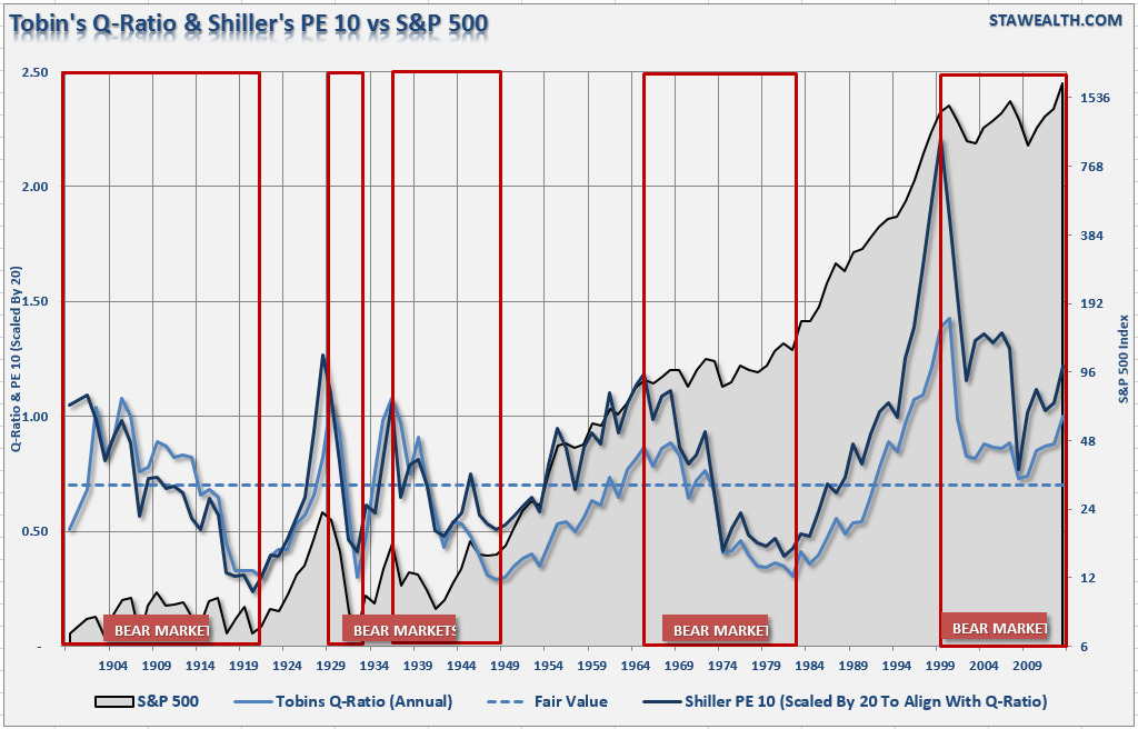
The following chart shows Tobin's "Q" ratio and Robert Shillers "Cyclically Adjusted P/E (CAPE)" ratio versus the S&P 500. James Tobin of Yale University, Nobel laureate in economics, hypothesized that the combined market value of all the companies on the stock market should be about equal to their replacement costs. The Q ratio is calculated as the market value of a company divided by the replacement value of the firm's assets. Dr. Robert Shiller, also a Nobel Prize winning Yale professor, created CAPE to smooth earnings variations and volatility over time. CAPE is calculated by taking the S&P 500 and dividing it by the average of ten years worth of earnings. If the ratio is above the long-term average of around 16x, the stock market is considered expensive. Currently, the CAPE is at 24.42x, and the Q-ratio is at 1.00.
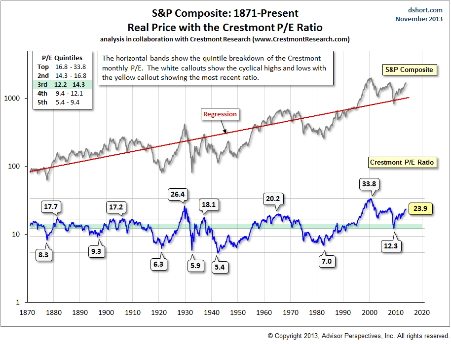
My friend Doug Short regularly publishes Ed Easterling's valuation work. Ed Easterling, Crestmont Research, has done extensive studies on valuation and resulting long term returns.
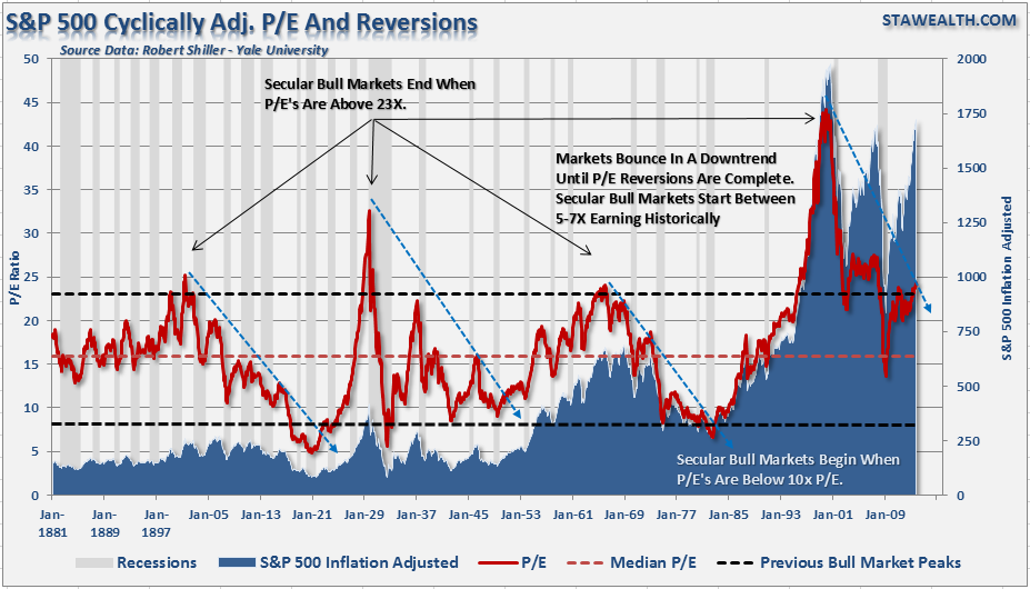
The next two charts are variants on Robert Shiller's CAPE. The first is just a pure analysis of CAPE as compared to the S&P 500.
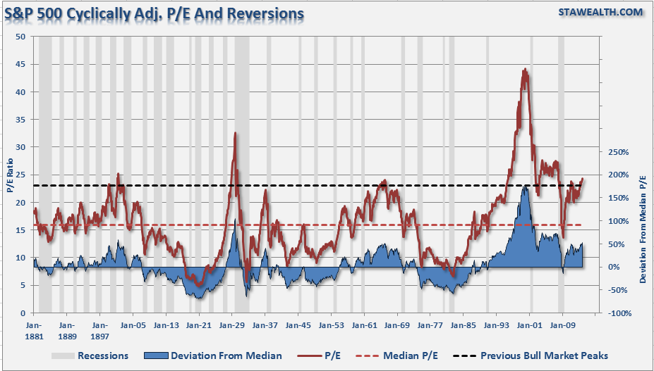
The next chart shows the deviation of valuations from their long term average.
Are stocks truly reflecting the economy?
One of Warren Buffet's favorite valuation measures is Market Cap to GDP. I have modified this analysis utilizing real, inflation adjusted, S&P 500 market capitalization as compared to real GDP.
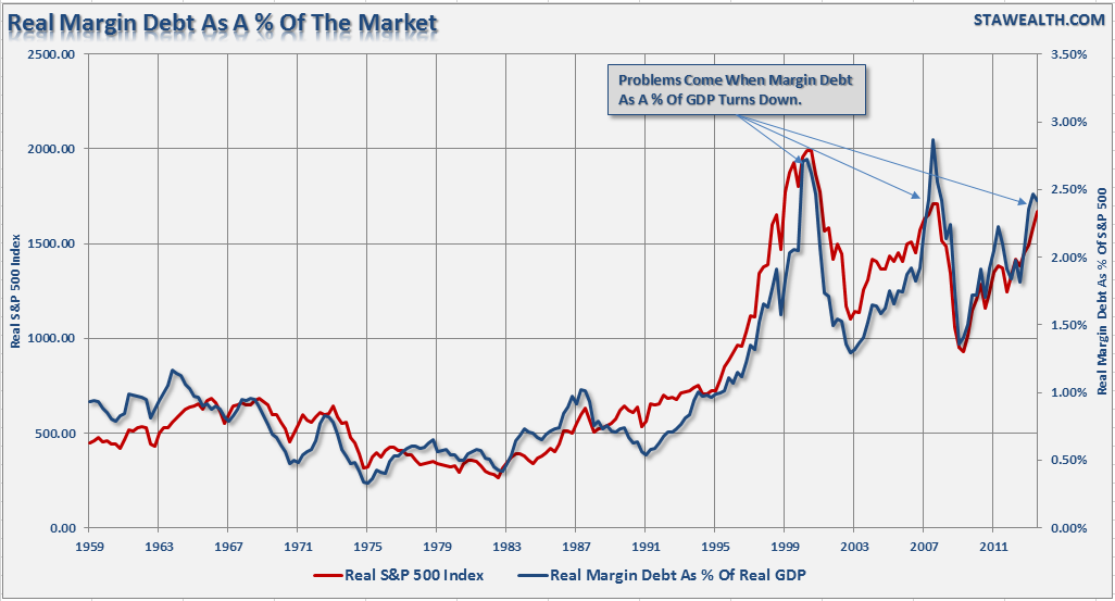
Since the stock market should be a reflection of the underlying economy, then the amount of leverage, or margin debt, in the market as a percentage of GDP could provide an important clue.
Deviation Measures
The following charts are measures of deviation from underlying trends or averages. The greater the deviation from the long term trends or averages; the probability of a reversion back to, or beyond, those trends or averages increases. The first chart is the deviation of earnings from the underlying long term growth trend of earnings.
The next chart is the deviation in price of both the S&P 500 and Wilshire 5000 from the 36-Month moving average. For more discussion on this chart read this.
The chart below is the same basic analysis but utilizing a 50-week moving average which is a more "real-time" variation.
The volatility index (VIX) is representative of investors "fear" of a correction in the market. Low levels represent investor complacency and no fear of a market correction.
Just For Good Measure
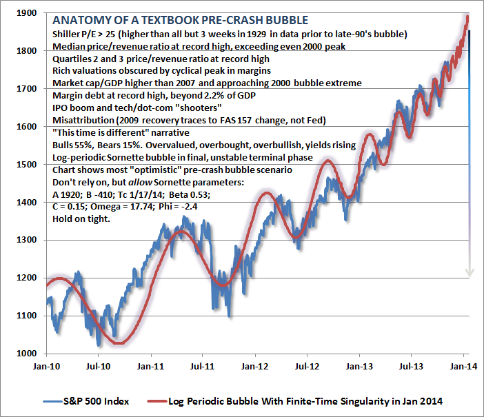
This past week John Hussman tweeted this chart of the S&P 500 that lists all of the warnings signs of a crash that we are experiencing now.
"Anatomy of textbook pre-crash bubble. Don't rely on further blowoff, but don't be shocked. Risk dominates. Hold tight."
This analysis, along with the economic data I posted recently, tells us much about where we are within the current economic and market cycle. While it is certainly easy to be swept up in the daily advances of the stock market casino, it is important to remember that eventually the "house always wins." What has always separated successful professional gamblers from the weekend sucker is strictly the difference of knowing when to cash in your chips and step away from the table.
Copyright © STA Wealth Management


