


For this week's SIA Equity Leaders Weekly, we are going to take a look at a topic we have been covering quite frequently within the ELW over the past year, Yield direction. To do this we are going back to the CBOE Interest Rate Chart, a great view of where U.S. Interest Rates are headed. Second we will take a look at the Canadian Interest Rate Environment through a comparison of Short vs. Long Term Bond ETF's. This analysis remains vital in the current market as long term interest rate directions have changed significantly.
CBOE U.S. Interest Rate 30- Year (TYX.I)
Our first chart today is on the CBOE Interest Rate. This chart has been featured within the ELW 12 times in the last year highlighting the importance that we all must have on staying abreast of changes in the key U.S. rate direction. For this week we are going to take a look at a longer term view of the TYX.I by switching to a 3% chart. This chart gives a longer term look at the extensive downtrend that rates within the U.S. underwent from 1981 until today. Looking to the chart we can see that in June of 2013 the downtrend line from 1981 was breached for only the second time in 32 years, the first in May of 2010. This breakout above the trend line and the subsequent follow through beyond a couple of near term resistance levels is letting us know that this direction is likely more significant than anything we have seen in decades.
Key resistance for the 30 Year Yield now stands in the 4.263% range and 4.942%. To the downside support is above 3.466% and 3.172%.
Click on Image to Enlarge

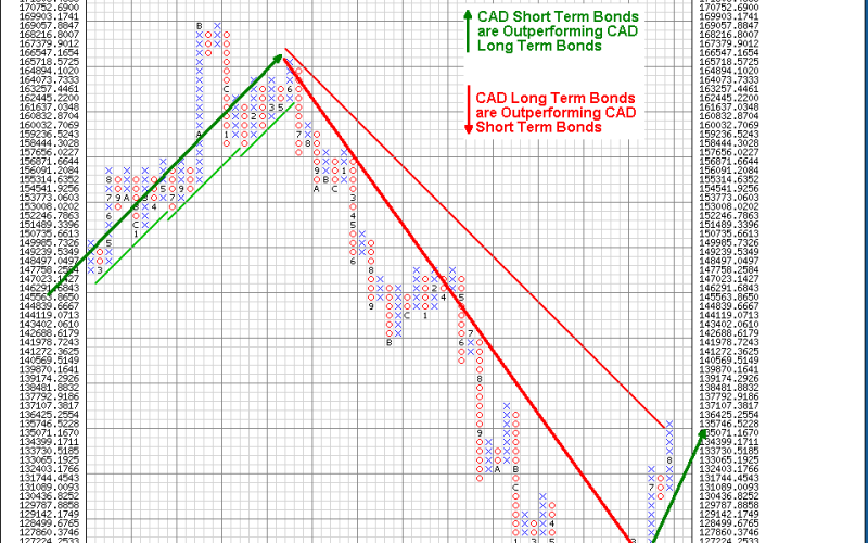
iShares DEX ST Bond vs. iShares DEX LT Bond (XSB.TO^XLB.TO)
Another way to get a picture on the direction of rates and their significance of the move to our Bond holdings is by using a comparison chart of different durations. In the second chart of this weeks ELW we are going to take a look at a CAD Short Term ETF vs. a CAD Long Term ETF. By comparing the two ETF products we can determine which of the two areas new purchases can be focused on and subsequently the relative direction of interest rates.
Looking to the chart we can see that the trend has changed between the Short Term and Longer Term products in Canada. Since June the Short Term Bond ETF has started to pull away from the Long Term Bond ETF on a relative basis. This strength has now seen the downtrend line within the comparison breached for the first time since 2009. It is clear that this chart has and is signaling higher rates in Canada as investors sell the long end of the curve and pick up the shorter side.
In summary our observations in the two charts today show us that Interest Rate pressure remains to the upside and that especially in the U.S. this trend appears to be longer term in nature. This information can be acted upon within the fixed income portion of our portfolios but also adds weight to some of the rotations we are seeing in equities as investors rotate out of interest sensitive's to other sectors.
Click on Image to Enlarge

SIACharts.com specifically represents that it does not give investment advice or advocate the purchase or sale of any security or investment. None of the information contained in this website or document constitutes an offer to sell or the solicitation of an offer to buy any security or other investment or an offer to provide investment services of any kind. Neither SIACharts.com (FundCharts Inc.) nor its third party content providers shall be liable for any errors, inaccuracies or delays in content, or for any actions taken in reliance thereon.