by Charts, Etc.
As I've written, I keep an eye on several indicators or metrics which help to gauge where we are on the risk-on/risk-off spectrum. Over the last few weeks, many of these have clearly been signaling that it's time to reign in risk and get more bearish.
The following chart shows the Russell 2000 Index versus the S&P 500 in the lower inset, and the S&P 500 in the upper inset.

Source: Stockcharts.com
When small-cap stocks begin to underperform larger-caps, it's a risk-off signal and as you can see small-cap performance has fallen off a cliff versus larger-caps.

Source: Stockcharts.com
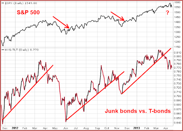
The chart above shows high-yield "junk" bonds versus T-bonds. When high-yield bonds begin to underperform T-bonds, it's a risk-off signal and the relative performance of junk bonds broke trend last month.

Source: Stockcharts.com
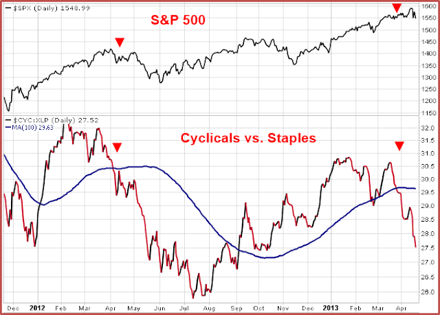
I've discussed the above chart in the past. When cyclical stocks underperform staples, breaking through the 100-day moving average to the downside, it's a risk-off (sell) signal. A risk-off signal was generated late last month.
I've also discussed how mortgage REIT Annaly (NLY) has triggered a risk-off signal, and how the outperformance of health care stocks has not been a bullish sign for the market.
After being bullish since last September, color me bearish....


