Central bankers have done their part flooding the world with liquidity, and investors have caught on as well by taking asset prices higher. Central bankers have their backs, but there is no reason to think that some new virtuous cycle has been created. By lifting global markets, central bankers have averted a recession and cushioned any future fall in asset prices. So what if the SP500 drops 10%? That would take the SP500 down to its 200 day moving average. What a buying opportunity that would be for the always bullish crowd. So while it may not be a virtuous cycle, we can say, “mission accomplished”. I don’t think the “all clear” is ever warranted and just when investors get comfortable with one thing, the market has a way of changing its tune. Predicting when this will happen is difficult, but it is more likely to happen in the current market environment when bullish extremes in investor sentiment persist. If you are a buyer now, you may not make any money, but that is the risk you take when buying high with the expectation to sell higher. So while central bankers can claim mission accomplished, for the average investor it is going to boil down to market timing.
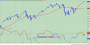
The “Dumb Money” indicator (see figure 1) looks for extremes in the data from 4 different groups of investors who historically have been wrong on the market: 1) Investors Intelligence; 2) MarketVane; 3) American Association of Individual Investors; and 4) the put call ratio. This indicator shows extreme bullishness. As stated last week: “If we look at the “dumb money” indicator in figure 1, we know that as long as the indicator stays above the upper band (see green arrow on chart), prices should continue to go higher – albeit in a grinding fashion at this stage of the rally. This is the syndrome I call “it takes bulls to make a bull market”. If the indicator closes below the upper band, then the best time to sell is usually one week after this occurrence. In this instance, the market is rolling over and those late to the party are buying that dip. The data shows that this is the optimal time to sell. But these are optimal scenarios, and I should caution that optimal and stock market are rarely spoken of in the same sentence. The market is just too unpredictable. Who saw the May, 2010 “flash crash” or the 20% drop over 3 weeks in 2011 coming? If you hang around too long, you could be one of those casualties. Alas, there are no right answers or guarantees. These are just signposts that help us better understand the price action. ”
Figure 1. “Dumb Money”/ weekly

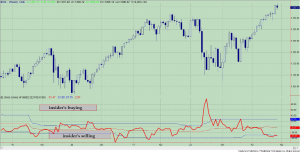
Figure 2 is a weekly chart of the SP500 with the InsiderScore “entire market” value in the lower panel. From the InsiderScore weekly report: “Insider selling levels continued at elevated levels, however, volume began to diminish as some companies began closing trading windows ahead of the quiet period straddling the end of one quarter and the beginning of another.”
Figure 2. InsiderScore “Entire Market” value/ weekly

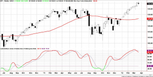
Figure 3 is a weekly chart of the SP500. The indicator in the lower panel measures all the assets in the Rydex bullish oriented equity funds divided by the sum of assets in the bullish oriented equity funds plus the assets in the bearish oriented equity funds. When the indicator is green, the value is low and there is fear in the market; this is where market bottoms are forged. When the indicator is red, there is complacency in the market. There are too many bulls and this is when market advances stall. Currently, the value of the indicator is 68.16%. This is the second week in a row that the indicator has turned down week over week. Values less than 50% are associated with market bottoms. Values greater than 58% are associated with market tops. It should be noted that the market topped out in 2011 with this indicator between 70% and 71%.
Figure 3. Rydex Total Bull v. Total Bear/ weekly

Copyright © The Technical Take


