Contributed by QVM Group
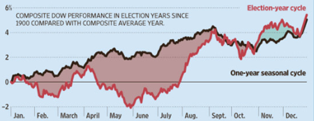
A composite view of the Dow Jones Industrials Average in U.S. presidential years (red line) versus the average of all years (black line) from 1900 forward is shown in this chart from the Wall Street Journal. The pattern is distinctly different on average. A mid-year slump is more likely, it would seem than in other years. A temporary advantage after the election is also typical. However, on a full year basis, the return in election years is about the same as in other years.

But don’t go betting on such averages. First, individual years don’t closely track the average. Second, what is happening in the world now is far more important this year than what happened in prior election years. Every year is different.
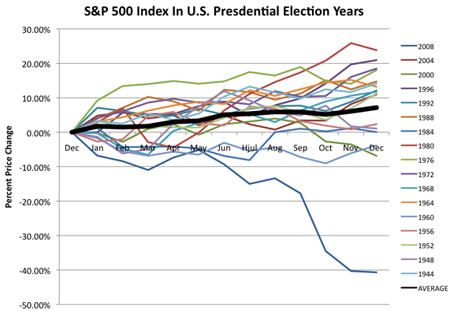
Here is a chart we put together that plots the month-by-month price change of the S&P 500 index from the 1944 election year through the 2008 election year. The thick black line is the average (doesn’t look much like the 108 year average in the Dow chart above. The other lines are the individual election years (they are all over the place).

Copyright © QVM


