


Stock/bond correlations have been steadily decreasing since peaking in 2015: What does it mean?
Key takeaways
• A feature of October’s 11.5% intra-month S&P 500® decline (ending in a 1-month return of –6.8%) was that bond yields barely moved.
• The 5-year correlation between stocks and bond yields peaked in 2015 and has come down steadily since. Will it flip to negative like it did during the mid-1960s?
• If so, investors may need to reconsider how to protect against downside equity risk.
• That doesn’t mean bonds no longer play an important role in a diversified portfolio, since they still provide income, diversification, and lower volatility.
One of the notable things about the S&P 500’s 11.5% intra-month decline in October is that it left investors with basically no place to hide, other than in cash or a defensive sector such as utilities.
Growth/momentum exposure offered no reprieve, and cyclicals and interest rate-sensitive groups got clobbered.
Stock/bond correlations have been steadily decreasing since peaking in 2015: What does it mean?
Source: Fidelity Investments Canada
So more or less everything got hit, which can be seen in market-breadth indicators that compare the number of companies advancing versus declining. According to data from Bloomberg, an 11.8% intra-period decline in January/February 2018 produced a modest 801 new 52.week lows (across all exchanges), but the almost identical 11.5% decline this October produced a crescendo of 1,916 new lows.
But most noteworthy, I think, was that bonds offered no safe haven either. Yes, the 10-year Treasury yield fell from its high of 3.23% to 3.07% for a few weeks (producing a roughly 1% return), but those gains proved short-lived, as the 10-year yield quickly moved back to 3.22%.
Bond yields up while stock prices down? That is certainly a twist to the market playbook that we have gotten so used to over the past two and a half decades. Since the late 1990s, most market shocks have carried with them fears of deflation, which meant that drawdowns in stock prices were generally associated with declines in yields.
This has, of course, been very helpful to most broadly diversified portfolios, which rely on bonds for a measure of downside protection.
But what if things are moving from a positive correlation between bond yields and equity prices to a negative one? I think that could be groundbreaking, to say the least, because it could suggest that we are shifting from a deflationary to an inflationary regime. That could influence expected risk premia and valuations across many or even most asset classes, and it could change what investors might want to have in their tool kits with regard to diversifying assets.
So, let’s see what we can learn from history. Taking a look at some very long-term data, we can see that the correlation between interest rates and stock prices is ever evolving. Exhibit 1 shows the rolling 5-year correlation between monthly changes in the inflationadjusted S&P 500 price index and monthly changes in the inflation-adjusted yield on long-term Treasuries.
Like a pendulum, the rolling correlation is always ebbing and flowing (between roughly +0.5 and –0.5), but it can persist, positively or negatively, for long stretches.
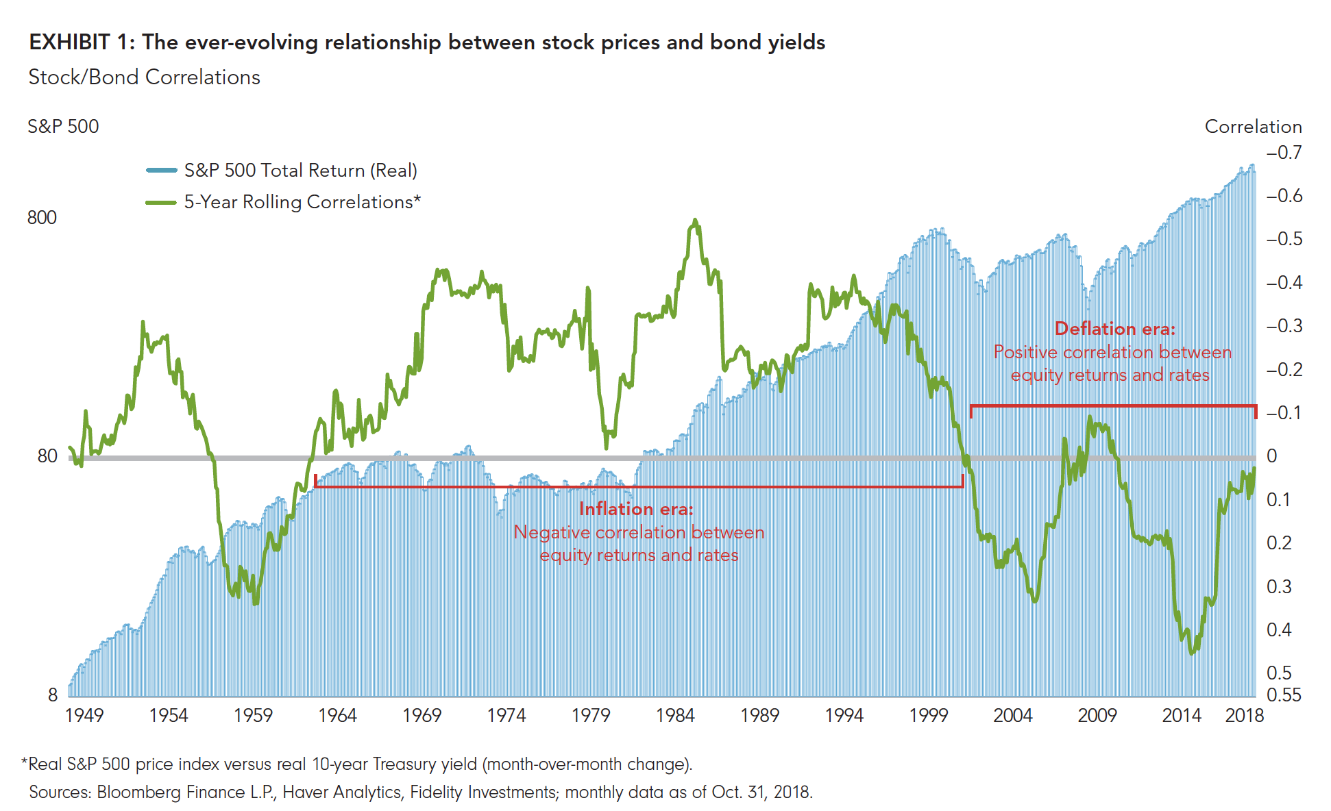 For me, the key inflection points are 1960 and 2015. In 1960, the 5-year correlation swung from persistently positive (stocks up, yields up) to persistently negative (stocks up, yields down), as the secular backdrop evolved from the deflationary mindset arising from the Great Depression to the inflationary mindset of the late 1960s and into the “stagflationary” ’70s.
Once the correlation swung to negative in 1960, it more or less stayed there until the late ’90s, by which time the deflationary mindset was returning—first with the “Asian Flu” in 1997 and the 1998 collapse of hedge fund Long- Term Capital Management, followed by the bursting of the dot-com bubble in 2000, and finally the 2008–2009 global financial crisis (GFC).
With the exception of early 2009—when yields were rebounding from their GFC lows while equity prices were still falling—the correlation had been persistently positive from the late ’90s until 2015. Since then, the 5-year correlation between the real S&P 500 price index and real bond yield has been steadily falling, and as of October 2018 it stands at roughly zero.
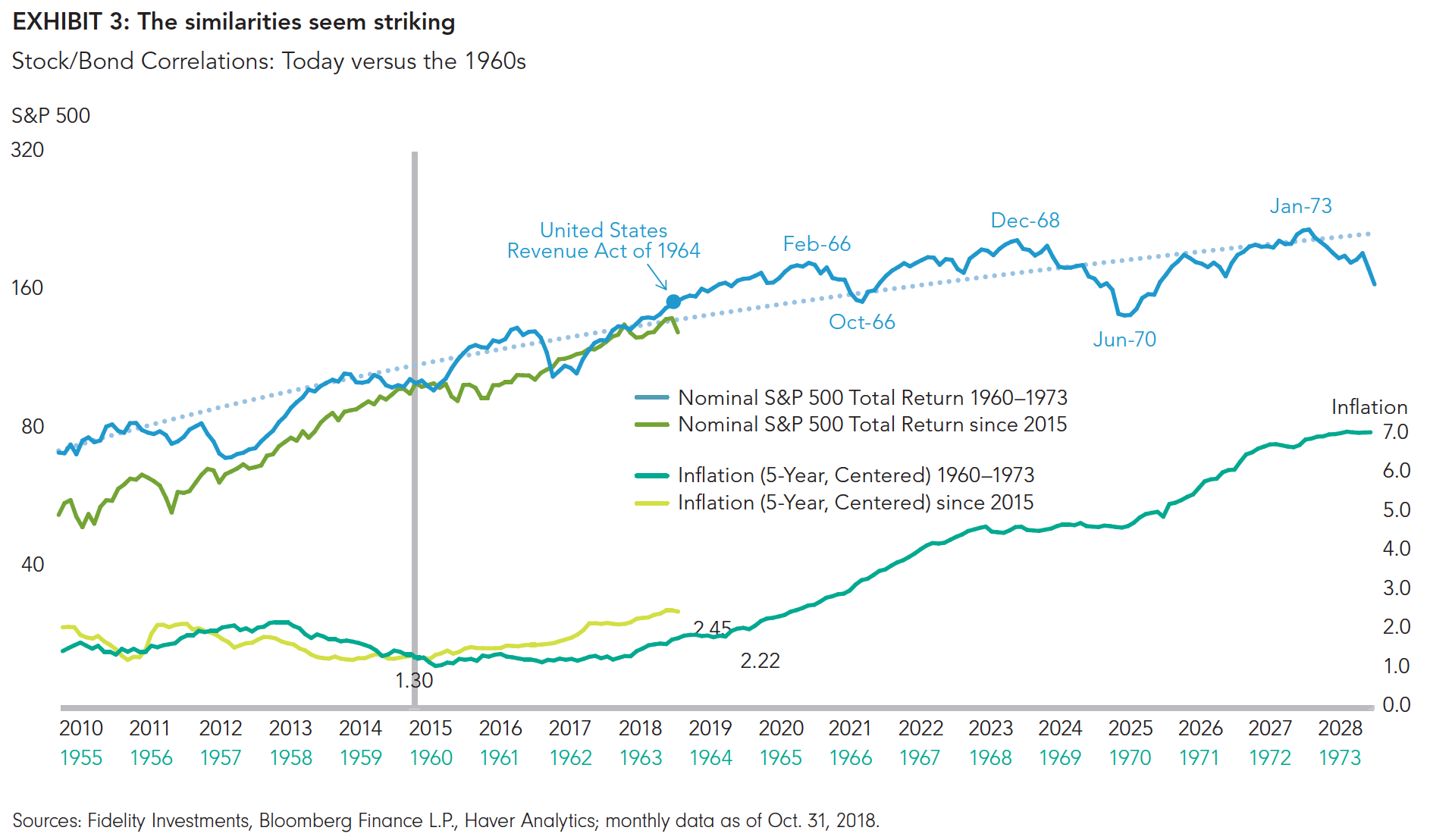
The next step in this study is to create an analog of these two periods, lining up the two inflection points of 1960 and 2015 to see what we might learn. So, we are now at “1964” in Exhibit 2, which compares the historical and recent trends of the S&P 500 nominal total return in the top panel and the two periods’ 5-year rolling correlations in the bottom. Exhibit 3 shows the S&P 500 real return and the 5-year annualized inflation rate for each time frame.
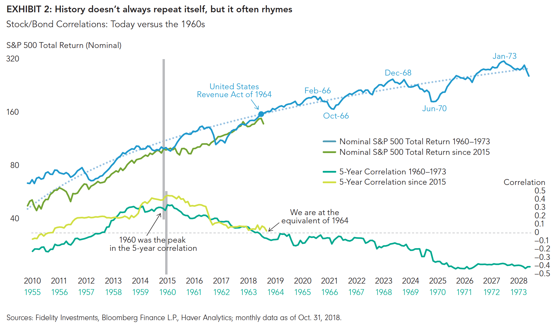
The analog is compelling, to say the least (with the usual caveats). For one, I find it interesting that there was a large tax cut in 1964 (the United States Revenue Act of 1964), similar to today’s. Also, we know that deficit spending started ramping up in the later years of the 1960s. Third, the ’60s followed a long period of ultra-low interest rates and even something akin to the U.S. Federal Reserve’s quantitative easing (via the Fed’s interest rate caps during and following World War II). Finally, stocks were well into a secular bull market during the ’60s that had begun (by my count) in 1949 and which ended in 1968. We won’t know for a long time whether the current post-GFC market regime is a secular bull or not, but if it is, then the parallels to the ’60s are even more compelling.
We can see from the analog in Exhibit 3 that inflation was forming a structural bottom in the early 1960s, coming off its secular lows but still around a well-behaved 2-ish% (the high-inflation ’70s were still a ways off). But it was definitely on the rise. Likewise, inflation today appears to be slowly rising off of a secular low but still at reasonable levels, just like 1964.
Now, I am certainly not prepared to argue that we are headed into a regime of high inflation or severe stagflation, as the analog might suggest, but the point here is that once the inflation genie gets out of the bottle, it can be quite difficult to put it back in. Inflation changes people’s behavior, and that can become a self-reinforcing feedback loop. If this is what is happening now, then we all may need to modify how we think and invest.
It’s a lesson to keep in mind as the deficit- and tax reform-fueled U.S. economy is creating both growth and inflation at a time when the Federal Reserve seems comfortable remaining on or even behind the curve (i.e., bringing policy from accommodative to neutral only very slowly, even though the Fed’s employment and inflation mandates have both been met).
But as scary as this analog may seem, the charts also suggest to me that it doesn’t necessarily need to be a negative for stocks, at least not for a while. While inflation accelerated higher in the second half of the ’60s, the stock market kept on making new highs for four more years, until the second of three rolling peaks took place in 1968. In 1964, the secular bull market was 15 years old, with another four to go.
This is less true in real terms, since a good chunk of the returns in the second half of the 1960s was eaten up by inflation. By the time the correlation inflected in 1964, the slope of the advance was already flattening out as the market went from the steep returns of the ’50s to a more moderate return stream in the ’60s. Nevertheless, the market kept going up in both nominal and real terms well after stock/bond correlations flipped. It just did so with a slope that was less steep than before.
In conclusion, while I don’t believe it is correct to argue that a regime change from positive to negative stock/ bond correlations as rates continue to rise is going to cause an immediate bear market, it is safe to say that the stock market may not be able to rise as much as it would were interest rates and inflation to stay low; that is, unless earnings continue to grow strongly (in the double digits) and the equity risk premium falls from its already low 2% level.
It’s a tall order on both counts, but not impossible.
*****
Author
Jurrien Timmer | Director of Global Macro, Fidelity Global Asset Allocation Division
Jurrien Timmer is the director of Global Macro for the Global Asset Allocation Division of Fidelity Investments, specializing in global macro strategy and tactical asset allocation. He joined Fidelity in 1995 as a technical research analyst.
This is original content from Fidelity Investments in the U.S.
The source of all factual information and data on markets, unless otherwise indicated, is Fidelity Investments. Commissions, trailing commissions, management fees and expenses all may be associated with mutual fund investments. Please read the prospectus, which contains detailed investment information, before investing. Mutual funds are not guaranteed, their values change frequently and past performance may not be repeated. Certain Statements in this commentary may contain forward-looking statements (“FLS”) that are predictive in nature and may include words such as “expects”, “anticipates”, “intends”, “plans”, “believes”, “estimates” and similar forward-looking expressions or negative versions thereof. FLS are based on current expectations and projections about future general economic, political and relevant market factors, such as interest and assuming no changes to applicable tax or other laws or government regulation. Expectations and projections about future events are inherently subject to, among other things, risks and uncertainties, some of which may be unforeseeable and, accordingly, may prove to be incorrect at a future date. FLS are not guarantees of future performance, and actual events could differ materially from those expressed or implied in any FLS. A number of important factors can contribute to these digressions, including, but not limited to, general economic, political and market factors in North America and internationally, interest and foreign exchange rates, global equity and capital markets, business competition and catastrophic events. You should avoid placing any undue reliance on FLS. Further, there is no specific intentional of updating any FLS whether as a result of new information, future events or otherwise.
From time to time a manager, analyst or other Fidelity employee may express views regarding a particular company, security, and industry or market sector. The views expressed by any such person are the views of only that individual as of the time expressed and do not necessarily represent the views of Fidelity or any other person in the Fidelity organization. Any such views are subject to change at any time, based upon markets and other conditions, and Fidelity disclaims any responsibility to update such views. These views may not be relied on as investment advice and, because investment decisions for a Fidelity Fund are based on numerous factors, may not be relied on as an indication of trading intent on behalf of any Fidelity Fund.
Stock markets are volatile and can fluctuate significantly in response to company, industry, political, regulatory, market, or economic developments. Please note that there is no uniformity of time among business cycle phases, nor is there always a chronological progression in this order. For example, business cycles have varied between 1 and 10 years in the U.S., and there have been examples when the economy has skipped a phase or retraced an earlier one.
Investing involves risk, including risk of loss.
Past performance is no guarantee of future results.
Diversification and asset allocation do not ensure a profit or guarantee against loss.
All indices are unmanaged. You cannot invest directly in an index.
Index definitions
S&P 500 is a market capitalization-weighted index of 500 common stocks chosen for market size, liquidity, and industry group representation to represent U.S. equity performance.
Third-party marks are the property of their respective owners; all other marks are the property of Fidelity Investments Canada ULC.
© 2018 Fidelity Investments Canada ULC. All rights reserved.