by Liz Ann Sonders, Senior Vice President, Chief Investment Strategist, Charles Schwab & Co
Key Points
- The August payroll report was strong, albeit with revision offsets; but the jump in wage growth garnered the most attention…rightly so.
- Indications are that the “Phillips curve” may be kicking back in and should not have been left for dead.
- The tight labor market is good news for “Main Street” but has implications for “Wall Street” as well.
Source: Charles Schwab.
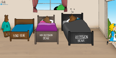
Goldilocks may be leaving the building. The reference to the cute girl with the golden ringlets has become a popular way to describe an economic environment that’s not too hot, not too cold. But as Friday’s employment report may be indicating, the days of strong job growth without accompanying upside wage pressure may be ending.
First, the details
Non-farm payrolls were up 201k, which was above the consensus of 190k. However, revisions subtracted 50k from the prior two months. What garnered more attention though was the jump in average hourly earnings, which were +0.4% month/month and 2.9% year/year (the latter is up from 2.5% on average last year). The unemployment rate was unchanged at 3.9%; with household survey employment -423k after +389k last month. But that drop was because the size of the labor force fell by 469k.
Fed will stay busy
As has been much discussed, there are presently more U.S. job openings than there are unemployed people (see chart below). In addition, “job leavers” (those having the confidence to leave their job in the hopes of getting a new one) as a percentage of the unemployed is up to 14%, which is the highest since October 2000. In keeping with that, the number of employed people working part-time for economic reasons (not because they’re choosing that option) fell by nearly 200k.
More Job Openings Than Unemployed Persons
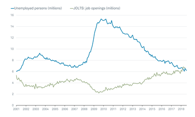
Source: Charles Schwab, Department of Labor, FactSet. Unemployed persons as of August 31, 2018. Job Openings and Labor Turnover Survey (JOLTS), as of June 30, 2018.
The bottom line is that the pace of job gains, coupled with a multi-decade low in unemployment claims (see chart below), are more than sufficient to keep the unemployment rate trending down—which also means wage pressures should intensify. It also puts two additional rate hikes—likely this month and again in December—almost assured. This should keep upward pressure on the U.S. dollar, which in turn could keep emerging market volatility elevated.
Claims Approaching Late-1960s Lows
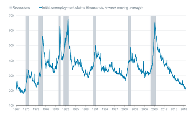
Source: Charles Schwab, Department of Labor, FactSet, as of August 31, 2018.
Nominal growth takes the over on unemployment
In further support of the higher wage growth story is the fact that nominal gross domestic product (GDP) growth is now above the unemployment rate for the first time in this economic cycle (see chart below). These are not two variables often compared, but my friend Jim Paulsen at The Leuthold Group alerted me to how the relationship affects the Phillips Curve (remember, the Phillips curve highlights the historic inverse relationship between the level of unemployment and the rate of wage inflation).
Nominal GDP Jumps Over Unemployment Rate
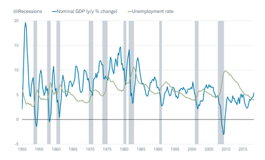
Source: Charles Schwab, Bureau of Economic Analysis, Department of Labor, FactSet, as of June 30, 2018.
As you can see in the pair of scattergrams below, when the unemployment rate has historically been above the nominal rate of GDP growth, the Phillips Curve breaks down. However, when the unemployment rate has historically fallen enough, and/or growth has accelerated enough such that nominal growth exceeds the unemployment rate, the Phillips Curve kicks back in.
Phillips Curve Kicking Back In?
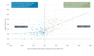
Source: Charles Schwab, The Leuthold Group, June 30, 1952-June 30, 2018.
NFIB’s tell
Another clear indication of upward wage pressure comes from the National Federation of Independent Business (NFIB) survey—specifically its component that tracks the percentage of small businesses planning to raise worker compensation in the next three months. Shown below, you can see how closely it tracks AHE and what it likely portends for the near future.
Compensation Plans Bode Well for Wage Growth
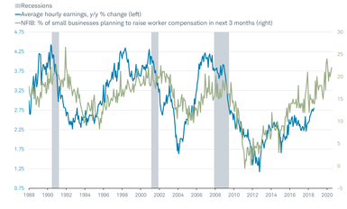
Source: Charles Schwab, Bureau of Labor Statistics, FactSet, Strategas Research Partners LLC. Average hourly earnings as of August 31, 2018. National Federation of Independent Business (NFIB) data advanced 24 months and as of July 31, 2018.
Small businesses in particular are under pressure to raise wages; due in part to the burgeoning skills gap. As you can see in the chart below, at the start of this economic cycle, concerns about sales were paramount, followed by taxes and regulations. But more recently, the number one concern on small businesses’ minds is “quality of labor.”
NFIB’s Single Most Important Problem
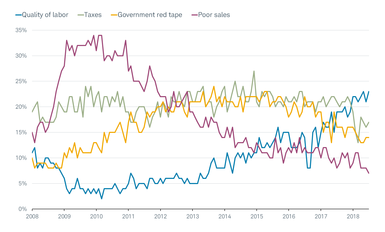
Source: Charles Schwab, FactSet, as of July 31, 2018.
“Main Street” may feel better than “Wall Street”
Most of the above is great news for workers and a long time coming. But it raises additional late-cycle risks as it relates to the stock market. As readers are probably tired of reading from me, when it comes to the relationship between economic fundamentals and the stock market, “better or worse tends to matter more than good or bad.” When data becomes as historically-strong as we’re seeing in a variety of employment statistics, it’s time to start looking for possible inflection points—when the best news has already been priced into expectations and the market.
The unemployment rate is one of the more lagging of economic indicators and helps illustrate the relationship between economic fundamentals and stock market performance. As you can see below, historically when the unemployment rate was in its highest quartile, the stock market had its best performance—nearly three times the performance of the lowest quartile. And when it dropped to sub-4% (as it is now), returns were further diminished.
Lower Unemployment Rates Less Cheered by Stocks
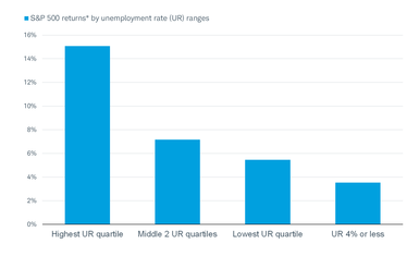
Source: Charles Schwab, The Leuthold Group. *S&P 500 returns based on monthly data annualized from January 1950-August 2018. Annualized returns are inflation-adjusted by CPI.
None of this is to suggest investors need to run for the hills. There likely remains a decent length of runway before we have to really start inflection point hunting. Productivity has picked up, 2.9% AHE is not excessive, and top-line revenue growth remains strong for businesses. This should prolong the healthy profit margin story and keep the Fed from having to aggressively tighten policy. But it’s also not the time to become complacent or cavalier of increasing signs that we are moving into the latter stage of the economic cycle.
Copyright © Charles Schwab & Co


