by Liz Ann Sonders, Senior Vice President, Chief Investment Strategist, Charles Schwab & Co
Key Points
- It’s getting later in the cycle and time to weigh the rising risks, like trade, alongside the continued rewards, like strong economic growth.
- Earnings growth has been stellar and remains a tailwind; but be wary of a very high expectations bar heading into 2019.
- Financial conditions are tightening and liquidity is receding…time to look for who’s swimming naked.
When it comes to the connection between economic and/or corporate earnings fundamentals and the stock market, it’s worth considering my oft-expressed view that “better or worse tends to matter more than good or bad.” As a leading indicator, the stock market typically does a great job sniffing out important economic or earnings inflection points in advance. This is why at market tops the data typically looks great, while at market bottoms the data typically looks abysmal. Keep this in mind as you read through this outlook for the remainder of 2018.
Our key theme coming into this year was “it’s getting late,” in reference to the stage of the economic cycle. The key implications noted were the likelihood of rising inflation, tighter monetary policy and greater market volatility. Check. We have also been consistently highlighting protectionism and trade as a market and economic risk. Check.
We are entering the second half of the year in the middle of the S&P 500’s trading range, which has been in place since the correction that began in late-January. Until the index takes out its January high, it’s considered to still be in correction mode. For what it’s worth, only the 1994-1995 correction went longer without turning into a bear market (20% decline or more, using the standard definition). If this was a typical correction, it would have been at or near new highs by now; and the longer that takes, the higher the likelihood that this correction gets worse before it gets better.
Looking ahead, starting with trade
Let’s look into the second half of the year to expand on some of the aforementioned themes, as well as posit some additional themes to consider. Let’s start with trade. Many who are still brushing off a possible trade war often cite the limited impact of the currently-proposed tariffs on gross domestic product (GDP) growth—especially since it’s dwarfed by the benefits of fiscal stimulus. The problem with that argument is that it only considers “first order” effects; while not considering “second order” effects—which include, most importantly, the impact on business and consumer confidence.
Animal spirits, which have propelled everything from hiring, to wage increases, to capital spending plans, could be deflated if there is not an easing in trade tensions soon. In fact, economists’ pessimism about sliding down the slippery slope toward a trade war is already getting reflected in surveys, including those conducted by the National Association for Business Economics (NABE), The Wall Street Journal, Reuters and CNBC.
Other headwinds (and tailwinds)
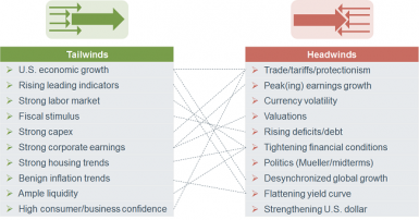
More broadly, at the midpoint of the year, there continue to be both headwinds and tailwinds for the economy and the market. Trade uncertainty clearly falls in the former. As you can see in the graphic below, I have loosely connected many of these, along the lines of an “on the one hand…on the other hand…” analysis. I will touch on some of these in this report; while others will be addressed in subsequent reports.
Source: Charles Schwab.
High earnings/economic growth already priced in?
As of this writing, we have yet to receive the second quarter GDP report; however, the closely-watched GDPNow forecast from the Atlanta Fed is calling for 3.8% growth—clearly a shift up in the trajectory of the economy (although down from a high of 4.8%). The Thomson Reuters forecast for second quarter S&P 500 earnings growth is 21% (after 27% in the first quarter); while it’s 23% and 20% for the third and fourth quarters, respectively. The relevant question for markets is whether these economic and earnings growth rates are sustainable and/or whether the expectations bars are getting set too high?
As is often said, earnings are the mother’s milk for stock prices; but what is lesser known is that at high earnings growth rates, stocks often have middling returns as they tend to anticipate the inevitable inflection point (when earnings stop getting better, and start getting worse). If you break historical earnings expectations into three primary zones—more than 14.2% growth, between 3.4% and 14.2% growth and less than 3.4% growth—the market returns may be surprising. Since 1984, during the highest zone for earnings growth, the S&P 500 was actually down a median 2.9%; during the middle zone, the S&P was up a median 10.2%; and during the worst zone for earnings, the S&P was actually up nearly 14%.
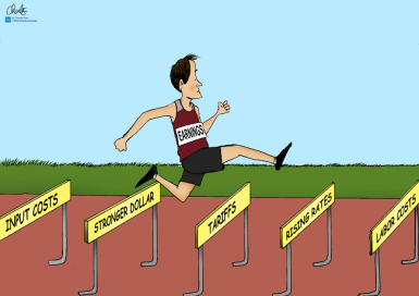
Tax reform provided a huge jolt to earnings in the first quarter and to estimates for the remainder of this year. But comparisons will begin to get more difficult, so expect a slowing in the year-over-year growth rate in earnings. Aside from the simple math, there are also some high hurdles which earnings growth face in the near-to-medium term, including trade/tariff hits, rising labor and input costs, the strong dollar and rising interest rates.
Source: Charles Schwab.
Hot topic: yield curve
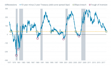
The yield curve continues to flatten and continues to cause consternation. As you can see in the chart below, the spread between 10-year and 2-year Treasury yields recently flattened to less than 35 basis points. Clearly, this is getting close to an inversion; but it’s important to look historically at the relationship between the yield curve at similar spreads and the action by the stock market and economy. In the table accompanying the yield curve chart below, you will see that there typically remained a decent length of runway between 35 basis points and trouble for either the stock market or the economy. Even from the point of inversion, there was a bit of runway left before trouble ensued.
Too Soon to Fret Flat Yield Curve?

Source: Charles Schwab, Bloomberg, FactSet, as of June 29, 2108.
A flattening yield curve is normal at this stage in the economic cycle; with the Federal Reserve having begun a rate hiking campaign in December 2015, followed by the shift from quantitative easing (QE) to quantitative tightening (QT) last fall. For what it’s worth, the average span between the inversions highlighted above and the beginning of recession was 18 months (median of 20 months); while the average span between those inversions and the beginning of bear markets was 41 months (median 21 months). By the way, the reason for the much higher average than median in the latter comparison is due to the extremely long 134 month span between the January 1989 inversion and the March 2000 bear market start.
We anticipate the Fed will hike rate twice more this year given movement in both of the Fed’s mandates—inflation and employment. Other global central banks—notably the European Central Bank (ECB)—are also moving toward policy normalization, which means the tide of global liquidity is receding. As they say, when the tide goes out, it’s time to start looking for the naked swimmers.
Inflation, here it comes
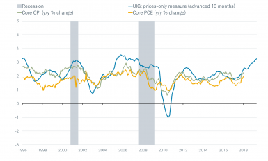
Rising inflation risk and the tightness of the labor market come alongside stronger economic growth—which is good for Main Street—but have implications for risk assets. As you can see in the first chart below, a newer gauge of inflation constructed by the Federal Reserve Bank of New York is the Underlying Inflation Gauge (UIG), which tends to lead changes in the more well-known measures of inflation. Already, all three measures are at or above the Fed’s 2% target for inflation. Higher inflation is an impediment to valuation expansion; meaning the market needs to rely more on earnings growth and less on valuation expansion.
Inflation Trending Higher
Source: Charles Schwab, Federal Reserve Bank of New York, Ned Davis Research (NDR), Inc. (Further distribution prohibited without prior permission. Copyright 2018(c) Ned Davis Research, Inc. All rights reserved.), as of May 31, 2018.
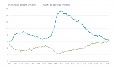
As mentioned, the labor market has become increasingly tight as well—which in turn has implications for Fed policy, but also profit margins. The chart below shows the relationship between job openings and the number of people still unemployed. For the first time in the history of the data, there are more job openings than there are unemployed people. Caveat: there remains an ample and burgeoning skills gap such that many of the jobs available aren’t matched by the skills of the unemployed.
More Jobs Than Unemployed People
Source: Charles Schwab, Department of Labor, FactSet, as of April 30, 2018.
Volatility: rule, not exception
Tighter monetary policy and financial conditions were pre-conditions for the increase in volatility this year; and that force is not likely dissipating any time soon. But on the subject of volatility, please note that last year’s lack of volatility was the exception, not the rule. This year is more in keeping with the rule, and consistent with late-cycle tendencies.
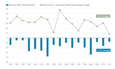
Another reason to expect continued bouts of volatility is that we’re in a midterm election year (duh). History has not been kind to midterm election years in terms of stock market weakness. As you can see in the chart below, the average maximum drawdown in midterm years since 1950 has been -17%, with the weakness tending to be concentrated in the pre-election day period—specifically in the summer months. But there’s a good news caveat here: as you can also see in the chart, there has been a consistent tendency historically for post-drawdown rallies, averaging a hefty +32% in the subsequent year.
Midterm Years’ Jeers Followed by Cheers
Source: Charles Schwab, Bloomberg.
Stimulus: ample, but late
Let me end on another positive note (albeit one with a caveat). Fiscal stimulus—both tax and regulatory reform—has had a material impact on the trajectory of both the economy and corporate earnings, and that tailwind should persist at least in the near term. However, with that sugar high comes the side effect of deteriorating budget deficits over the next decade. And, as debt is the cumulative effect of running budget deficits, debt continues to expand rapidly. In fact, among all major economies, the International Monetary Fund (IMF) expects only the United States to have a rising debt burden in the next five years. Although households are in relatively good shape courtesy of their post-financial crisis deleveraging, public and non-financial corporate sectors’ debt has surged. This is both a risk—as rates continue to rise and interest payments balloon—and an impediment to economic growth due to the “crowding out” effect on other spending.
Some readers may now be wondering why I didn’t include my favorite topic and indicator in this report—investor sentiment. That’s because I presently see it as neither a headwind nor a tailwind. In late January, collective measures of sentiment had reached a historically-high level of optimism (a contrarian indicator and proximate “cause” of the ensuing correction). That optimism came off the boil during the correction, but never created a pessimistic enough foundation for the next major move higher. For now, sentiment is generally neutral.
In sum (and a reminder)
With competing headwinds and tailwinds, the U.S. stock market has been largely range-bound since the January-February correction. If a few things go right in the near-term, including an easing of trade tensions, stocks could break out on the upside. But there are the aforementioned catalysts for a break out on the downside as well.
I’ll close with what may arguably be the most instructive and important visual below—highlighting what investors need to consider; especially if they are cheering the better economic and earnings news we have seen and could continue to see. Admittedly, I chose extreme examples; but instructive ones nonetheless. Take a look at how great the economic/earnings data was around the ultimate market peak in March 2000; and how horrific the data was around the ultimate market bottom in March 2009.
This may be the first year in some time that “Main Street” feels better than “Wall Street.” Investors often feel most comfortable about investing when the economic/earnings data is stellar; but it’s typically the case that the data is at or near its best readings at market tops. The opposite is true at market bottoms. Again, better or worse tends to matter more than good or bad.
Stocks Tend to Nail Economic Inflection Points

Source: Charles Schwab, FactSet, Thomson Reuters I/B/E/S. AAII=American Association of Individual Investors.
In early 2009, equities became extremely attractive from a risk/reward perspective, in spite of weak economic growth; because monetary policy was exceptionally easy, equity valuations were attractive and forward earnings expectations were bottoming at extreme lows. Fast-forward to today, and we see an economy that’s late in its up-cycle amid a tight labor market and tighter monetary policy. Perhaps not all of the good news is priced into the stock market, but the risk/reward proposition has unquestionably deteriorated. I’ll conclude where we did in our first half outlook, with a message to investors that now is the time to focus on discipline, including diversification and rebalancing.
Copyright © Charles Schwab & Co


