


by Steve Blumenthal, CIO, CMG Management
“There are essentially two forces influencing returns: growth and inflation.
The task, then, is building a portfolio that can weather any scenario, regardless of what
these factors are doing… You should be building a diversified portfolio with assets
that are balanced according to their risk rather than their dollar amounts.”
– Ray Dalio, Founder, Bridgewater Associates, LP
President Donald J. Trump nominated Jerome Powell to be chairman of the Federal Reserve Board. If confirmed, Governor Powell will replace Janet Yellen in February. Powell is smart, well-liked and respected by Republicans and Democrats alike.
Importantly, Powell’s confirmation as chairman of the Fed Board means there will be no change in monetary policy. He has never dissented against Chair Yellen on any interest rate policy decision. Yellen has raised rates four times since December 2015. Expect to get more of the same.
The same is a desire to get interest rates near 3%, or so-called “normalization.” Federal Reserve policymakers have raised their target for the benchmark federal funds rate by a quarter point, to a current range of 1 percent to 1 1/4 percent. Despite the increase, inflation, as measured by their preferred indicator (year-over-year change in the PCE Price Index), remains well below their targeted 2% inflation rate.
The index is reported monthly with a one-month lag. The Fed’s conundrum is that while the labor market is strong, the other part of their “dual mandate,” inflation, is not responding as their models might suggest. Here is a look at the year-over-year change since December 2015 (data from the St. Louis Fed). Not so good on the inflation goal front.
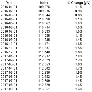
Source: Federal Reserve Bank of St. Louis, Economic Data
Tighten (raise rates) more? Currently, odds show a 90 percent probability of a December rate hike. The next PCE Price Index number comes out on November 30. Keep it on your radar.
Last week I wrote about the Fed. Specifically, “Don’t Fight the Tape or the Fed.” Despite four rate increases, the Fed model is neutral and the trend (or tape) component is bullish. So put that in your mildly bullish bucket.
However, the drum beat pounds on as the Fed looks to normalize rates. Expect more of the same game plan with Powell as chairman.
The Fed is wedded to the Phillips Curve. It believes that low unemployment will drive wages higher and inflation higher. Yellen recently said that low inflation is “a mystery.” We are not yet seeing the inflation they believe we should be seeing. Mystery indeed but stay alert. Yet they are determined to get to 3% and that will likely bring risk back into the global markets. The following is from Ambrose Evans-Prichard:
The message from a string of BIS [Bank of International Settlements] reports is that the US dollar is both the barometer and agent of global risk appetite and credit leverage. Episodes of dollar weakness – such as this year – flush the world with liquidity and nourish asset booms. When the dollar strengthens, it becomes a headwind for stock markets and credit.
Nothing changes under Chairman Powell. I shared the above quote along with this next from Evans-Pritchard in late September. “The long-awaited reversal of quantitative easing will kick off in October. Deutsche Bank calls it the start of the ‘Great Central Bank Unwind,’ candidate ‘Number One’ for the world’s next financial crisis. …The puzzle is why the Yellen Fed – usually so cautious – has chosen to enter these treacherous waters when there is no strict need to do so and before it has raised interest rates to minimum safe levels. This tightening sequence makes no sense.” (Source: Yellen Fed courts fate by reversing QE so soon.)
Makes no sense? The Fed is in a challenging spot. I wrote about inflation a few weeks ago and noted there are signs of inflation appearing and that a new inflation indicator from the New York Fed called the Underlying Inflation Gauge (UIG) suggests that inflation pressures may be on the rise. Specifically, the price-only component called UIG has been edging higher since April 2015 and rose 2.3% year-over-year in September, the most since April 2012. The bigger UIG has been increasing since February 2016. It is up to 2.8% year-over-year through September and marks the fastest pace since 2006.
I personally feel the PCE Price Index and Core CPI understates the inflation you and I are actually experiencing, but they are the Fed’s go-to gauges. Notable is that PCE tends to lag and follow UIG. If that’s the case, the Fed will continue to raise rates. On the one hand, we have the data in the chart above; on the other hand, we have inflation rumblings in UIG. But where do you place your bets? What will happen over what kind of time frame?
Fundamentally, I find myself in Dr. Lacy Hunt’s camp. As he said in his recent quarterly client letter, “These existing circumstances indicate that a Fed policy of QT (quantitative tightening) and an indicated December hike in the federal funds rate will put upward pressure on the short-term interest rates. At the same time, lower inflation (SB here – Lacy argues we will ultimately see lower inflation) and the resultant decline in inflationary expectations will place downward pressure on long Treasury bond yields, thus causing the yield to curve to flatten. Continuation of QT deep into 2018 would probably cause the yield curve to invert.” You can find his quarterly client letter here.
Steve, translation into English please: Once again, the Fed is going to drive us into recession. This is the worst recovery of all recoveries since WWII and it required the greatest injection of unprecedented global central bank liquidity and even asset purchases. And with all of this, our initial starting conditions are not great. Sub-par growth, record high debt, aging demographics and a coming-down-the-tracks-at-us-quickly pension crisis. Because of this, Lacy is saying the Fed is making a mistake. Raising rates will drive us quickly into the next recession. I think they will raise rates another 25 basis points in December.
My friend, John Mauldin, shared the following during a panel discussion a few weeks ago. I love his honest way. He said, “You know, this market has me so confused. Honestly, I think that trying to make predictions about market leadership in a market that just keeps relentlessly wanting to go up. I think where the leadership is actually coming from is the move into passive investments. I mean they’re buying these big across-the-board indexes. And not only that, the Bank of Switzerland now owns something like 4% or more of the S&P 500 and the Bank of Japan is buying the S&P 500. They’re buying products that track the indexes, they’re not stock picking, they’re just saying, ‘We want the whole thing.’ If there’s any leadership out there, it’s coming from the move to passive investing.” Amen, brother John.
We humans tend to herd and boy are investors herding. Much like investors did in 1999. Then it was the tech stock craze. More buyers than sellers and prices goes up. More buyers into the same few stocks and prices really go up. Until they don’t. Minus 75% and 15 years to get back to breakeven was the cost of that error. Were value plays the better pick then? Yes. Were utility stocks a better pick then? Yes. Were bonds a better pick? Yes. Was portfolio diversification a better plan? Yes. But everyone wanted that shiny red Ferrari.
So when your moderate growth client calls in wanting to buy a Ferrari, point him or her to the risk questionnaire and investment policy statement you carefully crafted with them. And if goals and risk objectives have changed, then ok… consider the Ferrari. But one can’t expect a minivan to drive like a Ferrari or a Ferrari to provide you with the benefits of a minivan. Two different things. As Dalio said, “You should be building a diversified portfolio with assets that are balanced according to their risk rather than their dollar amounts.” Tech was the 1999 Ferrari. Passive S&P 500 Index exposure is today’s Ferrari. Well, actually FAANGs are today’s faster Ferrari but you get the point.
Grab that coffee and jump in. There are no signal changes in Trade Signals yet the link is provided for you if you’d like to view the updated charts. You’ll see that our Ferrari, the Ned Davis Research CMG U.S. Large Cap Long/Flat Index signal continues to have its foot on the gas. There is also a fun section on the time spent in drawdowns. I share a few quick valuation charts below and we’ll take a deeper look at valuations and specifically what they are telling us about coming 7-, 10- and 12-year returns next week.
The Reality of Long Periods of Underperformance
The following is from Meb Faber. I felt it worth sharing with you. Please feel free to share it with your clients.
One of the biggest challenges of investing is long periods of underperformance, or outright negative performance and losses. Cliff Asness has a fun piece out on his blog where he talks about 5 year periods in stocks, bonds, and commodities and basically how anything can happen.
Unfortunately for investors there are only two states – all-time highs in your portfolio and drawdowns. Drawdowns for those unfamiliar are simply the peak to trough loss you are experiencing in an investment. So if you bought a stock at 100, and it declines to 75 you are in a 25% drawdown. If it then rises to 110 your drawdown is then 0 (all time high).
One challenge for investors is how much time they spend in drawdowns. It is emotionally challenging largely since they anchor to the high value in their portfolio. If your account hit $100,000 last month up from $20k ten years ago, likely you think of your wealth in terms of the recent value and not the original $20k. If it then declines to $80k, many think in terms of losing $20k rather than the long term gain.
I thought it would be interesting to look at a few asset classes and ask how long they spend in each outcome – either all-time highs or in a drawdown. Below is a chart of a basic 60/40 portfolio’s drawdown since 1972, REAL RETURNS. Notice how brutal the high inflation 1970s were to the portfolio:
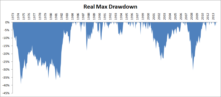
The investor only spends about 22% of the time at new highs, and the other 78% in some form of drawdown. A few values for common asset classes below….
- US Stocks 17% new highs, 73% in some form of drawdown
- Foreign Stocks 12% new highs, 88% in some form of drawdown
- Bonds 16% new highs, 84% in some form of drawdown
- REITs 16% new highs, 84% in some form of drawdown
- Commodities 9% new highs, 91% in some form of drawdown
- Gold 4% new highs, 91% in some form of drawdown
- 60/40 22% new highs, 91% in some form of drawdown
Meb concludes, “So if you’re going to be an investor, get used to being a loser!”
If you are an advisor, like me… no wonder the job is challenging. Maybe we should have gone into plastics.
A Quick Look at Valuations
The P/E 10 ratio is the smoothed average over a 10-year period. We’ll look at price-to-sales, price-to-book, median P/E and even Warren Buffett’s favorite measure next week. They are all near or at record high valuations. So yes – we should step forward with caution.
I like this next chart because it puts things into perspective. It uses a percentile analysis to put today’s market valuation in the historical context. As the chart below illustrates, the latest P/E 10 ratio is approximately at the 97th percentile of the series data going back to 1870.
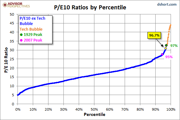
Source: dshort.com
Volume Precedes Price
In case you missed the post, following is a reprint of a previously-shared OMR topic. I believe it is something that may help us assess overall market risk.
In the “what you can do” category, you can control a good portion of the risk in your clients’ portfolios. I share ideas each week in Trade Signals (link below). There are other processes like putting a 200-day stop-loss rule in place. Though that is not my preferred method. I liked this next quote from Ned Davis.
“The late analyst, Joseph Granville, liked to say that ‘volume precedes price.’ By this, he meant that daily and weekly volume on the stock exchanges usually peak out prior to the bull market peak in prices. I think this is almost universally correct at tops, and is often true at bottoms where the peak volume comes on a selling climax with lower volume on a test of these lows.” – Ned Davis
NDR tests just about everything. By now you know I’m a big fan. My friend, Robert Schuster, refers to NDR as “myth busters.” Maybe that’s why I like them so much. Recently, they shared some of their research that takes an objective look at volume and found volume more useful when divided into up (demand) and down (supply) volume.
One of the trade signals I post each week looks at just this. It measures volume demand (think of it as buyers) vs. volume supply (sellers). More buyers than sellers is what drives prices higher or vice versa. Looked at statistically, it looks like this:
Here is how you read the chart:
- Focus in on the stats boxes at the bottom of the chart.
- Shaded is the current regime, i.e., currently more buyers than sellers.
- Note the returns in each regime.
- The middle section (black line) tracks the volume demand (buyers) and the (red line) tracks the selling supply. When buying demand is greater than selling supply, it is a buy signal. Reverse is a sell signal. Current regime is large yellow circle with green outline.
- Note the great sell signal in 2007 and the one in 2000. And the buy signal in 2015.

Source: Ned Davis Research
I like watching this chart because it removes noise and tells me what’s happening in the markets. Volume precedes price. Makes sense. For now, there are more buyers than sellers and this indicator still leans mildly bullish. Not perfect but well worth keeping our eyes on.
Long-time readers know that I am a big fan of Ned Davis Research. I’ve been a client for years and value their service. If you’re interested in learning more about NDR, please call John P. Kornack Jr., Institutional Sales Manager, at 617-279-4876. John’s email address is jkornack@ndr.com. I am not compensated in any way by NDR. I’m just a fan of their work.
Trade Signals — Feeling Good with Altitude Worry
S&P 500 Index — 2,577 (11-1-2017)
Notable this week:
No changes in the indicators or signals since last week. Outside of global geopolitical risks and extreme equity market overvaluations, the most significant short-term issue I see this week is the extreme investor sentiment (optimism). Yet trend trumps sentiment, so I remain moderately bullish. The equity market and fixed income trade signals remain bullish. U.S. economic growth remains strong. Risk of recession in the next six to nine months remains low. Inflation risk is neutral.
Click here for the latest Trade Signals.
Important note: Not a recommendation for you to buy or sell any security. For information purposes only. Please talk with your advisor about needs, goals, time horizon and risk tolerances.
Stephen B. Blumenthal
Executive Chairman & CIO
CMG Capital Management Group, Inc.
Copyright © CMG Management