


After the 45th President of the United States was elected yesterday, the markets have had some wild swings in the immediate aftermath, but with all change, comes opportunity. This week for the SIA Equity Leaders Weekly, we are going to analyze the strong bounce taking place in the 30 year interest rate yield by looking at the CBOE 30 - Year US Treasury Yield Index, and second, look at a comparison of equities versus bonds in the SPDR S&P 500 ETF vs. iShares Core U.S. Aggregate Bond ETF (SPY vs. AGG) chart.
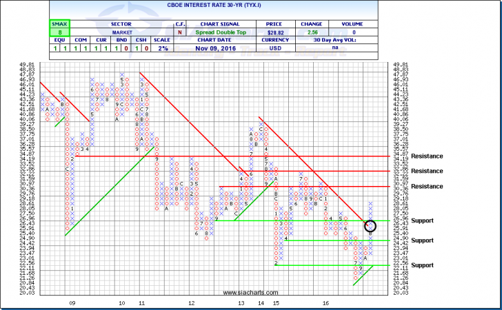
CBOE Interest Rate 30-Yr (TYX.I)
We last looked at Treasury yields just two weeks ago, but after the Presidential vote, U.S. interest rates rose sharply driving down bond prices. The 30-Yr U.S. Interest rate (TYX.I) had its biggest day-to-day increase since August of 2011. The 10-year Treasury also had its biggest one-day increase since July of 2013. Investors are digesting the fiscal implications of what a Trump presidency might mean and the short-term reaction has been negative for bond prices going forward on the idea of Trump's potential fiscal policy changes taking some of the weight off of monetary policy. The implications going forward will have major influences not only on the 30 year interest rate yield, but also the relative strength rankings of various duration and credit quality fixed income investments both within the US universe but also on a international scale.
This new rally we're witnessing in the 30 year yield has made its way all the way up and now through the downtrend line which began in late 2013. Resistance levels are now found above at around 3.1% and 3.29%, which is the high from 2015. Support to the downside is found at 2.696% and at 2.442%.
Click on Image to Enlarge
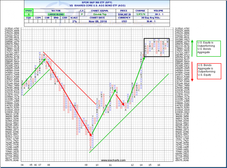
SPDR S&P 500 ETF vs. iShares Core U.S. Aggregate Bond ETF (SPY vs. AGG)
The comparison chart between the U.S. Equities and the Bonds continues to be an important comparison to monitor as the markets move forward. When the chart is moving upwards, this tells us that U.S. Equities are outperforming Bonds (shown with the green arrow). When the chart is moving down this indicates that Bonds are outperforming U.S. Equities. The relationship between these two asset classes has not been directional since the middle part of 2015 and has been range bound for much longer as shown by the black box. This back and forth battle is why we don’t see a clear leader in the Asset Class Rankings with Bonds and Equities trading blows. This back and forth battle though still trends upwards and slightly favors Equities given the Green EAC. This crossroad is potentially coming to a head from recent movements with a break above the current range a positive indicator for equities moving forward.
Within the U.S. Equity and Fixed Income asset classes, important battles are also going on right now as the election results have given some initial potential direction for different stock sectors and different bond types. The best way to measure these new trends and money flows is through relative strength analysis looking at both the short/medium term outlook and the long-term relationships moving forward.
Click on Image to Enlarge
SIACharts.com specifically represents that it does not give investment advice or advocate the purchase or sale of any security or investment. None of the information contained in this website or document constitutes an offer to sell or the solicitation of an offer to buy any security or other investment or an offer to provide investment services of any kind. Neither SIACharts.com (FundCharts Inc.) nor its third party content providers shall be liable for any errors, inaccuracies or delays in content, or for any actions taken in reliance thereon.
For a more in-depth analysis on the relative strength of the equity markets, bonds, commodities, currencies, etc. or for more information on SIACharts.com, you can contact our customer support at 1-877-668-1332 or at siateam@siacharts.com.
Copyright © SIACharts.com