


Efficient Frontier “Theory” for the Long Run
by Clifford Asness, Ph. D. AQR Capital Management, Inc.
(Corrected December 12, 2014)
Financial theory has taken a lot of abuse recently, specifically some of the basic tenets of modern portfolio theory. Some of it we at AQR aid and abet (just two examples: markets are good but not perfect, and risk balancing beats capitalization weighting). But a fair chunk of the abuse comes from our industry’s collective tendency to judge ideas over relatively short periods, even if — or precisely because — short periods often feel like long periods. Thus, it’s important to occasionally step back and note that when examined properly, the very basics hold up better than many think or sometimes casually assert.
To explore this, I’m going to do some analysis very similar to something I saw Gary Brinson do many years ago (at least I think it was Gary; of course, while I’ve stolen the basic idea, any errors of concept or execution are my own). While the whole concept is borrowed, a fair amount of this will be out of sample as I’m getting old and it was a while ago! To start off, if you wanted to create an efficient frontier of stocks, bonds and commodities (here, I just look at the U.S., though I think, from distant memory, that Gary’s version included international and possibly small stocks, too) you’d probably expect:
- Bonds (U.S. 10-year Treasury bonds) to be lower volatility and lower expected return;
- Stocks (S&P 500) and commodities (S&P GSCI) to be higher volatility and higher expected return. Having said this, commodity expected returns are more difficult to pin down. Why? Certainly they are harder because their weight within the market portfolio is quite arguable, but also because they seem to have low correlation with the market portfolio of wealth. So, unlike equities you probably expect lower returns compared with their volatility. In fact, whether or not you expect positive excess returns over cash for commodities is a controversial topic. We would (just our opinion) expect positive — but not as high as stocks (again, because their risk is more diversifiable) — even though commodities have been, and probably will remain, quite volatile. Of course, we also have the benefit of knowing what the final figure at the end of this piece looks like!
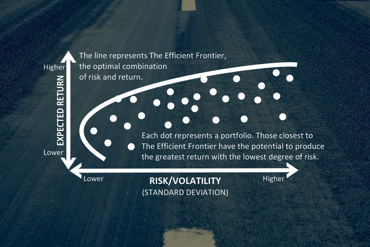
All of the analysis below is done using excess returns over cash, and represent annualized realized monthly arithmetic average returns and annualized monthly standard deviations.
We begin with 1970-1974 and proceed in five-year increments (for all of the charts I keep the range of the X axes constant, as is my preference for comparing exhibits, but I can’t indulge this preference for the Y axes because they just vary too much).

Well the first five-year period certainly doesn’t look right! Stocks shouldn’t have a lower expected return than bonds (I’m foreshadowing the ultimate point here of course as these are not “expected” returns but realized returns). And negative to boot! And commodities can’t be that good. What gives? This theory stuff is not starting out well… Maybe the next five years will restore some sanity?

Darn, different but not much better. Stocks earned positive returns (though not enough to offset the early-decade losses). But now bonds are losing money: they sure aren't riskless. Investing is hard.
Maybe the next five years will do it. I certainly hope so…

Finally, stocks and bonds demonstrate a pretty reasonable fit with our priors, albeit with an incredibly volatile period for bonds (almost as volatile as stocks and commodities). And it’s doubtful anyone would ever invest in commodities, perhaps not even as a hedge, with an expected loss of nearly 10% per annum and a lot of volatility to boot. Finally, as a premium over cash, <4% on equities is certainly more reasonable than losing money, but ain’t so great. Theory isn’t as disastrous here but certainly not looking strong.
By the way, you might remember we had a fairly devastating recession during this period. It really crushed stocks and made bonds soar for the whole five years, didn’t it? Well, no, it didn’t. It probably was responsible for crushing commodities if that helps get you through this long dark night of efficient frontiers, but stocks seemed to survive OK. It’s just a nice statement (one we’ll emphasize again a few times) that the headline events over even a five year period often are short-term and less impactful than you might think.
The next five years have to make sense, they just have to…

OK, now we’re talking. Bond volatility, though still high by historic standards, is more reasonable than that crazy 1980-84 ride. All realized returns are positive over cash, and stocks > commodities > bonds. All is good in the world. Except… Nah, it would be churlish to object now. OK I’ll say it. These returns are pretty high. Really high. Do people really expect/require 12% over cash (over cash!) to own stocks? Do they need 7% over cash to own bonds? Theory doesn’t predict negative expected returns but it also doesn’t predict giant positive ones. I’m beginning to think this theory stuff is really overrated…
Also remember that this period includes the great crash of October 1987. See how such a crash can kill stock returns? They only made about 12% over cash this period. Wait, that’s an awesome return. But there was a crash, I know there was… Also, though stock volatility does look a bit high, it’s not close to crazy high. But a massive crash happened! Something odd is going on…
But I have high hopes for 1990-94. Really. I do. Promise.

Well those hopes were partially realized. 1990-94 is the best one yet. Both bonds and stocks look pretty reasonable, though the GSCI is a big disappointment. Taking that kind of wild volatile ride only to lose money vs. cash can’t be rational can it?
Oh, and recall that a crushing period for bonds, the 1994 Fed hike, is included in this period. But you really can’t see its effects can you?
All in all, definitely this efficient frontier looks the most intuitive so far, even if far from perfect. Maybe we’re on a roll. Come on 1995-1999!

Wow! By the end of this period people were shouting Dow 36,000! Stocks for the long run! So, our hopes for a roll have been dashed. This doesn’t look right at all. Remember, too high is as wrong (for theory, more fun for investors) as too low.
Equity returns are way higher than we’d rationally ever expect/demand, bonds far lower versus stocks (though perhaps reasonable on their own), and the GSCI basically flat for half a decade; hardly a win for such a high-volatility asset class. This period is a bust. It doesn’t fit theory at all. Maybe it is theory that’s a bust.
So, after such a weird five years, we’re owed a “normal” looking five-year efficient frontier, right?

Nope. Sigh. So very far from normal. Horrifically far from normal. Really, really not even close to normal. I think you’re getting my drift. It doesn’t look normal. Theory stinks.
It was a great time to own bonds and commodities, but a terrible time to own the asset we’d expect the most from, stocks.
As a side note, this was the period of coming down from the great dot-com bubble. Given that ex post knowledge, the poor stock returns are not so surprising. But perhaps you are surprised that stock market volatility was again quite restrained (around 16% per annum) when viewed over the full five years. It seems even knowing what happened (at least some of the things that happened) it’s hard to get this stuff right. My wife and I (mainly her) did have four children within an 18-month stretch of this five year period so some things were indeed pretty volatile (at least for me). But stocks? Not so much.
I’m feeling very good about 2005-09 though, aren’t you?

This is ridiculous! After losing money for the prior five years, stocks have lost money again. This finance/efficient-frontier stuff is for the birds. I mean, besides stocks, commodities lost even worse and at huge volatility. Who would call that rational? Who’s running this place?
Note this was the period of the Global Financial Crisis. So at the very least we’d certainly expect this to be a period of wild and crazy stock market volatility, no? Well, again, no, not really when viewed over the whole five years. Volatility of 16% or so is maybe a tad high but mostly pretty darn normal. It seems you can’t even count on the seminal financial event of our times anymore to produce what you expect, when you wait at least 5 years to judge.
OK, we have one five year period left, 2010-14 (one month short actually as we’re ending in November). It’s all up to you 2010-14, you’ve always been my favorite!

* 2014 includes 11 months, January-November.
OK, this is just nuts. Returns and volatility are greater for stocks than bonds, that’s nice, it fits our theories well. But a 15% or so annual premium for stocks over cash? No sir. Not an efficient frontier I’d call reasonable. And commodities again a big and volatile loser, that makes no sense. Who would own those things if that were their expected return? Finally, if you get more than 6% over cash on your 10-year U.S. Treasury holdings, you should be praising your higher power, as it’s certainly more than a rational investor expects/demands.
Nope, while kind of pleasant ex commodities, the above is not a normal-looking efficient frontier, and not one theory takes kindly to (or vice versa).
We have one more card to play. Thankfully it’s a really good card.

* 2014 includes 11 months, January-November.
Yep, you’re looking at the same calculation methodology as before, but now we are using the full 45-year (OK, one month shy) period.
My God it is beautiful.
Bonds at about a 3.5% premium to cash. That’s probably a higher premium than we’d expect long-term, but more reasonable than most of the other periods (as I’m typing this, bond yields are about 230 basis points over cash — while many people predict bonds will suffer price declines caused by rising rates going forward, that kind of yield premium makes a number like 3.5% look at least not so crazy).
Stocks at just over a 5% premium to cash look reasonable. It’s hard to get annoyed with that in either direction, as an investor or as a theorist.
Commodities have done well, but not as well as stocks. Remember, even though they are more volatile they’re also more diversifying (again, in theory you get paid for bearing risk you have to bear, not volatility you can diversify away). So, over this 45-year period, theory is feeling pretty good about itself.
Here’s another way to view it, ordering each asset class increasing from left to right, done separately for ordering by average return and realized volatility over the period.
|
|
Ordered by Average Return |
||
|
1970-74 |
S&P 500 |
Bonds |
GSCI |
|
1975-79 |
Bonds |
GSCI | S&P 500 |
|
1980-84 |
GSCI |
Bonds |
S&P 500 |
|
1985-89 |
Bonds |
GSCI |
S&P 500 |
|
1990-94 |
GSCI |
Bonds |
S&P 500 |
|
1995-99 |
GSCI |
Bonds |
S&P 500 |
|
2000-04 |
S&P 500 |
Bonds |
GSCI |
|
2005-09 |
GSCI |
S&P 500 |
Bonds |
|
2010-14* |
GSCI |
Bonds |
S&P 500 |
|
Full Period |
Bonds |
GSCI |
S&P 500 |
|
Ordered by Volatility |
|||
|
1970-74 |
Bonds |
S&P 500 |
GSCI |
|
1975-79 |
Bonds |
S&P 500 |
GSCI |
|
1980-84 |
Bonds |
GSCI |
S&P 500 |
|
1985-89 |
Bonds |
GSCI |
S&P 500 |
|
1990-94 |
Bonds |
S&P 500 |
GSCI |
|
1995-99 |
Bonds |
S&P 500 |
GSCI |
|
2000-04 |
Bonds |
S&P 500 |
GSCI |
|
2005-09 |
Bonds |
S&P 500 |
GSCI |
|
2010-14* |
Bonds |
S&P 500 |
GSCI |
|
Full Period |
Bonds |
S&P 500 |
GSCI |
* 2014 includes 11 months, January-November.
Basically, we know a lot more about volatility than the level of returns over the short term (and remember five years is still pretty short-term). I think we all know this already, and it’s implied by basic mathematics, but it helps to be reminded of its importance occasionally.
All in all, this full 45-year period is our most reasonable looking realized efficient frontier yet. So what lessons do we take away from the above, and also from living a fair amount of these 45 years “real time”?
- Five years is not a very long time. You see crazy things over five years. Of course, it often feels like a lifetime to actually live through it.
- Over the long haul (which I’ll call 45 years here though there is no perfect agreed upon definition) some of the most basic parts of financial theory look pretty darn good.
- The long haul is a really long time. It sometimes feels like several lifetimes to actually live through it.
Without trying to quantify it here, I’d wager that remembering and implementing these lessons (patience, how long is long term?, basic relationships holding up if you only have enough patience, etc.) are worth a lot of “alpha” in a loose use of that word, and are available to all free of charge. Well, free of charge unless you count the internal organ damage some of those “short-term” periods can inflict.
The point here is certainly not that theory is perfect, that markets are perfectly efficient, that the CAPM holds, that security returns are “normally distributed,” that all you should care about is mean and variance, that mean and variance are best estimated from monthly historical experience, and so on. Indeed, we have, to a significant degree, spent our careers arguing against these propositions and investigating where value can be added. The point is not arguing for perfection. The point is that the very basic tenets of our field are better than what’s often casually asserted, implied, inferred, imputed, and assumed; and that those assailing these basic tenets are too short-term oriented and sometimes far too triumphalist. The point is that even if not perfect, you have to give it up for the 45-year mean-variance plot of the three main asset classes!
Bottom line: Let’s all be nicer to theory. If we stick with it long enough, it will probably be nice to us.
This post was originally published at AQR Capital
Copyright © AQR Capital