


Mr. Market’s outlook has turned darker lately. The ongoing slide in stocks and oil, combined with an increase in the spread in junk yields over Treasuries, is creating deeper doubts about the strength of the US economy. The Treasury yield curve is still positively sloped, which implies that growth will survive. But some analysts say that this historically valuable indicator is less reliable these days because of extreme measures with monetary policy in recent years.
The hard data for macro has yet to deliver a knock-out blow and confirm that a new recession has started. But the economic numbers proper are available only through December. Real-time market indicators, on the other hand, are effectively telling us that the yet-to-be published January dataset will look ugly. That’s still a speculative call at this point. For those who take the bait it’s all about trusting Mr. Market’s forecast. In any case, we’re at a precarious point when a markets-based reading of the economic trend is signaling weaker growth or worse but without confirmation in the underlying macro numbers.
The key question is whether we should accept the markets-based projection and assume a new downturn is fate or wait for a genuine signal of recession based on a full set of indicators? For some perspective, let’s catch up on the numbers as they currently stand.
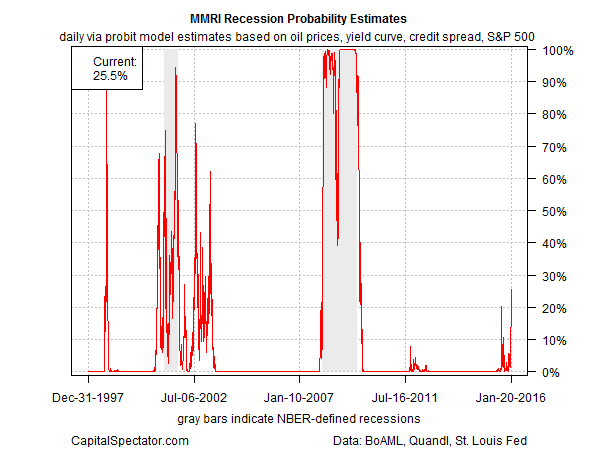
First, here’s a markets-based view of the economic trend. The Macro-Markets Risk Index (MMRI) chart below is based on a probit model that crunches the raw data on the stock market, crude oil, the junk-bond spread and the Treasury yield curve. (For methodology details, see pages 3-4 in the sample copy of the US Business Cycle Risk Report.) Not surprisingly, MMRI’s implied risk that a new NBER-defined recession has started has jumped recently. But while the current probability estimate of roughly 26% (as of Jan. 20) is the highest since the last downturn, it’s still below the 50% threshold that probably marks the point of no return.
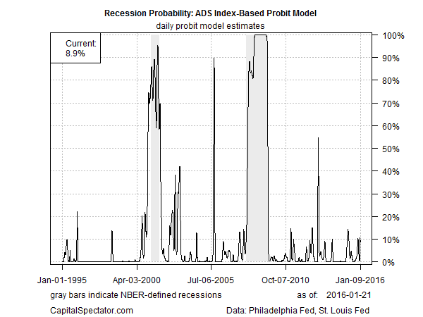
As for the economic indicators, the Philly Fed’s ADS Index offers a quasi real-time measure of the macro trend based on six datasets. The benchmark’s current reading, reflecting economic activity through Jan. 9, points to a higher level of turbulence but well short of an all-out recession reading. Analyzing the raw data for the ADS Index via a probit model translates into a low 9% probability that an NBER-defined recession started this month.
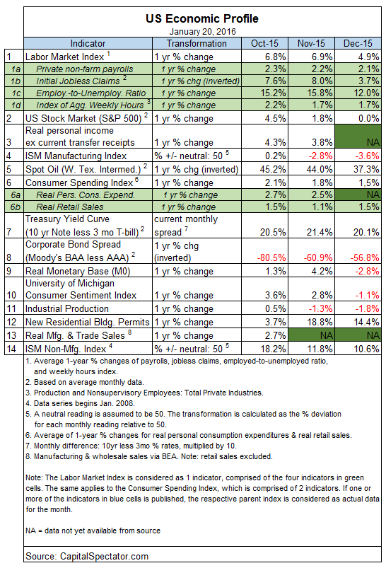
Meanwhile, a broader set of macro and market indicators through December also point to low economic risk, according to The Capital Spectator’s Economic Trend and Momentum indices (ETI and EMI, respectively). Near-term projections through February anticipate softer readings but without slipping below the danger zone. The analysis is based on a methodology outlined in Nowcasting The Business Cycle: A Practical Guide For Spotting Business Cycle Peaks![]() . Using this framework, an aggregate of economic and financial trend behavior shows that business-cycle risk remained low through December. The current profile of published indicators through last month (12 of 14 datasets) for ETI and EMI continue to signal a positive trend overall. Note, however, that there’s a bit more red ink than we’ve seen recently (see table below). The critical debate now focuses on whether the crimson tide will advance further in January and February and signal that a new recession has arrived. For the moment, econometric projections still look mildly encouraging (as discussed below), but we’re in a fluid situation at present and the outlook could change quickly, depending on the incoming data.
. Using this framework, an aggregate of economic and financial trend behavior shows that business-cycle risk remained low through December. The current profile of published indicators through last month (12 of 14 datasets) for ETI and EMI continue to signal a positive trend overall. Note, however, that there’s a bit more red ink than we’ve seen recently (see table below). The critical debate now focuses on whether the crimson tide will advance further in January and February and signal that a new recession has arrived. For the moment, econometric projections still look mildly encouraging (as discussed below), but we’re in a fluid situation at present and the outlook could change quickly, depending on the incoming data.
Meantime, aggregating the current data in the table above into business cycle indexes reflects weaker but still positive trends overall. The latest numbers for ETI and EMI indicate that both benchmarks are above their respective danger zones: 50% for ETI and 0% for EMI. Yet it’s also clear that both indexes have been falling sharply in recent months. When/if the indexes fall below the tipping points, we’ll have clear warning signs that recession risk is elevated. Based on the latest updates for December — ETI is 76% and EMI is 3% — there’s still a margin of safety between current values and the danger zones, as shown in the chart below. (See note at the end of this post for ETI/EMI design rules.)
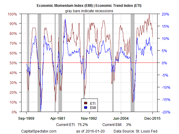
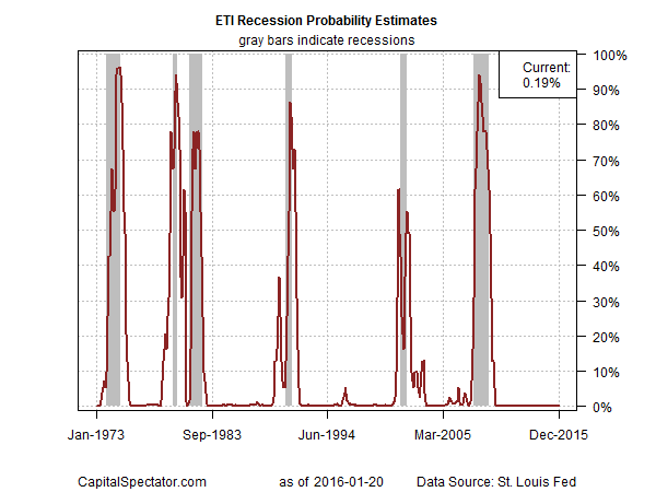
Translating ETI’s historical values into recession-risk probabilities via a probit model also points to low business cycle risk for the US–as of last month. Analyzing the data with this methodology implies that the odds are virtually nil that the National Bureau of Economic Research (NBER) — the official arbiter of US business cycle dates— will declare December as the start of a new recession.
For another perspective, consider how ETI may evolve as new data is published. One way to project future values for this index is with an econometric technique known as an autoregressive integrated moving average (ARIMA) model, based on calculations via the “forecast” package for R, a statistical software environment. The ARIMA model calculates the missing data points for each indicator, for each month–in this case through Feb. 2016. (Note that Oct. 2015 is currently the latest month with a complete set of published data.) Based on today’s projections, ETI is expected to remain above its danger zone for the near term. Nonetheless, the near-term projections call for a decline that’s only modestly above the 50% mark, which suggests that business-cycle risk may soon approach the tipping point. (Keep in mind that frequent business cycle updates are available on a weekly basis in The US Business Cycle Risk Report.)
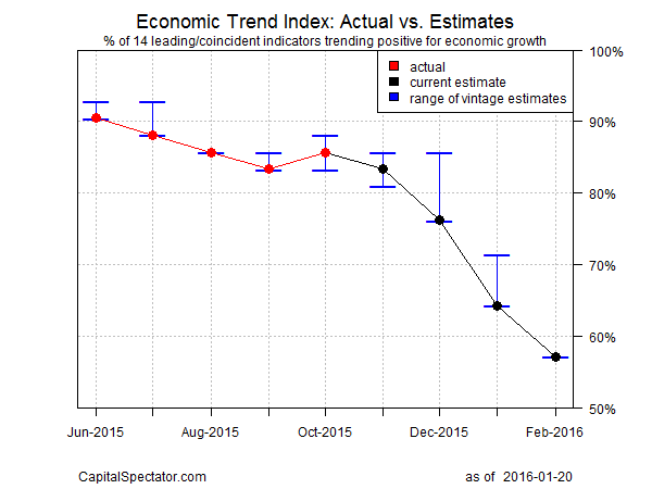
Forecasts are always suspect, of course, but recent projections of ETI for the near-term future have proven to be relatively reliable guesstimates vs. the full set of published numbers that followed. That’s not surprising, given the broadly diversified nature of ETI. Predicting individual components, by contrast, is prone to far more uncertainty in the short run. The current projections (the four black dots on the right in the chart above) suggest that the economy will continue to expand. The chart above also includes the range of vintage ETI projections published on these pages in previous months (blue bars), which you can compare with the actual data that followed, based on current numbers (red dots). The assumption here is that while any one forecast for a given indicator will likely miss the mark, the errors may cancel out to some degree by aggregating a broad set of predictions. That’s a reasonable assumption via the historical record for the ETI forecasts.
For additional perspective on judging the track record of the forecasts, here are the previous updates for the last three months:
18 Dec 2015
19 Nov 2015
21 Oct 2015
Note: ETI is a diffusion index (i.e., an index that tracks the proportion of components with positive values) for the 14 leading/coincident indicators listed in the table above. ETI values reflect the 3-month average of the transformation rules defined in the table. EMI measures the same set of indicators/transformation rules based on the 3-month average of the median monthly percentage change for the 14 indicators. For purposes of filling in the missing data points in recent history and projecting ETI and EMI values, the missing data points are estimated with an ARIMA model.