


by Jonathan Beck, SeeIt Market
Markets peaks are generally not event driven, but rather take time to develop. However, there oftentimes are very subtle warning signs that show up in the form of divergences, which can give investors an early indication that things may not be as rosy as the news/media, and even the price charts are suggesting. This is especially true at critical inflection points, in my view. I have a feeling that we may be undergoing one such divergence as I pen this brief note, as the High Yield Bond market (via HYG) and US equities (via SPY) look to be going their separate ways.
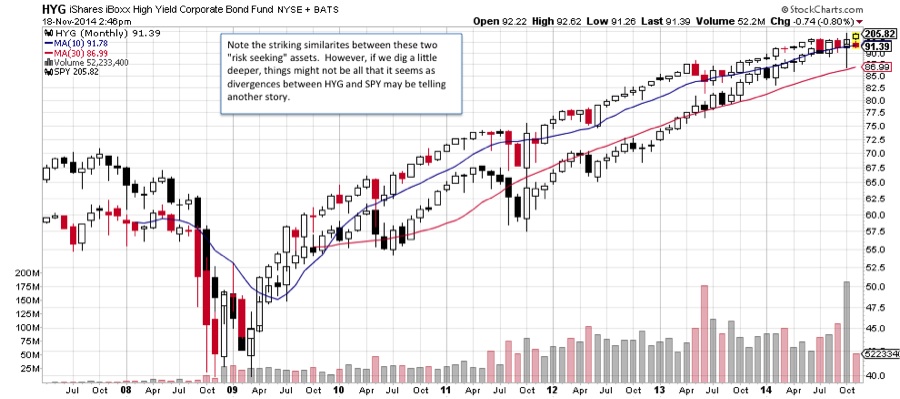
If one takes a step back though, it clearly looks as if these two “risk seeking” assets have traded nearly in lock step since the beginning of this bull market. Under the surface however, things might not be all that it seems as divergences between the iShares iboxx High Yield Corporate Bond (HYG) and SPDR S&P 500 (SPY) may be telling another story.
HYG vs SPY – Monthly Chart
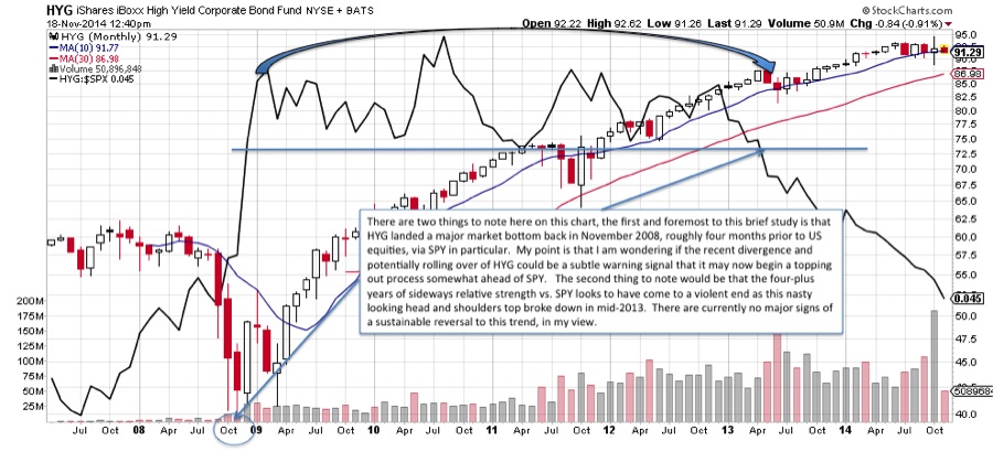
Now let’s turn our attention to the chart below. There are two things that I find noteworthy:
First and foremost, to this brief study at least, is that HYG landed a major market bottom back in November 2008, roughly four months prior to US equities, via SPY in particular. What I am wondering now is if the recent divergence and potentially rolling over of high yield bonds could be a subtle warning signal that HYG is starting to top out in advance of SPY.
The second thing to note would be that the 4-plus years of sideways relative strength vs. SPY looks to have come to a violent end as this nasty looking head and shoulders top broke down in mid-2013. There are currently no major signs of a sustainable reversal to this trend, in my view. So, although there still seems to be a strong preference for SPY over HYG, it is also a sign that investors have gravitated to the relative safety of SPY. One concern that I have is if this may also suggest a crowding out trade into SPY as investors run out of choices, or in some cases, places to hide (more in a future post).
HYG Monthly Chart vs HYG:SPY Ratio
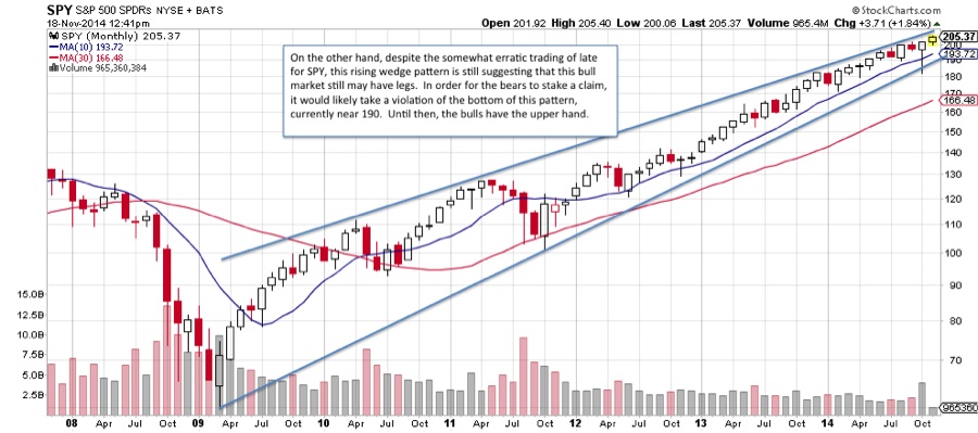
On the other hand, despite the somewhat erratic trading of late for SPY, the long-term rising wedge pattern shown in the chart below is still suggesting that this bull market may have room to run. In order for the bears to stake a claim, it would likely take a violation of the bottom of this pattern, currently near 190. Until then, the bulls have the upper hand.
S&P 500 (SPY) Rising Wedge Pattern
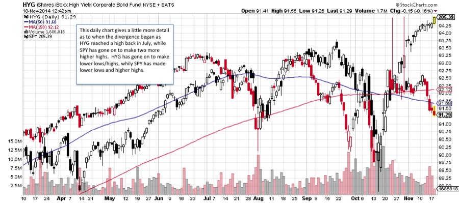
This daily chart gives a little more detail as to when the divergence began as HYG reached a high back in July 2014 but has since failed to trade higher. SPY on the other hand has gone on to make two more higher highs, albeit with a lower low.
HYG vs SPY – Daily Chart
The bottom line here is that as certain assets bottom first and lead to the upside, they may also peak first and thus lead to the downside as well. It is possible that the high yield bond ETF (HYG), which reached a cyclical bottom ahead of SPY, may now be showing signs of weakness and this divergence may be an early warning sign that all may not be well with SPY. Time will tell.
Follow Jonathan on Twitter: @jbeckinvest
No position in any of the mentioned securities at the time of publication. Any opinions expressed herein are solely those of the author, and do not in any way represent the views or opinions of any other person or entity.