


Whenever you hear a reference to how the market is doing on the major news networks, the broadcast invariably refers to the performance of the Dow Jones Industrial Average. While the index is not nearly as broad a representation of the US economy as the S&P 500, the performance of the index typically tracks the S&P 500 pretty closely. Enough at least for the average Main St. investor.
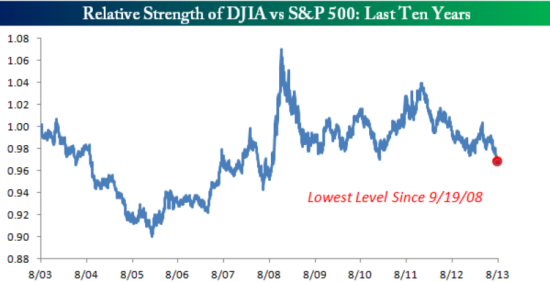
More recently, however, the DJIA has been a notable laggard compared to the S&P 500. In a post yesterday, we noted this trend when we highlighted the fact that more than half of S&P 500 stocks were above their 50-day moving average while only a third of DJIA stocks were above the same threshold. The chart below shows the relative strength of the DJIA vs. the S&P 500 over the last ten years. When the line in the chart is rising it indicates the DJIA is outperforming, and when the line is falling the DJIA is lagging. As you can see in the chart, in the last several months the DJIA has been underperforming to such a large degree that the relative strength vs. the S&P 500 is at its lowest levels since the depths of the Financial Crisis!

Copyright © Bespoke Investment Group