May 24, 2012
Randy Frederick
Managing Director of Trading and Derivatives, Schwab Center for Financial Research
Key Points
- Sometimes understanding the past can help you with your forecasts.
- Pattern repetition can lead to potentially more reliable forecasting.
- Study and learn from history, but we recommend that you don't base your trading strategies entirely on history.
Does history really tell us anything about today's market? Trading has certainly changed from the day of brokers trading in the streets to today's high-frequency traders. Indeed, the trading environment of yesteryear is as foreign to modern-day markets as a horse and buggy are to a Formula 1 race car.
And yet it often seems that the more things change, the more they stay the same. We often find that we rely heavily on past performance (or more specifically, past data) to forecast the future, because history has shown that past patterns often re-emerge, and quite frankly, history is all we have.
Technical patterns
As both an active trader and a market analyst, I spend quite a bit of my time looking for market patterns. Then I watch to see if things play out the same way this time. The belief that patterns repeat themselves is essentially the foundation on which technical analysis is based.
While I'm not strictly a technical trader, I think it's unwise to ignore technical indicators. Because whether or not I believe technical analysis has merit, as long as market participants take action based on technical events, these events are worth watching.
Taking this into consideration, what makes a pattern noteworthy? The answer is repetition—or how many times it has occurred in the past with the same or a similar result.
Golden Cross and Death Cross
In the world of technical analysis, one of the most frequently discussed patterns is the Golden Cross—when a 50-day simple moving average (SMA) crosses up through a 200-day SMA. This is often seen by technical traders as a sign of a continuing bullish market.
The opposite of a Golden Cross is known as a Death Cross—when a 50-day SMA crosses down through a 200-day SMA. As you might imagine, this is most often seen by technical traders as a sign of a continuing bearish market.
But do they work? To find out, I looked at S&P 500® Index (SPX) data from 1950 to the most recent Golden Cross (January 31, 2012) to see what typically happens following these events.
Since 1950, there have been 31 Golden Crosses and 32 Death Crosses. The average return for a long position on the SPX going forward one year from each of these signals was 3.8% for the Death Cross and 10.2% for the Golden Cross. So interestingly, the Death Cross signal wasn't actually bearish, just less bullish for the one-year period following the events observed.
Looking at more recent history, the results are pretty similar. Since 2003, there have been five Golden Crosses and five Death Crosses. The average return for a long position on the SPX going forward one year from each of these signals was 8.5% for the Death Cross and 9.2% for the Golden Cross. So again, the Death Cross wasn't actually bearish, just slightly less bullish.
The chart below depicts all of the 50/200 SMA crossover points for the past four years.
- The yellow line is the 50-day SMA and the pink line is the 200-day SMA.
- Notice how the crossovers never signal the start of a bullish or bearish trend, but rather the continuation of a trend.
Crosses in Action
Source: StreetSmart Edge®.
Now, let's say that since 2003 you had gone long only on the Golden Cross and short only on the Death Cross. Here's what would have happened:
- For the five bullish signals since 2003, the average return on the SPX going forward from each Golden Cross until each Death Cross was 8.6% (so a long position would have gained 8.6%).
- For the five bearish signals since 2003, the average return on the SPX going forward from each Death Cross until each Golden Cross was 0.0% (so a short position would have essentially broken even).
- The most recent Death Cross was August 12, 2011 and while that is typically seen as a bearish signal, if you look at this period until the Golden Cross of January 31, 2012, the SPX actually gained 12.3%.
- Since the most recent Golden Cross (January 31, 2012), the SPX has gained about 5% (as of this writing), although it has only been a few months.
Cyclical patterns
Technical patterns aren't the only events that re-emerge in the markets. Cyclical patterns can also occasionally provide insight into what the future holds. While investors should never base trading decisions strictly on cyclical patterns, the statistics associated with them are often interesting to discuss. Here are a few that I've found to be particularly noteworthy:
- Thirteen of the last 17 year-end rallies continued into January. Most recently, for example, SPX gained about 0.9% in December 2011 and about 4.3% in January.
- The fourth year of a bull market (e.g., 2012) is typically much stronger than the third (e.g., 2011). According to data compiled by Standard and Poor's Equity Research, the average third-year bull-market return for the SPX is 3% vs. 13% for the fourth year. The SPX returned 0% in 2011 and was up about 10% this year as of this writing.
- Presidential election years have been positive 12 of the last 15 times. They have an average return of 6.6% (and that includes the 38% decline in 2008). If you exclude the 2008 election, the average return jumps to 9.8% and then election years would be positive 12 of the last 14 elections. The other two losing election years were 2000 (George W. Bush) and 1960 (John F. Kennedy).
The chart below shows the start (green vertical line) and finish (red vertical line) of each presidential election year since 1950.
- The three down years (1960, 2000 and 2008) are identified with a red box.
Stock Market Action in Presidential Election Years
Source: Schwab Center for Financial Research.
Seasonal patterns
Now, let's take a look at the (sometimes) annual pattern often referred to as, "Sell in May and go away." Like so many other patterns, this "rule" appears to have historical merit. It seems like the market often begins to wind down around Memorial Day and then does not pick back up until around Labor Day.
I looked at SPX performance from 1950 through 2011 for the 68 trading days preceding the Labor Day holiday (basically June, July, August and the first week of September). Here's what I found:
- The SPX had an annual gain in 45 of those 62 years.
- But the period from Memorial Day to Labor Day (about 68 trading days) was only positive in 41 of those 62 years.
- During this 62-year period, the SPX increased from 16.66 to 1257.60, which was an average annual return of 7.22%. Note: To find out the annualized return we use the formula below.
- However, the average return for each yearly period between Memorial Day and Labor Day (68 trading days) was only about 1.1%.
So while 68 trading days represents about 27% of the approximately 250 trading days each year, the period between Memorial Day and Labor Day accounted for only about 15% of the total average annual returns. In other words, this tends to be a historically underperforming period of time.
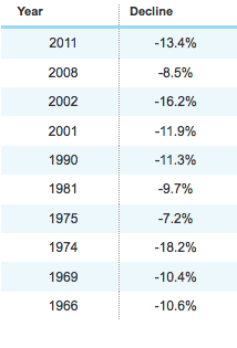
Sometimes statistics can imply patterns that aren't quite as repetitive as they appear, so below is a list of the 10 most bearish years for the Memorial Day to Labor Day period going back to 1950. While there is definitely a small bias toward negative action in more recent years, it is not as skewed as some might expect.
As shown in the chart below, sell in May and go away was a pretty good strategy for three of the last four years. But in 2009, the year the bear market ended and the SPX rose 23% overall, this strategy would have missed out on about an 8.5% gain during this period of time.
Summer Market Activity During the Last Four Years
Source: StreetSmart Edge®.
Volatility patterns
An area of the market that has garnered a lot of attention in the past few years is volatility. One of my favorite statistics in the area of volatility relates to the CBOE® S&P 500 Volatility Index (VIX). According to my calculations, the VIX has closed above 40, exactly 167 times since it was created in 1993:
- 95% of the time, when the VIX closed above 40 on a given day, the market was higher exactly 12 months later. The average gain was more than 31%.
- Only 5% of the time, when the VIX closed above 40 on a given day, the market was lower exactly 12 months later. The average loss was less than 10%.
In 2011, the VIX closed above 40 on 11 days between August 8, 2011 and October 4, 2011. The average level of the SPX between August 8, 2011 and October 4, 2011 was about 1,170. So from a strictly historical perspective, there could be about a 95% likelihood that the SPX will be higher than Q3 2011 by Q3 2012, perhaps sharply higher.
Looking at this data a slightly different way, because historical spikes in the VIX were concentrated in just seven specific periods of time, it may make more sense to view the results if you simply went long the SPX1 on the day of the very first spike above 40. If you did, the results would have been as follows:
- From August 31, 1998, the 12-month return was 37%
- From September 17, 2011, the 12-month return was -15%
- From July 22, 2002, the 12-month return was 20%
- From September 19, 2002, the 12-month return was 22%
- From September 29, 2008, the 12-month return was -3%
- From May 7, 2010, the 12-month return was 20%
- From August 8, 2011 to the time of this writing, the return has been approximately 15
The chart below shows the seven periods above. The green lines represent gains over the next 12 months; the red lines represent losses. The pink line represents the inverse of the VIX and the black line shows the SPX. The red line at the bottom illustrates the equivalent level of 40 on the VIX. Since the VIX is mapped inversely, any time the VIX closed above 40, the pink line will be below the red horizontal line on this chart.
Seven VIX Spikes
Source: Schwab Center for Financial Research.
Bottom line
No strategy, statistic, research or historical pattern can consistently predict the future. But experienced traders study history anyway because they know that while, "History doesn't always repeat itself, it often rhymes."
For additional information or for assistance with other trading strategies, please contact a Schwab Trading Specialist at 800-435-9050.
Brokerage Products: Not FDIC Insured - No Bank Guarantee - May Lose Value
The Charles Schwab Corporation provides a full range of securities, brokerage, banking, money management and financial advisory services through its operating subsidiaries. Its broker-dealer subsidiary, Charles Schwab & Co., Inc. (member SIPC), offers investment services and products, including Schwab brokerage accounts. Its banking subsidiary, Charles Schwab Bank (member FDIC and an Equal Housing Lender), provides deposit and lending services and products. Access to Electronic Services may be limited or unavailable during periods of peak demand, market volatility, systems upgrade, maintenance, or for other reasons.
This site is designed for U.S. residents. Non-U.S. residents are subject to country-specific restrictions. Learn more about our services for non-U.S. residents.
© 2012 Charles Schwab & Co., Inc, All rights reserved. Unauthorized access is prohibited. Usage will be monitored. (0512-3478)


