


by John Mauldin, Thoughts from The Frontline, Mauldin Economics
Job Openings
Working Past 65
COVID Retirement Boom
Investing Framework
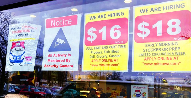
Paying More Is Happening Less
Built to Rent
Chinese Cars
Consumption Growth
WFH Plateau
Mortgage Stimulus
Quick Take on the Employment Data
Austin, NYC, and a Reading Recommendation
If a picture is worth a thousand words, this will be the “longest” letter I’ve sent you in a while, as there are quite a few pictures. It may also be the most wide-ranging.
Every Wednesday my Over My Shoulder members get a PDF file with some of the week’s most interesting charts, all selected by me and co-editor Patrick Watson. We call it Clips That Matter. We look for things that truly do matter, and often they’re not obvious until you look at them graphically. They come from a variety of sources we encounter in our voracious reading and research.
Today I’m going to share just a few of the clips we sent members over the last month. Each has a chart plus a few quick comments. These are exactly what we said at the time, except where I’ve added new information in [brackets].
If you like this kind of research, you can get a lot more by joining Over My Shoulder. At just $9.95 a month, it is by far the most “bang for your buck” economic analysis I’ve ever seen. Click here to learn more.
Since this was jobs week, we’ll start with some employment-related charts and then move on to housing, China, and other topics.
Job Openings
We’ve looked before at the US Labor Department’s job openings data, i.e., the number of positions employers would fill immediately if they had a qualified candidate. The numbers are so large as to almost defy belief. And indeed, they may be overstated… or maybe not.
This chart shows total job openings by month back to 2001. Notice the long uptrend that began around 2010, just as the Baby Boom generation began reaching retirement age. It continued until the 2020 COVID recession, then headed higher again.
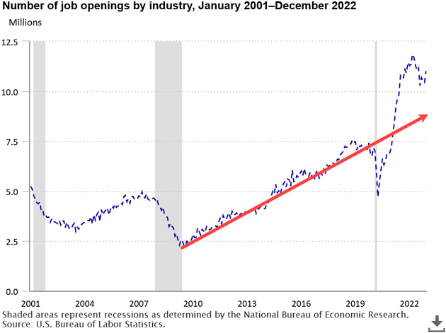
Source: BLS
Drawing a trendline through the 2010‒2020 period, we see that simply continuing that growth rate would have put today’s job openings only about 2 million below the official data. Early retirements plus COVID deaths and disabilities would easily fill that gap.
The pandemic seems to have intensified a labor shortage that was already developing—and more important, it’s not going away.
[Jumping in with some new data: Job openings are indeed starting to fall ever so slowly, as industries start to adjust to the new macroeconomic monetary environment—i.e., higher rates. I was talking with Danielle DiMartino last night about the softening labor market. And sure enough, this morning her Daily Feather shows 100% of job posting categories are falling, 100% of industries are showing job cuts, and initial unemployment claims are beginning to rise (ever so slowly). We are seeing the kind of data associated with the beginning of recession, in addition to the extended inverted yield curve.]Working Past 65
One of several factors contributing to the US labor shortage is a COVID-inspired urge to retire early. In this case, “early” doesn’t necessarily mean retiring younger. It just means “earlier than planned.” People who would otherwise still be working decided to stop.
We can see this in the chart below, which shows the number of workers age 65+ as a percentage of all employed persons. The percentage had been growing since around the year 2000. Then in 2020, it went flat.
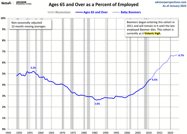
Source: Advisor Perspectives
This could change, of course. People sometimes retire then decide to go back to work, at least part-time. But Baby Boomers also aren’t getting any younger, so that may become less common. The percentage of people working past 65, now at a historic high, seems unlikely to go much higher.
COVID Retirement Boom
“Where did all the workers go?” is a recurring question lately. [It was a topic of intense interest at a dinner that I had a few months ago with Larry Kudlow, Bob Pisani, and Peter Boockvar. They have all been in New York for decades, and when they go out they notice the staffing problems. For whatever reason, the workers left after COVID as their jobs went away, but many have not come back.]
This chart has a partial answer. The blue line shows retirees as a percentage of the US population. As you would expect, it turned higher after the first Baby Boomers turned 65 in 2010. The red dotted line shows the smoothed trend for that period.
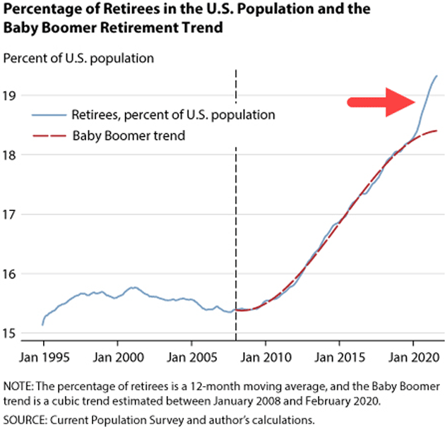
Source: Federal Reserve Bank of St. Louis
Then came 2020, and we see by the red arrow the percentage of retirees rising sharply above the previous decade’s trend. COVID-19 appears to have motivated a bunch of early retirements, which seem to be accelerating. Everyone has their own reasons, but we suspect this isn’t entirely health concerns. Some retirees probably saw big portfolio gains as markets surged, and decided they could afford to retire earlier than planned.
The percentage may look small, but this divergence represents something like 3 million “excess retirees” above what the prior trend predicted. That’s substantial labor force shrinkage.
Investing Framework
This graphic deserves more attention. Conceived by Charles Gave in 1978, it clarifies how to invest in the four possible combinations of inflation/deflation and boom/bust.
Of course, for this information to be useful you must first know which quadrant the economy presently inhabits or is entering. Easier said than done. But once you adopt an outlook, this will help you know what to do with it.
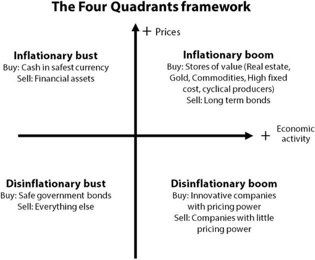
Source: Gavekal
Paying More Is Happening Less
The idea of paying more than the seller asks makes no sense for most goods. It happens in home sales, though, since each product is one-of-a-kind. Making an above-list offer may be the only way to guarantee you get the particular house you want in a hot housing market with little inventory.
In the 4 weeks ending February 12, some 20.5% of US home sales closed above the final list price, down from about 40% at the same point in 2022 and 30% in 2021.
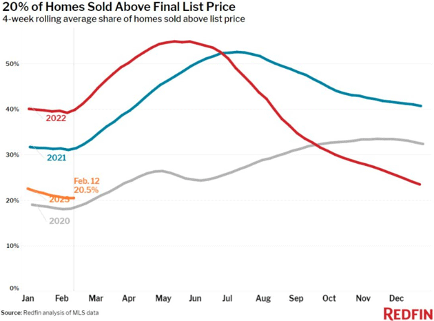
Source: Charlie Bilello
If this is a good proxy for housing boom intensity, it now looks like summer 2022 was peak craziness. At that point more than half the sales were over the list price.
Even 20% seems pretty high. It suggests sellers (and their agents) aren’t very good at knowing what their homes are worth. But this may indicate the boom is still in progress, albeit at a somewhat less frenzied pace.
Built to Rent
We have an interesting change in housing starts. This chart breaks down the total number of homes being constructed by category: single family built for sale, single family owner built, built for rent, and multifamily built for sale.
Note in the bottom right the blue line (built for rent) just crossed above the red “built for sale” category—the first time that has happened since the series began in 1975. That means more new single-family homes are being built with the intent of renting rather than selling them.
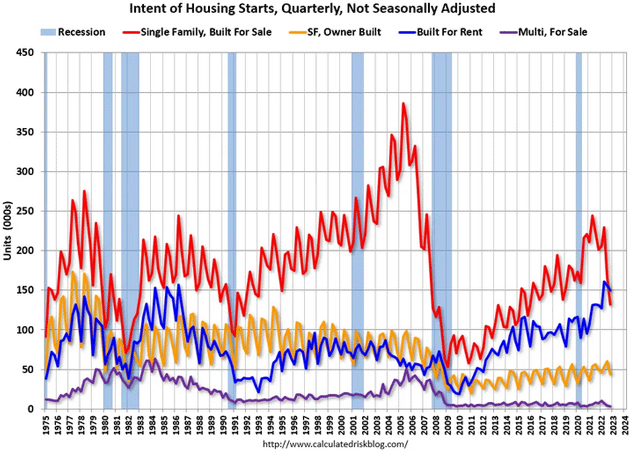
Source: Calculated Risk
We can think of two factors contributing to this. First is higher mortgage rates, which are no doubt pricing out many first-time buyers. Second is the 2017 tax change which made the interest deduction less valuable for many families. Renting can make more financial sense than it used to.
The owners are often large corporations and private funds that are pioneering a new business model: developments consisting entirely of rental homes. We will see in the next few years how well it works.
[No so long ago, buying single-family homes and using leverage to develop a portfolio of rental homes was a way for small and hardworking investors to create a multi-million-dollar portfolio over time. I've met many readers who did exactly that. I truly enjoy listening to their stories and admire their work ethic. That type of entrepreneurial activity is still possible in certain areas, but the larger private equity companies are now significant competition.]Chinese Cars
Three years ago, we said the COVID-19 pandemic would bring changes we could not yet predict. One such then-unimaginable change was that China would become the world’s top automobile exporter. Yet this chart shows it is well on the way to doing exactly that. Chinese car exports now match Germany’s and could exceed Japan’s in a year or two.
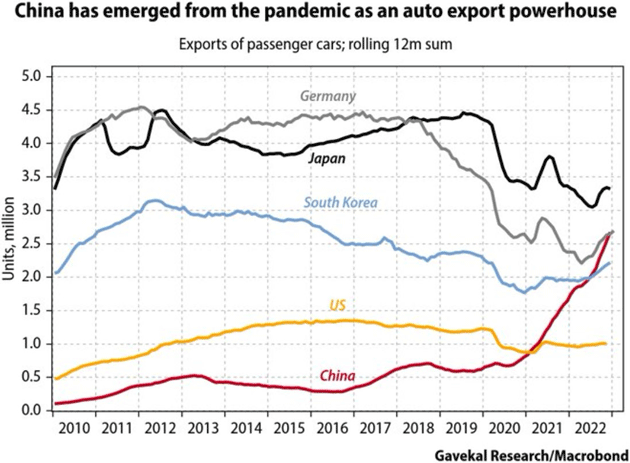
Source: Gavekal
The Gavekal report adds some other context, though. This isn’t really about COVID. The first factor is that Chinese companies excel at making the electric vehicles and hybrids that are in high demand in Europe. The second is that some of China’s exports are from non-Chinese companies with factories there, like Tesla, or from legacy brands bought by Chinese companies—Volvo, for instance.
We don’t see many Chinese cars is the US nor, given the state of relations, is that likely to change soon. Having the largest market off-limits may serve to cap Chinese auto exports. But China itself is still a giant market.
Consumption Growth
The GDP formula includes several inputs, one of which is “personal consumption,” i.e., the total amount US households spend on goods and services. Adjust it for inflation and you get real personal consumption spending, shown in this chart. Other than the COVID interruption, it has been growing steadily despite higher prices for many items.
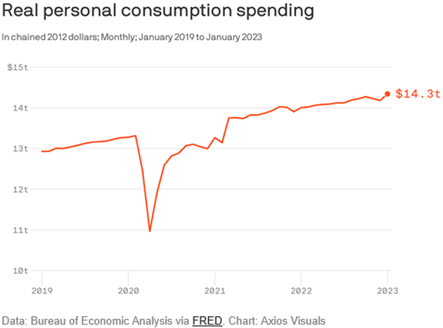
Source: Axios
In other words, inflation has had little impact on aggregate household spending. Certainly, some households are having problems. Overall, though, we’re still consuming at about the same rising rate as before COVID.
That’s good news but it also means tighter monetary policy isn’t yet cooling growth. It’s hard to imagine the Fed cutting rates until that line bends down or at least flattens. [Maybe a better way to say it would be that the conditions that create falling consumer spending will also create the potential for the Fed to pause and maybe even sometime next year actually cut rates.] No sign of it yet.
WFH Plateau
The COVID pandemic increasingly seems to have forced a permanent change in working arrangements. This graph uses language processing to identify the number of hybrid or remote job postings in the top English-speaking countries. You can see it surged in 2020 and then continued rising at a slower pace.
[It goes without saying this will reduce the need for office space in central cities, which along with higher rates is putting a crimp in commercial real estate and especially private equity and real estate funds. It will be some time before we know the full extent.]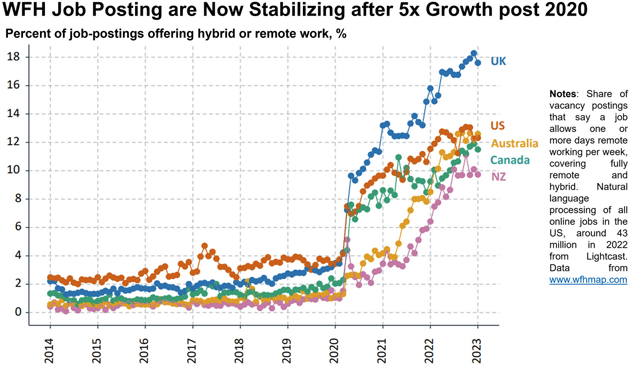
Source: Nick Bloom
We don’t know why work-from-home job opportunities are so much more common in the UK, but growth elsewhere is remarkable, too. Yet it now seems to be stabilizing with 10% to 20% of job postings mentioning at least one day a week of remote work. Stanford economist Nick Bloom, who compiled the data, thinks this may be the new normal.
If so, it implies that something like 80% to 90% of new jobs won’t offer any remote workdays. The change is still dramatic, but working from home remains relatively uncommon. Most people still leave home and go somewhere else to work… at least for now.
Mortgage Stimulus
This chart shows current US mortgages by origination year. If someone refinances this can be different from the year they acquired the home. The insight here is how many mortgages happened in 2020‒2021 when rates were low—typically around 3% for a 30-year fixed mortgage. It appears around half of current mortgages may be in that category.
This is important because it’s a kind of hidden economic stimulus. Someone who refinances their 5% mortgage to 3%—as millions did—has a 0% or maybe even a negative real rate. This means more spending power for consumer goods or other investment assets.
That could explain some of the oddly persistent economic strength. But if so, it will also gradually disappear as people move or otherwise sell these homes. The new buyers may get the opposite of stimulus.
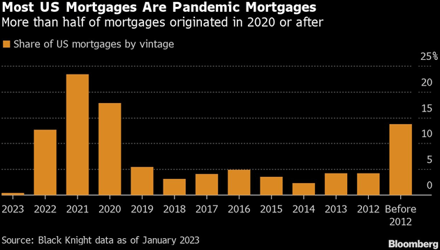
Source: Liz Ann Sonders
I’ll end our chartfest there, but you can get many more with an Over My Shoulder membership. Many readers say these clips are their favorite part of the service, but they’re only the beginning. Every week we send 2‒3 other interesting research notes, drawing on my wide network plus many lesser-known sources.
You aren’t getting the full John Mauldin experience unless you’re reading Over My Shoulder, so check it out here.
Quick Take on the Employment Data
The employment data came in a little higher than expected but buried in it were signs the economy is slowly softening. My friend Peter Boockvar pointed out the “prime age” (25‒54) participation rate is finally back to its January 2020 level. That’s the labor market’s core and it is good to begin to see more of them get back to work. I suspect higher wages have a lot to do with this.
I asked my friend Barry Habib at MBS Highway to give me some insights on the internal numbers. Barry and his team do it very quickly:
- Huge jump of 343,000 more individuals that were unemployed for less than 5 weeks. If Initial Claims would have risen significantly or job creations would have dropped significantly then we could potentially see a reason for this. But since Initial Claims have been exceptionally low and hirings supposedly on fire, then the only explanation for this is that individuals are having a more difficult time quickly finding a job after losing one. Think of a bucket being filled with water (newly unemployed). The bucket represents the first 5 weeks of unemployment. That bucket also has a drain of people being hired or extended unemployment duration. If the flow into the bucket increased dramatically then we could see the bucket fill more quickly than being drained. But the flow in has actually been constricted, so the only explanation is, as stated above, the job market is cooling.
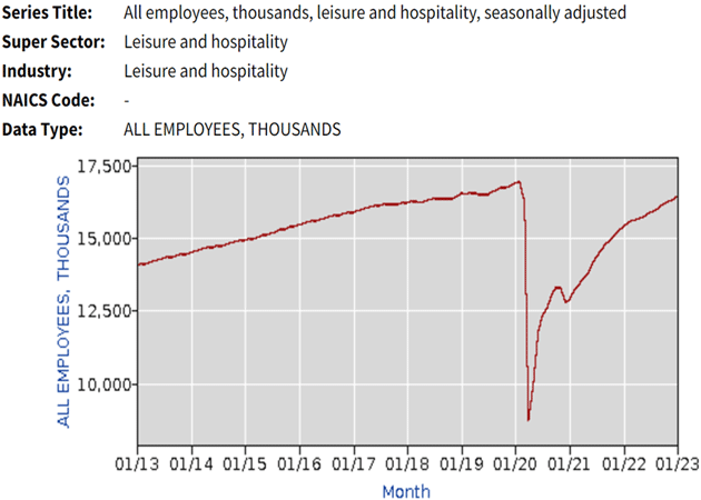
- Much of the job gains have come from Leisure and Hospitality, as illustrated by the chart. And today’s report showed another 105,000 job gains in this category. But as you can see, this engine of growth is clearly nearing an end. And the end may be upon us, as suggested by yesterday’s JOLTS report, which showed openings in this category down by 194,000.
Source: MBS Highway
- Average hourly earnings rose by only 0.2%, the slowest gain in a year. Average weekly hours worked declined by 0.1 to 34.5 hours. This is contrary to supposedly red-hot jobs numbers being reported. We all know that before hiring additional workers, hours are increased. As a result, average weekly earnings declined slightly. This brings the year-over-year increase to 4%, which is a big drop from last month’s year-over-year increase of 4.7%.
In short, nothing in this data suggests Jerome Powell will change his mind about raising rates at a measured pace of 25 basis points per meeting. It may be more than just one or two meetings before he stops, too. Remember I was writing over a year ago that Powell would not stop till he got to 5% fed funds and 5% unemployment? We are going to get to that 5% fed funds a lot sooner than we get to 5% unemployment.
While I’m not going to forecast it, there is a nontrivial chance Powell will end up raising the fed funds rate to 6% before he is finished.
Austin, NYC, and a Reading Recommendation
I'm still trying to work out that Austin schedule, and I want to be in New York City in three weeks to potentially have dinner with Art Cashin and other friends. And then of course we’re busy planning the Strategic Investment Conference. It is shaping up nicely.
I want to strongly suggest you read this brilliant essay from my friend Joe Lonsdale. His podcast is amazing and among the best I have listened to anywhere. I am amazed at the breadth and depth of the talent that he attracts to his podcast and I highly recommend you subscribe to his free letter. I’m sure you will enjoy it as much as I do and become a fan of Joe.
It is time to hit the send button. Spend times with friends and family, even if on the phone or Zoom. That is one investment I can guarantee will pay dividends—as will Over My Shoulder which, again, you should check out here.
Have a great weekend and don't forget to follow me on Twitter!
Your busy as a one-armed paper hanger analyst,

John Mauldin