


Jurrien Timmer reviews his calls in 2020.
by Jurrien Timmer, Director of Global Macro, Fidelity Investments
Key takeaways
- As 2020 comes to a close it’s a good time to reflect back on those volatile market days in March, what we thought we knew back then, and how it all played out thus far.
- When the market began to slide at the end of February, at first I compared it to the market downturn after 9/11. That was clearly wrong, as the COVID crash was much worse.
- From there I moved to the crash of 1987 and the Global Financial Crisis (GFC) in 2008 as market guides. Those turned out to be better analogs, and to this day the market has followed the GFC recovery analog very closely.
- By late March, market breadth (defined as new highs vs. new lows) had gotten so extreme that I was able to say with some confidence that the worst was behind us. That turned out to be correct, although in real time it was far from clear.
Anyone who has spent time on Twitter will be familiar with the theme in which someone shows a before-and-after picture of “how it started” vs. “how it’s going.” Many of these posts relate to pandemic life, in general, so I thought I would do my own markets version this week. It’s also a useful exercise in self-reflection as I look back at my hits and misses of the year, and what I can learn from them.
The 9/11 analog
During the early days of the COVID crash, when the market was down a mere 20% or so, I wondered if the 9/11 analog would be a fitting one for the COVID lockdown. My naïve thought at the time was that the lockdown would quickly reverse, much like what happened back in 2001. That was wrong, of course, and the market ended up falling 35%. The chart below shows the drawdown from the previous 20-day high, and subsequent recovery.
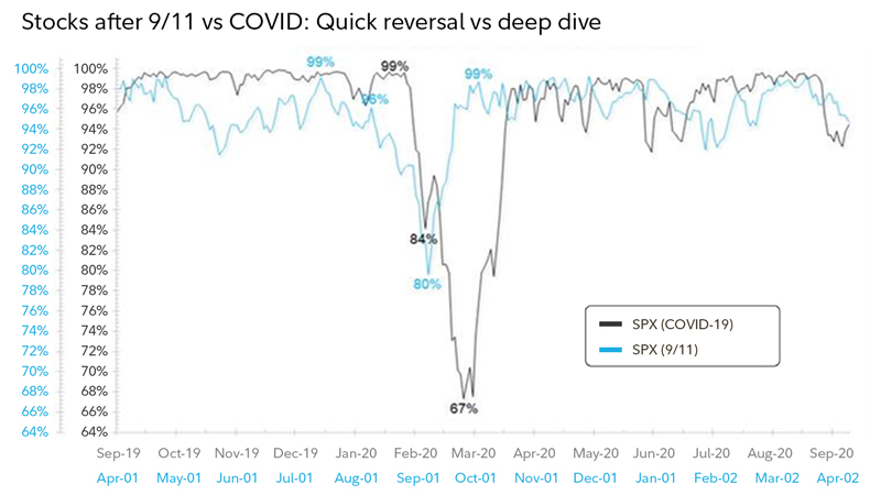 S&P 500 Price Index, drawdown from 20-day high. Daily data as of 12/13/2020. Source: Bloomberg.
While I was initially off by a mile, eventually the analog did kind of work in that, over time, the drawdown did gradually reverse. But that was from a much lower level, so it was still not a great call.
From here, still looking for answers, I moved to the 1987 crash analog as well as the Global Financial Crisis (GFC) in 2008. Those turned out to be better guides. Below I show the spike in volatility during and following the 1987 crash.
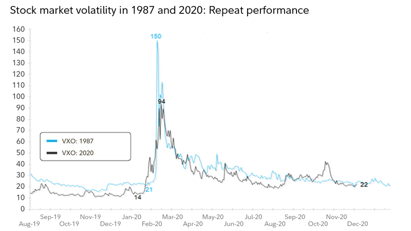 VXO is an index that estimates volatility, similar to VIX. Daily data as of 12/13/2020. Source: Bloomberg.
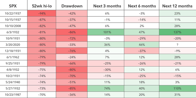
Perhaps my most significant call was in late March when the crash produced the kind of oversold breadth statistics that have rarely been seen. Market breadth measures the number of stocks going up vs. the number of stocks going down.
For the week ending March 21, the new-high-to-new-low ratio was −80%. That was the sixth most oversold reading in 100 years and the second most oversold reading since the 1930s (2008 was #1).
My conclusion was that “a” low was very likely in place, even though there was no way of knowing at the time whether it was “the” low (anyone claiming otherwise at the time was just guessing). Assuming that the 1930s were not going to be repeated (which seemed like a leap of faith at the time), the conclusion was that the market was likely going to be higher in 6 or 12 months.
While 2020 was a very rough year on many fronts, it was a good year to be a market technician/chartist. This breadth metric alone was weeks ahead of any fundamental data in spotting that enough bad news was discounted to produce a tradeable bottom.
Market breadth: S&P 500 Index 52-week highs vs. lows
 Data as of 12/13/2020. Source: FMRCo.
Part of the logic in my assuming that the 1930s would not be a fitting analog for 2020 was that the fiscal/monetary policy response in 2020 was far greater and faster than anything in history (other than perhaps the 1940s). The policy response matters, and in 2020 it blew away even the dramatic steps taken during the financial crisis in 2008.
The chart below shows the contraction in the economy and corporate earnings in the bottom panel, and the Fed’s policy response (balance sheet) at the top.
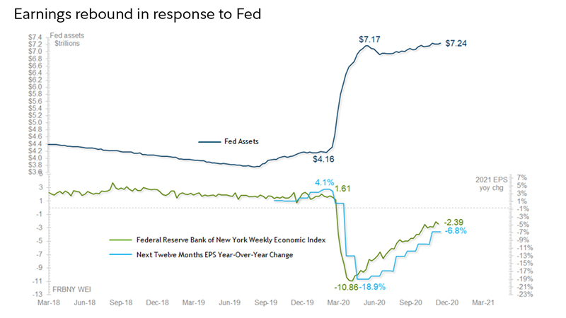 Weekly data as of 12/13/2020. Source: Bloomberg.
The dramatic fiscal/monetary policy coordination brought up another interesting analog: the 1940s. The reflationary success of that cycle hinged on a massive expansion of the Fed’s balance sheet combined with sharply negative real rates. The result was a robust rally in equities, and ultimately inflation.
In terms of market returns, (and COVID, of course), the world looked pretty bleak back in March but the view—despite the current rise in COVID spread—is relatively sunnier now. Here are a couple of examples. Back in March, large growth was down 10% for the first 3 months of the year but was up 52% through the end of November. Small growth was down 26% through March 2020 but was up 69% through the end of last month.
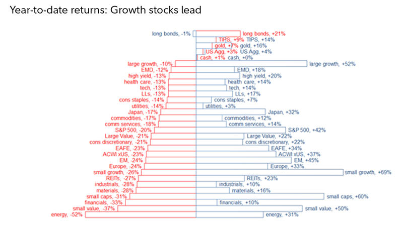 Definitions of acronyms: TIPS are Treasury Inflation Protected Securities; US Agg is Bloomberg Barclays Aggregate Bond Index; EMD is emerging markets debt; LLs is limited liability; EAFE is Europe, Australia, Far East; ACWI x US is All Country World Index excluding US; EM is emerging markets; REITs is real estate investment trust.
Dec. 2019–March 2020 (red) & March 2020–Nov. 2020 (blue). Monthly data as of 12/13/2020. Source: FMRCo, Haver. Past performance is no guarantee of future results.
All in all, 2020 has been an intense year. From a market perspective, it required a lot of soul searching and deep digging into market history to come up with context and perspective. There are never any easy answers, but we can learn from history and come up with the tools to guide us. By and large I think we accomplished that this year.
About the expert

Jurrien Timmer is the director of global macro in Fidelity's Global Asset Allocation Division, specializing in global macro strategy and active asset allocation. He joined Fidelity in 1995 as a technical research analyst.